Assignment 5 – Post Tutor Feedback reflections

Tutor Feedback – Read here

Tutor Audio Visual Conversation 13.01.2020

Assignment 5 – feedback

As always I had a very good conversation with Les about my Assignment 5 image and some of the things I need to complete ready for my submission for assignment.

Flowers – Les suggested that I research the use of flowers in art and photography and consider expanding on my reasons for choosing them, referenced against historical use and meanings associated with flowers. It is ok to do this retrospectively.

Print – Experiment with different sizes of print and make a case for the choice made. A smaller image, may give the viewer the opportunity to look at the image more closely, whilst a larger image, on a wall might allow the viewer more immersive in the space and emphasise the quality.

Meaning – Think about what the elements and symbols included a constructed image might mean to a viewer, particularly in the days of fine art / still life when a lot viewers couldn’t read.

Feedback – Having shown the image to some of my friends and colleagues, Les suggested I consider including a reflection on their reactions. What did they see or not see? What did they think I was trying to communicate? Did it have the impact I had intended?

Audience – consider what I am producing this for. i.e. social media, a gallery, a book. ‘Imagine it in it’s context’. Am I making something pretty for the wall or do I want it have such an impact that is spurs other people into action?

Assignment 4 – Essay – still need to rewrite – flag up what I’ve changed, show that I have listened and evaluated the feedback, flag up what I’m changed and why.

Assessment

Finish up the blog, write a conclusion / note to the assessor, guide them to the important parts of the blog, assure them that I am learning and progressing.

In preparation for next course Identity and Place, look at some study visits, good opportunity to discuss course with other students, tutors and others with academic and professional knowledge

Reflection

The audio visual conversations with Les have been the real highlight of the course, it is so good to be able to discuss and debate the thinking behind your work. He has been so good in guiding me to experience other photographers and read and research areas, I wouldn’t have found on my own. He also seems to have a knack of knowing what would interest me. This has helped we push myself and try different things.

I am really pleased with my final image and I really do feel that it reflects a culmination of the course. I feel like the feedback I’ve been given reflects the little extra bits that can I do to make the assignment really good and has helped me think about how to look deeper into the reasons behind what I’ve produced and the message I want give.

Note:

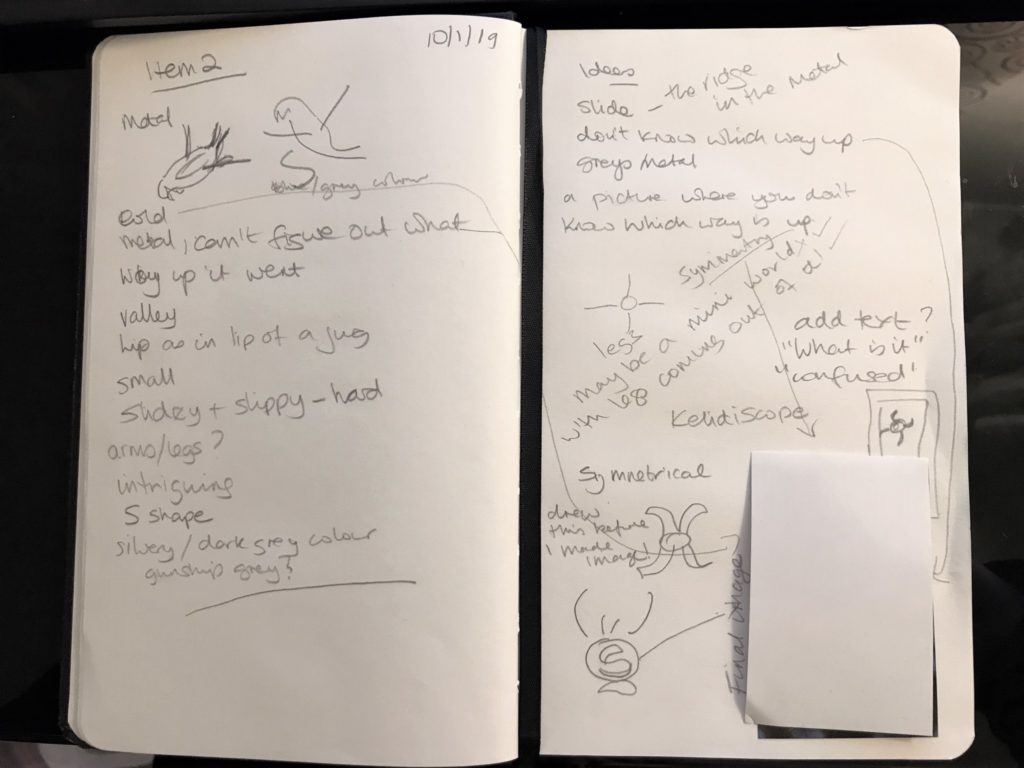
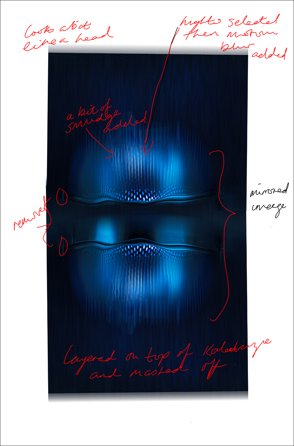
I have recently started using the the Cornell note taking method, which I found really useful to make notes during my conversation with Les . The picture above shows the results. I will definitely keep using this, as it really helped organise my notes and made it easier to write them up for this blog

Assignment 4 – “A picture is worth a thousand words” – Reflections/Assessment

Brief:
Write an essay of 1,000 words on an image of your choice. The image can be anything you like, from a famous art photograph to a family snapshot, but please make sure that your chosen image has scope for you to make a rigorous and critical analysis.

  • If you choose a well-known photograph, take time to research its context – the intentions of the photographer, why it was taken, whether it’s part of a series, etc. Add all this information into your essay to enable you to draw a conclusion from your own interpretation of the facts.
  • If you choose to use a found photograph, a picture from your own collection, or perhaps one from an old family archive, use it as an opportunity to find out something new. Avoid telling us about that particular holiday or memory – look directly to the photograph for the information. It may be interesting to compare and contrast your memory with the information you’re now seeing anew from ‘reading’ the picture so intensely.

It’s not enough to write an entirely descriptive or historical account of your chosen image. You must use the facts as a means to draw your own conclusions about what the picture means to you. You may wish to apply what you’ve learned in Part Four regarding translation, interpretation, connotation, signs, punctum, etc., but be sure you get the definitions correct.

There are many good examples of writing about single images (e.g. Sophie Howarth’s Singular Images), which you may find helpful to read before attempting your own. Take note of the level of critical analysis and aim for a similar approach in your own writing. You may write about personal connections but ensure you express yourself in a formally analytical and reflective manner.

Follow thought associations and other images that relate to the discussion, directly or indirectly. Look at the broader context of the image and its background and specific narrative as well as your personal interpretation of it and what thoughts it triggers for you. Follow these associations in a thoughtful and formal way. Allow yourself to enjoy the process!

Send your essay to your tutor, together with the relevant pages of your learning log or blog url.

Reflection

Don’t forget to check your work against the assessment criteria listed in the introduction to this course guide. Include your evaluation in your assignment submission.

Assignment

I decided to write my essay about the image ‘pieces of me’ by Meg Bitton. Having emailed the photographer for permission to publish her image on this blog, and not having had a full response, I have chosen to created a passworded page to display the essay.

Assignment 4 essay – ‘Pieces of Me’ can be read here (password protected, awaiting permission from photographer)

Approach

I started researching for this assignment by reading the recommended reading and also reading essays by other students to get a feel for the style and details required. read my research notes here

Whilst reading the feedback to one student’s essay, I came across a comment by his tutor that suggested he use the ‘PEEL’ method to organise his paragraphs.

I used this method to organise my paragraphs,

I have organised the essay around the theoretical tools for reading photographs described by Derrida and Barthes

Once I had decided on the image I wanted to review, I did some research on the photographer, in order to be able to add some background and context to the essay.

As the photographer and this work is current, I emailed the photographer for her permission to publish the image in this blog. As I am still awaiting a response, I decided to go ahead with the essay, but have passworded the page so it is not publicly visible.

Pre-tutor feedback Reflections

When I first read that I had to write an essay, I have to admit, I thought it might be a bit boring. However, I have really enjoyed the process. Spending the time to really look at an image in detail was really interesting and it’s amazing how many extra things you see, when you actually spend time looking. I also found researching the photographer very helpful. Although I have been following her work for a while, researching her history and other work, really helped put the image in context and added to the level of understanding and possible meaning she was trying to convey.

Using the PEEL method to organise the paragraphs, really helped me focus on the points I wanted to make and stopped me going off at a tangent. Something that was really useful when you only have a limited number of words.

Assessment criteria points

Demonstration of technical and visual skills – Materials, techniques, observational skills, visual awareness, design and compositional skills. (40%)

Visual skills were needed in this assignment in order to study the image and identify the signifiers and signs that help you read the image. Knowledge of composition skills also helped to give insight into the photographers intentions.

Quality of outcome – Content, application of knowledge, presentation of work in a coherent manner, discernment, conceptualisation of thoughts, communication of ideas. (20%)

In this assignment, I have displayed quality of outcome, by producing a coherent essay, where I have presented my analysis in a logical and reasoned manner. Drawing conclusions using the theoretical ways of seeing presented in the course.

Demonstration of creativity – Imagination, experimentation, invention. (20%)

For Assignment 4, the demonstration of creativity has been demonstrated in the reading of the image. Starting with imagining the meaning of the image, but then evidencing those thoughts in an rational and systematic way.

Context – Reflection, research, critical thinking. (20%)

In order to complete this assignment, critical thinking, research and reflection have been really important to interpret the ideas that the image has connoted and being able to present them in a formally analytical and reflective manner. I have used a recognised writing tool; PEEL, to focus the essay and reflected on the result.

Assignment 3 – pre-feedback reflections

It has taken me a long time from making these images to finalising the assignment for submission. I’m not sure if I really don’t want to have to put myself in the picture, or I wasn’t happy with the concept. Eventually though, I came to the conclusion that if I don’t submit the assignment and get feedback from my tutor, I’ll never improve them and probably won’t finish the course!!

In actual fact, I do like the set, it’s new thinking for me and very different to the two pieces of work I’ve already submitted, so in that respect it is a success.

Demonstration of technical and visual skills

In this assignment, I have used a variety of technical and compositional skills to capture the images. I wanted to show the shoes in the context in which I use them, so this required me to plan the shots for each pair of shoes and consider how best to compose them.

  • Images 1, 3, 5 & 9 were taken using a camera on an tripod with a timer and / or a remote control.
  • Images 2, 4, 8 & 10, are taken from my point of view
  • Images 2 & 4 are taken with an apple iphone, whilst the remainder were taken with a Nikon D810 dslr camera. I have edited them in a way that means it’s not obvious.
  • The images were all taken in a 2×3 format and have been cropped to a square format in photoshop.
  • I created a 3 x4 template in photoshop to mock up how the images would look on Instagram and had to remember to post them in reverse order, to achieve the layout I wanted.
  • A new Instagram account was created in order to display this work.

Quality of outcome

As I always intended for this set of images to be presented in a digital format on social media, I used my knowledge of the Instagram App to present the work in a way that I felt best displayed them as a set. The composition of each image was considered as an individual as well as part of the set. I am very happy with the subtle toning of the images and feel they work well as a set.

Demonstration of Creativity

My aim was to create a set of images that said something about myself, without giving away the whole story. Having reviewed other student’s responses to the brief, I feel that I have found an innovative and creative response. I do think I could expand on this and may continue to add images to the thread, ready for the final assessment. I haven’t yet explored other times of the day or even other seasons, when I may well wear different shoes, so this could add more to the story.

I have also shown creativity in the composition of the images, making the shoes the main focus of the image in some and incidental in others. I have also tried to vary the viewpoint and ensure that each image adds something new to the story.

Context

I have researched a number of photographers for this work, with particular interest in Eva Strenham’s idea of hiding part of the person in the portrait in order to make the viewer have to look at in more detail to make out what is happening. My images do tell a story, but are not particularly intimate, in the way that Elinor Carruci’s are. This issomething I would like to consider emulating in the future.

In posting them on Instgram, I am putting a bit of myself out there and also giving others the opportunity to comment. A fact I am both reticent and excited about!!

Although I am now waiting for Les’s feedback, at this point I am happy with the outcome of this work overall and what I have learned in making it.

Assignment 2 – Photographing the Unseen – Item 2

Item 2 – Ralph’s object

Using the same methodology as for Item 1, I was blindfolded and given the item to hold for 5 mins, and recorded my comments. As previously, I have not yet seen the actual item. These will be viewed once all images are complete.

This item although small like the previous item it immediately felt very different. It felt like it was metal, there were two long protrusions and a couple of shorter ones, there was a groove down the middle and I could feel an ‘S’ shape. I really couldn’t make out which way up the object was supposed to go or what it was.

Sound File can be heard here

Notes made after touching / feeling the object

I thought about the kind of image I wanted to make from this item, but struggled to come up with any solid thoughts, I felt very confused and intrigued, but also that the object had some symmetry about it and it was definitely metal.

At first I was going to try and incorporate the hand again, but it just didn’t fit into the ideas I had. I also considered a slide, which I thought would give me the metal groove I was wanting. But eventually, I wanted to capture the confusion and lack of clarity that I had. The idea of a kaleidoscope came into my head so I looked up how to make a kaleidoscope in photoshop.

I found this tutorial on the internet: How to create a Kaleidoscope – then needed to take an image to use to create my image. I found a metal colander which had the inside curves I was looking for. I also liked the idea of shining a light through the colandar. I added a blue gel to the speedlight to give a blue light and took a range of images with the colander in different positions. These can be seen in the contact sheets below.

Although the image chose looks quite dark in the contact sheet there was nice light spatter on the carpet above it. I was also drawn to the two ‘feet’ on the top which reminded me of the two protrusions on the item I’d felt.

I used this image to create the kaleidoscope effect as per the tutorial.

I have annotated below the amendments made to the colander.

This layer was added on top of the kaleidoscope layer and masked to merge them together. The original image was also very blue, so I added a hue and saturation layer to desaturise the colour . I also added some radial blur to the background highlights to give it a softer look. The wavy lines in the centre represent the ‘S’ shape I felt. The image can be view either way up in order to represent the fact that I couldn’t figure out which way round it should be.

Item 2 – Ralph’s object – final image

Assignment 2 – Photographing the Unseen – Item 1

Item 1 – Helen’s object

Context:

Helen is my sister, I gave her the brief and she provided me with the first object and test piece for this series of images.

sitting on the sofa in her lounge, I was blindfolded and then given the object.  I remembered I should be recording about half way through my 5 mins, so my husband only started recording on my phone at the end.

To hear the recording click here

I cannot post the pic of me handling the item or the item itself because I haven’t finished the set yet, but I’ll add to the final assignment document.

Copy of my written notes

When I first held the object, I was a little underwhelmed, but I found it really interesting to be experiencing it without seeing it.  I tried to create a visual image in my head based on what I was feeling.  I got quite fixated on the groves in it and that fact that I thought my fingers were creating a little cage around it.  I have very small hands, so I think it was a surprise that this object fit in my hand in this way.

I wasn’t sure I would be able to come up with an image at first, but on the drive home (my husband was driving), things began to start popping in my head and I drew the image above quite soon after.  Once it was in my head, I couldn’t / didn’t want to change it.  The colours came from the colours in a picture of an idol in a museum I took in Egypt a few years ago.  When holding the item, it immediately popped into my head.  This was a bit of research done in the middle of the night!!! looking through my old pictures for reference. 

I definitely wanted to emulate the sandy yellows and blues.  I used one of the images to look at the lighting:

key lighting came straight down and there was secondary light coming from the front.

Once I had the idea in my head, I started thinking about the technical aspects of the image.  I knew I wanted to include a hand and initially I wanted this to be my own.  However, I also realised that that would make it quite difficult logistically to take the shot and I wanted to do as much as could in camera.

My props list was:

  • hand
  • stone
  • sand
  • a container for the sand
  • blue paper/cloth for the background
  • lighting (two speedlights, umbrella, honeycomb)

I went to the beach and picked a few stones off the beach I settled on one that was oval in shape and fitted nicely within the palm of the hand.  It was also a sandstone colour to fit with my Egyptian sand theme.  This ended up being a wooden anatomical model that I could make to look like it was holding the stone in a little cage.

We had some sand and found a dark wooden picture frame to be the base for the sand.  I had this idea for a kind of zen garden in the sand, so that I could incorporate the grooves, but this element didn’t really work.

Once all the items were gathered, I set them up on the table in my kitchen with a one shoot through umbrella and a speedlight with a honeycomb dish held directly above this.

The set up and lighting for Image No 1

Technical Information

The images were taken with a Nikon D810 full frame camera with a 85 mm 1.8 lens.  Two speedlights were used to provide a key light above the set up with a dish and honeycomb and a secondary light shot through an umbrella.

The contact images below demonstrate how the shot was set up and the lighting was adjusted to get the feel desired.  It also shows how the set up progressed up until the the sane was poured over the stone.

Editing

The image chosen was one of the last taken. I chose this one because the sand wasn’t too heavy over the stone.

The image was edited using Adobe Lightroom and Photoshop. The sand above the thumb was removed by merging the image with another image where there was no sand.

printscreen of photoshop file

various tools were used including:

  • colour balance
  • curves
  • photofilters
  • high pass sharpening
  • layers and masks
  • displacement maps
  • added shapes and blending modes
  • overlay

    I used a curves layer to make the hand look cooler and stone/sand yellower.

    The Final Image

    Helen’s Item – Image 1

    The item was very small and could be completely enclosed in my hands which are themselves small.  The object was smooth to touch and cold at first but warmed up as handled.  There were distinct grooves carved around the base and a couple of spikes at the top which felt like cats’ ears.

    The item reminded me of an Egyptian idol which led to the idea of the sand and the colours.  I have added some ‘secret’ grooves to the stone and I added a metal overlay to the nails to emphasise the cold touch.  The fingers represent the cage around the stone.

    Item 1 – Helen Final Image (so far!)
    Reflection

    I really enjoyed this and am really looking forward to doing the next item.  I have tried to be really strict and finish writing this up before moving on to the next one and I have decided not to view any of the actual items until I have finished them all.

    For the next and subsequent items, I will try and make sure that it’s quiet and that I’ve got all of my equipment ready before we start. i.e. get my phone ready to record my comments.

    I think I would like all of images to be portrait but of course it may depend on how the next ‘feeling’ session goes and what image I am compelled to make.  It will be my aim to print these as A3 paper to be presented alongside images of the items. do I need to make such detailed notes for all of the rest of the images? I will ask my tutor about that.

    Assignment 2 – Photographing the Unseen – methodology for assignment

    I have decided to concentrate on the idea of exploring how to photograph how it feels to touch something.  The idea is to create an image that is inspired by the item rather than the item itself.

    In order to really experience the touch of the item, I feel that I need to eliminate sight from the reality.  To that end I am going to work to the following methodology.

    1. I will ask 7 – 10 people to participate in this assignment with me (the thinking behind this is that I will get objects that I don’t know and therefore won’t be influenced by what they look like)
    2. I will be blindfolded and won’t see the item at all
    3. The participant will be asked to take a photo of the item and a photo of me handling it, but won’t let me see the item.  They will also write a paragraph about the item, and why they chose it.
    4. I’ll handle the object for no more than 5 mins
    5. I will record my comments during the touching sessions so I can make notes afterwards.
    6. The object will be removed immediately, so I don’t see it.
    7. Following this I will create an image based on my feelings of touching the object, which will include colour, state, feelings etc.
    8. I won’t see any of the objects until after all images are complete. (my husband has agreed to collect the images of the items and me handling them and keep them save until the assignment is finished)
    9. Each image must be finished before attempting the next item (I think this is necessary so that individual images aren’t influenced by other items)

    I will use this methodology with the first item as a test, it may need to be amended based on my findings, but this feels like a good place to start

    The brief for participants can be read here

    Assignment 1 – Two Sides to the Story

    Create at least two sets of photographs telling different versions of the same story. The aim of the assignment is to help you explore the convincing nature of documentary, even though what the viewer thinks they see may not in fact be true. Try to make both sets equally convincing so that it’s impossible to tell which version of the images is ‘true’.

    Real Corners Reconstructed

    I have understood this brief to be about how I as a photographer consider my work, the approach I take and how I convey that to the viewer.

    Real Corners Reconstructed is an exercise in what is real and what is not.  Focusing on mundane street corners that people pass everyday, I have taken a series of images in and around Littlehampton in West Sussex. I have then used these images to create a second set of composite images, ‘reconstructing’ the corners in order to test whether they are distinguishable from the real ones.  They are presented on double sided postcards without title or comment so that the viewer can make up their own mind as to the validity of each image and to which set it belongs. Here on the blog, they are shown randomly.

    Planning and Research

    In researching for this assignment, I was struck by the fact that Dorothea Lange was given a ‘list’ of scenes to capture and wondered about the ‘truth’ of the images that were published.  Her photo  ‘Migrant Mother’ is acclaimed more for it’s aesthetic appeal than the story it told.  Today’s viewers are bombarded by imagery, do they even notice it’s ‘fake’? 

    The idea for the street corners was inspired by Chris Dorley-Brown‘s ‘Corners’ series. I like the idea of not knowing what’s around the corner and it reminded me of an image by Guy Bourdin which I came across during the Expressing Your Vision course. I was also intrigued by Sarah Pickering’s Public Order series, where nothing is quite what it seems at first viewing.  This led me to the concept of reconstructing real street corners to create new views 

    Approach

    There were a number of things which needed to be considered for these images. The corners needed to be shot with the same depth of field (f/8) so that they were easier to match, they also needed to have similar sized buildings or areas that could easily be masked and the angles needed to align.  Shooting on days that were grey and overcast meant that the light was flat and defused which meant that shadows and time of day were less important.

    Selecting Images that could be used for the composites was quite instinctive and I had an idea when I took them, which they might marry up with.  This didn’t always work as getting the perspective right was probably the most difficult thing to get right in photoshop.  Below is an example where it just didn’t work.

    an example of an image I couldn’t the the perspective right in

    Contact sheets can been seen here

    to read the Technical Information Sheet click here –  (spoiler alert: don’t read this until you’ve made your decision as to which images are real and which are reconstructed)

    Reflection

    To obtain some feedback on this idea I gave a copy of the prints to my family during a family get together and some of my work colleagues.  I was actually surprised and pleased by the level of conversation it generated between the people in the room.  Those that knew the area found them a bit ‘freaky’ because even they were getting confused about which were real and which were reconstructed.  In the end they were all trying to examine them in detail trying to work it out.  No one actually got every set right. I found getting feedback as I was developing the idea very useful and definitely helped me improve my approach.  As a result I changed the presentation and amended a couple of the images.

    I am very happy with the concept and I think the images work well as a set but I think I might like to introduce a greater variety for the final set. I do feel that I have met my own brief on considering my work, the approach I take and how I convey that to the viewer.

    Assessment Criteria

    For this assignment, I have demonstrated the following points:

    • Demonstration of technical and visual skills – Materials, techniques, observational skills, visual awareness, design and compositional skills. 
    • Quality of outcome – Content, application of knowledge, presentation of work in a coherent manner, discernment, conceptualisation of thoughts, communication of ideas. 
    • Demonstration of creativity – Imagination, experimentation, invention. 
    • Context – Reflection, research, critical thinking.
    References and Links

    Assignment 1 – Technical Information Sheet

    Camera and Settings

    All images were taken using a Nikon D810 Camera with a Nikkor 18-35mm 1:3.5-4.5 AF D Lens at f/8 to ensure consistency of depth of field.  IOS and shutter speed varied depended on exposure, but tried to keep ISO the same and wanted to match images.

    All images to were taken handheld at my eye level in  order to maintain plain of field for photo merging and were taken on different days in December 2018.

    Editing

    The images were edited in Adobe Lightroom:

    • Basic – profile converted to ‘Camera Standard’, highlights and shadows adjusted, vibrance decreased
    • Detail – Luminosity adjusted
    • Lens Correction – adjust to Nikkor lens
    • Tone curve added to some images to brighten them
    example of Lighroom editing screen
    Image set 1 – The Real Corners
    Image set 2 – The Reconstructed Corners

    All of the images were composited in Photoshop, using layer masks, cloning and tone curves. Details of how each image was constructed are listed below:

    Image #2 was created using images #1 and #8 using the left side of. The colour of then end of the building was changed and the roof of the one building extending to create corner building.

    Image #5 is a mirror image of image #8, but with all the signs reversed so that the writing is the right way round.

    Image #6 is created from images #14 and #1 – In this image it was the background that was changed leaving the viewer to believe that the corner leads to a different place.  In testing this was the image that the majority of viewer got wrong.

    Image #7  is created from two images below: One of the houses in the street was replaced with one from another corner.

    Image # 9 was created from from the two images below.  Leaving the traffic lights was deliberate in order to try and bring  images together.  It also required a bit of perspective warping to try and get the perspective right. I have to confess that the ‘original’ image is also not original as I added the lady crossing the crossing from another image (Oops)

    Image #10 – used two images of internal corners. I also retained the car on the left to try and maintain the perspective.

    Image #12 – This seafront appartment block sits quite comfortably behind this hedge on the corner. A reflection of a lamp post in one of the windows was removed as somone picked that up during my testing.  Otherwise this was one of the ones viewers got wrong.

    Project 3 Exercise

    Exercise
    Find a street that particularly interests you – it may be local or further afield. Shoot 30 colour images and 30 black and white images in a street photography style.

    In your learning log, comment on the differences between the two formats.
    What difference does colour make? Which set do you prefer and why?

    I found this a very interesting exercise.  I like black and white photos, but usually just convert them from colour.  So actually taking them in black and white gave it a new perspective.

    In order to take photos in black and white I had to learn how to set my camera to Monochrome in the shooting menu and then because I use a DSLR,  I had to use the live view on the screen rather than the viewfinder, which obviously doesn’t change.

    I chose this village street, because it had a number of different elements that I thought might be interesting. Ultimately though, the time of day and the lighting didn’t add much value to the images.

    I decided to take the colour photos first and then take black and white ones, as I didn’t want to mix them up.  This turned out to be a good plan because as I had taken them in RAW, Lightroom subsequently converted them all back to colour when I downloaded them.

    For the purposes of this exercise, jpgs would have probably been sufficient.

    As it was a very ‘bland’ day, lighting and weather wise , the colour images are only enhanced where there are blocks of green or dashes of colour to lift them, but they do give a feel of the time of year and almost deserted streets.

    The black and white images however, don’t offer the same information about time of year.  They could have been taken at any time.  I also found that they are much more structured and detailed.  There are not some many images of the trees and flowers and more of buildings and items where there is a greater contrast between the elements of the image.


    I’m not sure I really have a favourite set of these images. They both do different things.  I think on balance I prefer the colour ones here.  Only because you get a better sense of time of year.