The Brief:
Making it up
Construct a stand-alone image of your choice. Alternatively, you may choose to make a series, elaborating on the same theme.
As the culminating assignment for the course you may wish to draw upon skills learned from Parts One to Four – using various forms of narrative, using yourself as subject matter, telling stories and reading images. The only stipulation is that you produce work that has been controlled and directed by you for a specific purpose. Remember to create a story with a specific context like the artists you’ve looked at in Part Five. This means you need to have an artistic intention, so a good place to start would be to write down some ideas. This could then form the basis for a 300-word introduction to the piece. You may find it helpful to draw storyboards to help you visualise your ideas.
The aim of this assignment is to use props, costume, models, location, lighting, etc. to contribute to the overall meaning of the image. (Use flash/lights if required but available light is fine as long as it is considered.)
If the narrative is to be set in a different era then the elements of the image must reflect this. Also consider the symbolic meanings of objects and try not to be too literal in your approach. For example, don’t automatically use red roses in a love scene but try to be subtle in your ideas to obtain a more true-to-life scenario.
For this final assignment, you should also include an illustrated evaluation of the process you went through to produce your final image(s). Include snapshots of setting up the work and write about how you felt your direction went, how you found the location, props, etc. How did this process affect the final outcome? Write around 1,000 words in total (including your 300-word introduction).
Send your final image(s) to your tutor, along with your commentary and relevant pages of your learning log (or blog url).
Reflection
Before you send your work to your tutor, check it against the assessment criteria listed in the introduction to this course and make sure that it meets all the criteria. Make your evaluation available to your tutor.
Reworking your assignment
Following feedback from your tutor, you may wish to rework some of your assignment, especially if you plan to submit your work for formal assessment. If you do this, make sure you reflect on what you’ve done and why in your learning log.
Assignment 5 – Juxtaposition
Introduction
Juxtaposition: “two things being seen or placed close together with contrasting effect.”
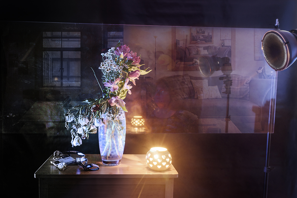
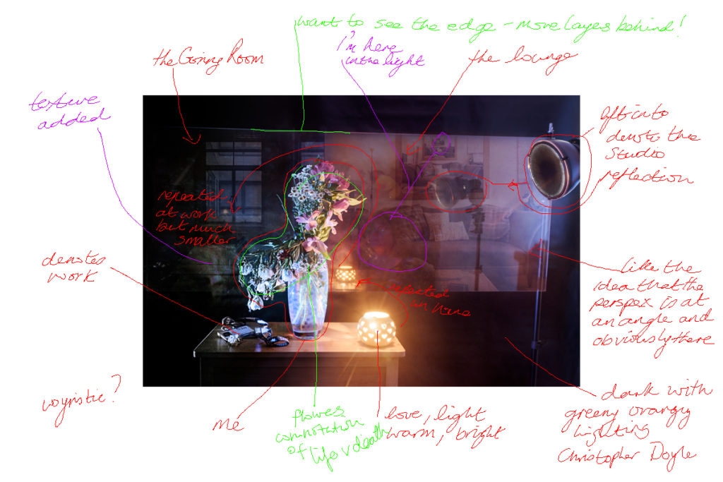
My art, my home, my passion is juxtaposed with the work I do to make a living. This is not about the physical places but focuses on the impact that they have on my health and wellbeing. The bright showy flowers masking the delicate, fragile and dying blooms that are hidden from the light. The contrast of thriving or surviving and the layers of complexity that lie beneath.
This self-absented self-portrait uses the vase of flowers as a surrogate, which dissects the views of two major areas of my life. One side of the vase is bright and fresh and the flowers standing upright in the light whilst, on the other side, the wilting. almost colourless aspects are fading into the darkness. The reflection of the studio within the background combined with the images of my home and work, show how you bring with you all of your experience and feelings into your current reality.
This work is the culmination of this course, drawing on aspects of the previous 4 assignments.
- the truth portrayed in images
- presenting visually unseen thoughts and emotions
- self absented portraiture and using surrogates
- constructing an image to tell a story
Influenced by Noemie Goudal’s work in Fictional Spaces which reminded me of my first assignment where I merged images to make a new reality and Meg Bitton’s ‘Pieces of Me’ where she used a screen to form a barrier from the outside world, the backdrop is a piece of perspex that acts as frame for the environmental images but also reflects the reality in the studio.
Remembering my learning point from Assignment 3, where I noted that everything in an image can have a meaning and impact on the viewer and Leah Schrager’s ‘Infinity Selfie’ where she places pictures inside pictures I have carefully considered all of the elements in this image.
I have chosen to present this image as 7 x 5 print on pro luster paper. The reason for this is that it is a very personal piece that is neither for public consumption or a graphic piece that is decoration for a wall such Goudal’s work. The viewer is invited to hold and study the image, this way they will see more of the layers of complexity and that it contains. I tested this out with some friends and family, by printing the image on various types and sizes of paper. Most preferred the smaller sized picture because it was easier to hold and study. I chose the 7 x 5 because it’s small enough to hold, but big enough to see the detail. I chose the pro luster paper because I wanted to retain the bright shine of the lights, which glossy paper gave as well as the texture that the matt paper gave and the worked well.
NB: the ‘blue text’ denotes amendments made after feedback from my tutor
Evaluation of Research, planning and process
The final image is made up of three separate images merged together using Photoshop to create a single image that creates a multi-layered, mirrored and reflected view focusing on the course themes of photographing the unseen and self-portraiture.
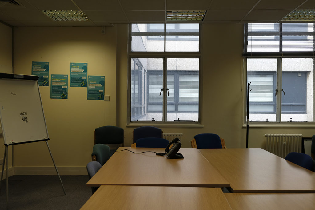
The Goring Room at work 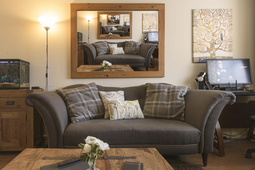
My lounge 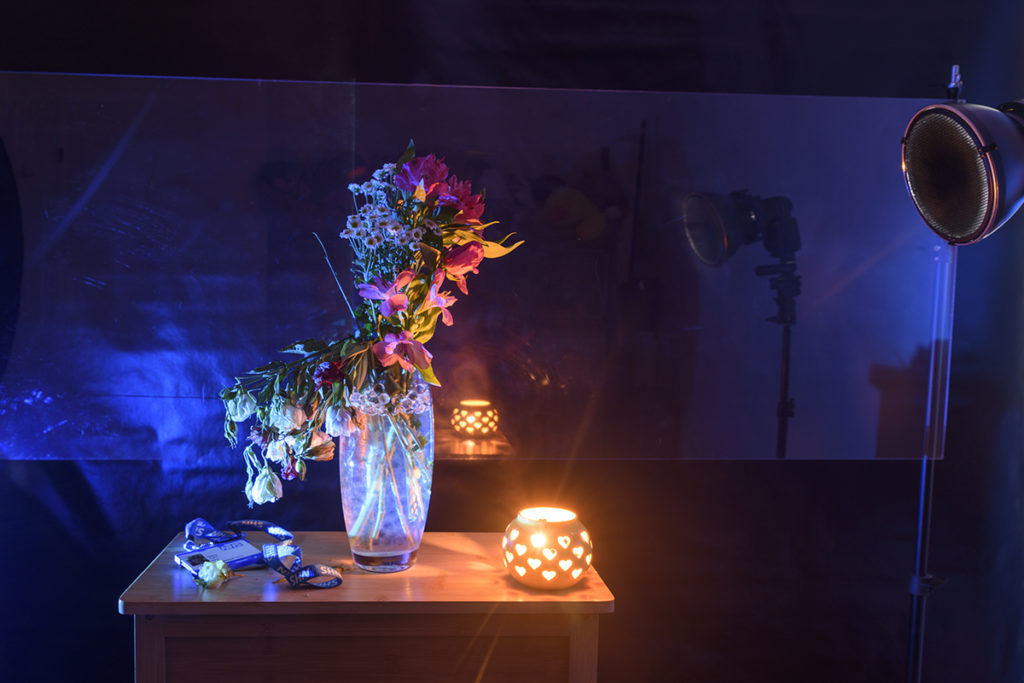
Vase of flowers with perspex behind


The Goring Room
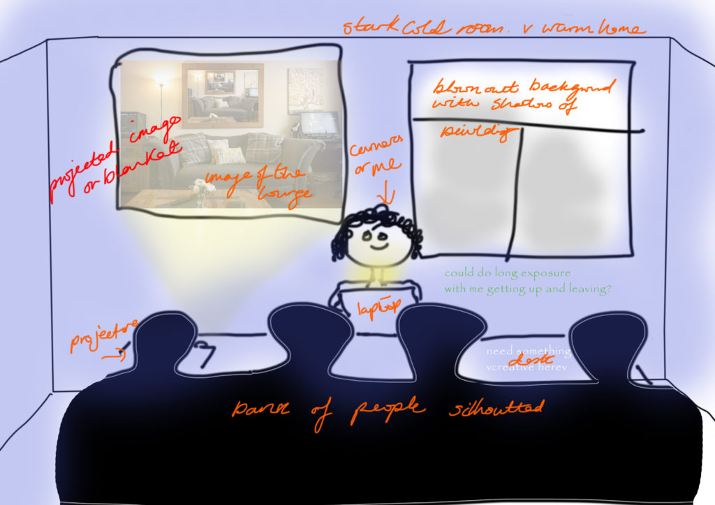
This is one of the meeting rooms at work. My original idea was to use this as the scene for an image describing my feelings of anonymity. I was going to project the image of my home onto the wall to symbolise the warmth and security it gives me to keep going, in what sometimes feels like a cold and faceless corporate environment. Below are the initial sketches/mock-ups I made for this idea:

I did ask some of my work colleagues to help me with this work, but ultimately decided that I didn’t want to involve others in the final piece as I wanted it to be about me, but not of me.
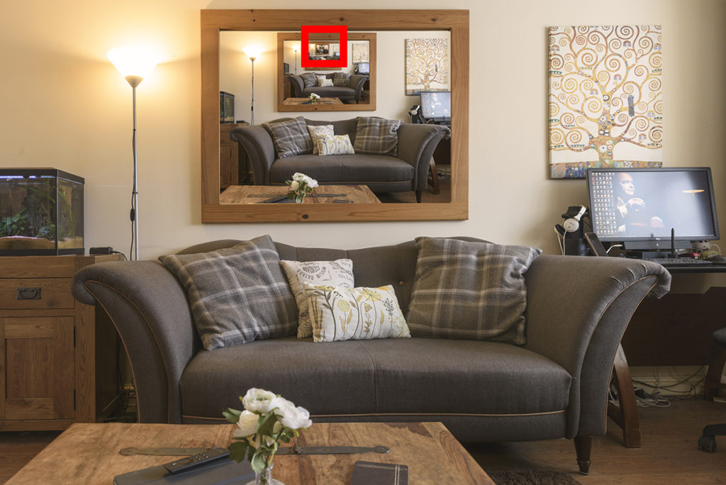
My Lounge
The image of my lounge was made when I was exploring the idea self-portraiture for Assignment 3. Being present in the image but not present. The reflection in the mirror, isn’t a reflection at all, but the same image repeated over and over again. All except one, where I am there, sitting on the sofa:
Hidden in the picture 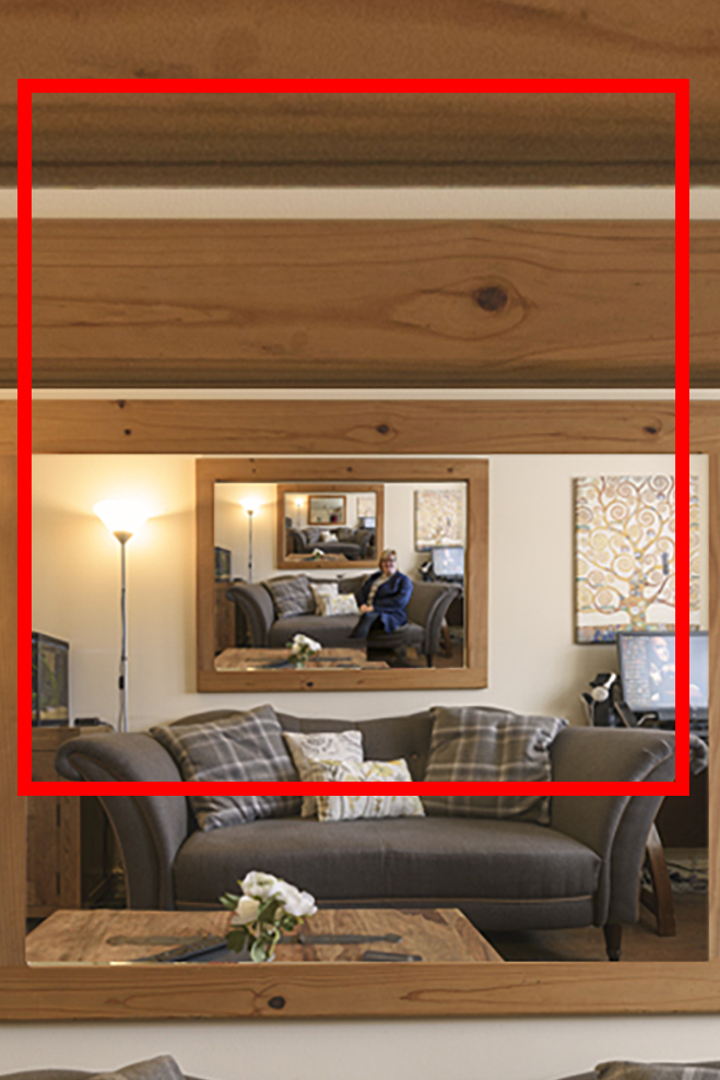
zoomed in

This idea was inspired by Leah Schrager‘s Infinite Selfie, where she appears to be showing herself to the camera in intimate positions, but the multiple layers of photos, end up showing you very little.
The image of my husband on the monitor is deliberate, as this is an image from Assignment 4 of Expressing Your Vision‘; one which I was very pleased with, but also represents his importance in my life.
Flower Vase
In Noemie Goudal’s Fictional Spaces she uses photocopied sheets to create an image which transforms the place and the view. In Meg Bitton’s ‘Pieces of Me‘ she uses a screen to transform the background into a studio and to form a shield from the world. Therefore, in my image I have a used a piece of perspex behind the flowers to act as a window to a couple of my realities but also to reflect the reality of the space I (the flowers) am currently occupying. I do not want to create a different world but explore all of the realities my mind can occupy at one time.
Following Assignment 3, where I used my shoes as a surrogate for myself in my self-portraits, I was encouraged by my tutor to consider why I had chosen that medium. Time and Time again, I come back to my desire to be recognised for my work but not wanting to be shouting from the hilltops, “hey look at me”. Am I scared of failure or more likely people thinking I’m arrogant or pushy, traits in others I do not like!
In this instance I have chosen to use a vase of flowers to represent myself. They are country flowers of different colours, sizes and complexity, representing the multifaceted elements of my personality, interests and skills. They are in a clear glass vase, where the stems can be seen strong and replenished by the water.
Following feedback from my tutor I researched the meanings associated with some of the flowers. I am lucky that my mum was an avid flower arranger, so although not being a gardener myself I do know the names of the flowers:
Flowers have been used as symbols in art for hundreds of years, not only do they are beauty and colour to images, but they have they had secret meanings that the viewer could use to read deeper meaning into the picture. I didn’t consciously choose specific flowers to do this, but having done a bit of research, it seems that if viewers are aware of these symbols, then I my choice of flowers does echo the story I am trying to tell:
source: flowers as symbol in art
The Alstroemeria, (also called Peruvian Lily), the wilted flowers on the left of the image, are symbolise devotion and friendship. It is also a symbol of wealth, fortune and prosperity. If well taken care of, Alstroemeria can be very, very long lasting! Inadvertently, this sits well with the image and one could say it represents that even the long lasting resilience I have is wilting in the face of the lack of nourishment I am getting from my role. It is also the primary source of my income (i.e. wealth and prosperity) which could definitely be better.
The pink flowers on the right are also Alstroemeria, which I think gives a great contrast to the white ones on the white. perhaps the message is that my wealth and prosperity is found in the love I have in my home life and this is long lasting and resilient.
Daisies have numerous meanings in different cultures, but mostly seem to symbolise purity, innocence and true love. As they are standing between the Alstoemeria and are standing straight and tall, perhaps they are representing the love I draw from my family, especially my grandchildren who bring joy through their innocence.
Blimey who’d have thought a few flowers in a vase could add such extra depth to the meaning of the image. The learning here is that especially in a constructed image such as this, everything in the image could denote or connote something different to the viewer. If I was doing this project again, I might think more carefully about the flowers that I chose.
Vase of flowers with perspex behind
The vase is flanked by my work ID card on the left and in the dark and by the little heart shaped light on the right which warms and lights up the flowers.
Technical
Before setting up the shot, I sketched out the idea for the end result, as can been seen below. This made it much simpler to set up as I already knew what outcome I wanted to achieve.
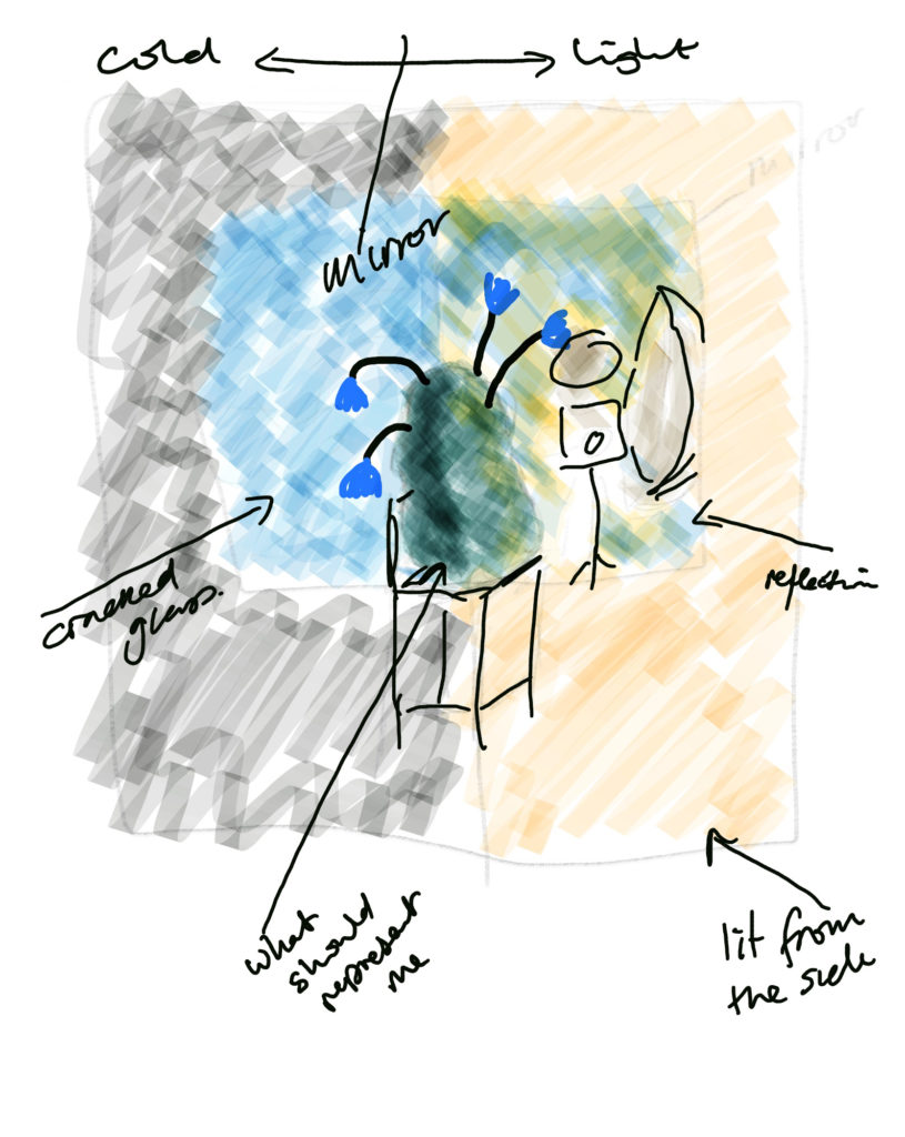
outline sketch of shot
The flower vase shots were taken in my back bedroom, which was set up as a studio. As per the sketch above, I did start with a chair, but found there was too much of a shadow on the back of the chair, so changed it to a table instead.
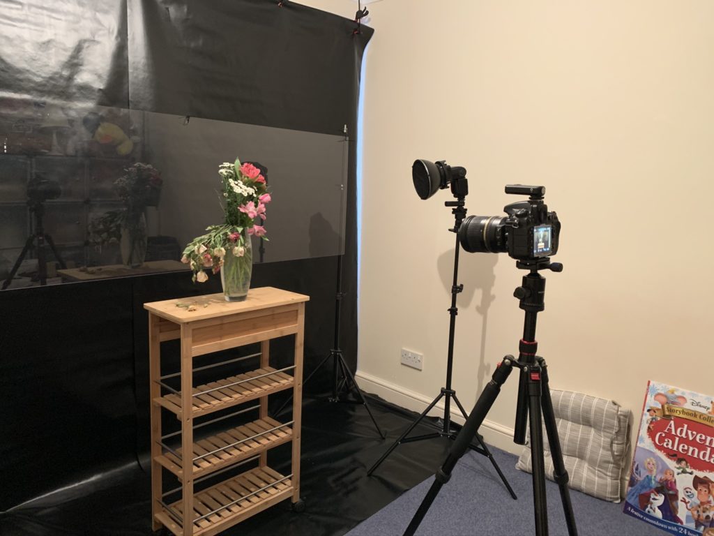
lighting and camera set up 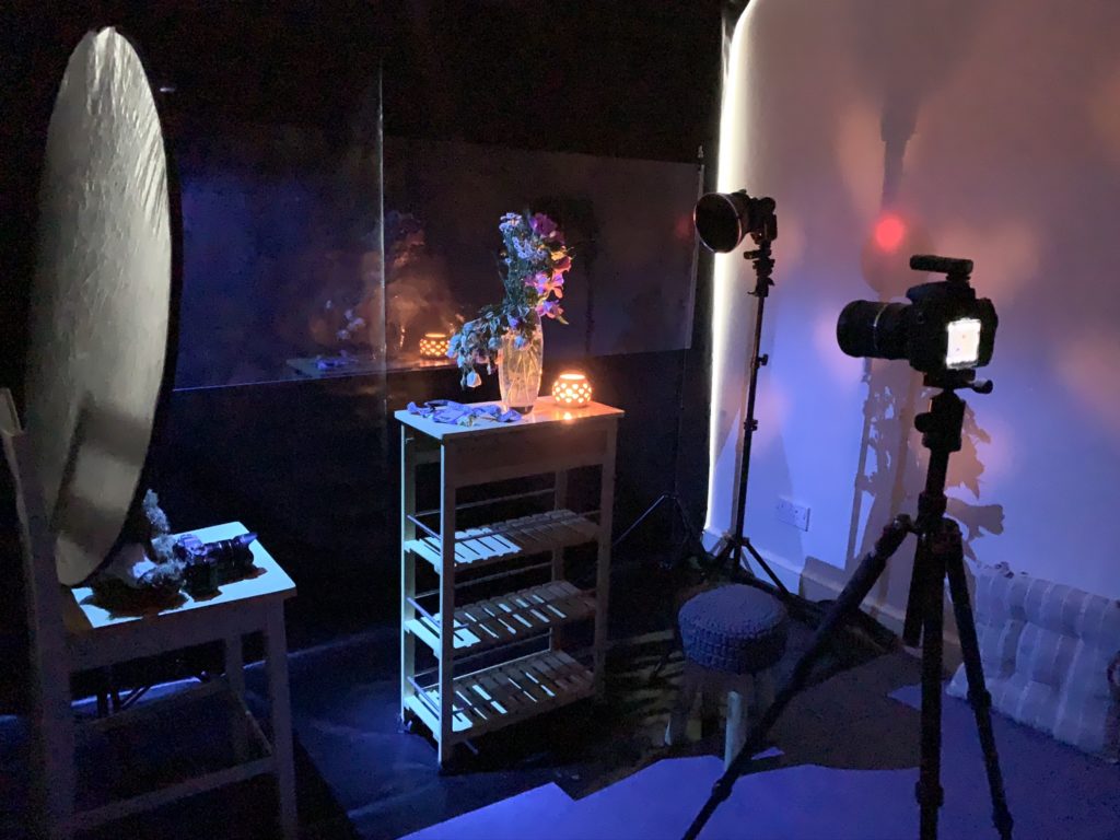
Room set up 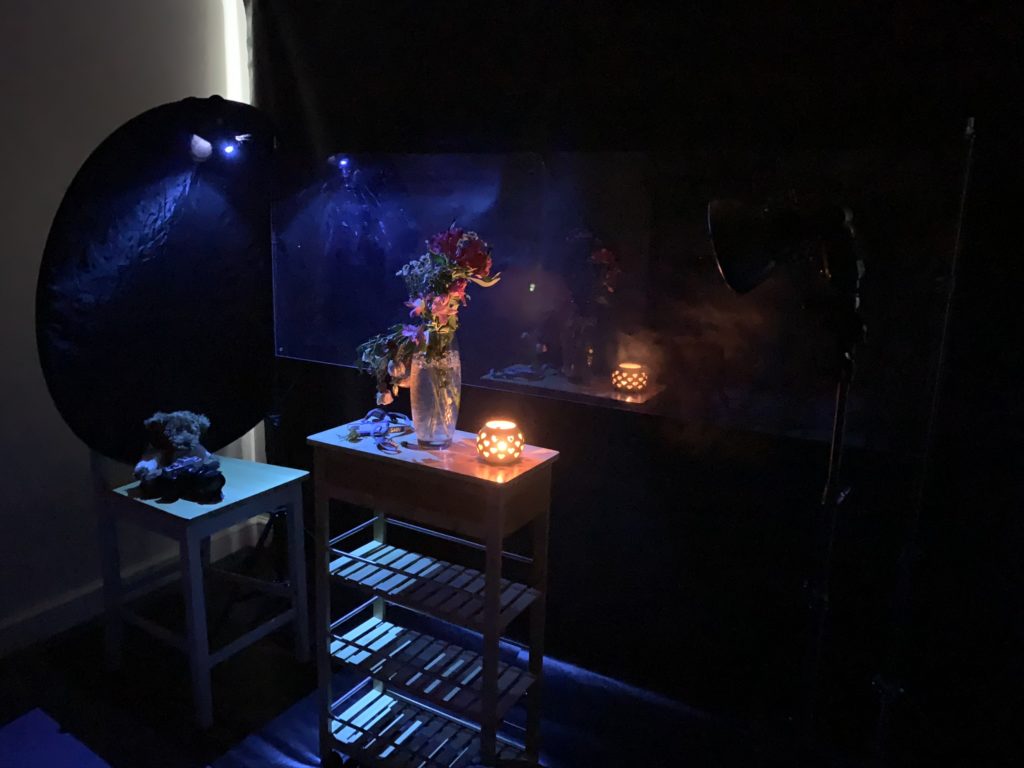
gelled lights to create mood


The images were taken with a Nikon D810 on a tripod, with a speedlight fitted with a small dish and honeycomb to reduce the spread of the light and focus it on the flowers. A small torch with a blue gel on, provided the blue light on the left hand side of the image. This was clamped to a black reflector to reduce the reflective light from the flash on that side. Settings, 24 mm, f/8, ISO 100, 15 sec exposure. I used the flash on rear curtain flash just to add fill flash at the end and used ambient lighting for the majority of the image in order to create the right low light mood.
The Contact Sheets for this session can be seen here.
The image of The Goring Room, was captured on a Fujifilm T20, settings 22.3 mm, f/6.4, ISO 400, 1/60 sec
The image of My Lounge, was taken with the Nikon D810, using a remote control, so I wasn’t in the images, except for the one on the sofa.
All images were edited using Adobe Lightroom and Photoshop.
Juxtaposition
The final image was constructed with Photoshop, using the three main images, a number of adjustment layers and overlays to add extra texture and colour to certain sections of the image. These can been seen in the image below:

Image – Photoshop Screenshot of image and multiple layers
As an entirely constructed image, I am conscious that the viewer will be aware that every element of the image will have been included for a reason and as such, I hope that I have portrayed their meaning clearly. The colour grading was influenced by Christopher Doyle’s work which I came across in Expressing Your Vision and the low key look gives it a vieweristic feel.
Unlike in Assignment 1, where I wanted the viewer to have to decide which was the real view or not, in this image I wanted the viewer to know that this was a constructed image, but see that there are tangible elements of reality within it. That’s why I left the stand holding the perspex and the lighting dish visible and the images of The Goring Room and My Lounge are bounded within it. It wasn’t immediately apparent what connection the Goring room was to me, therefore, I added the work ID badge, in the hope that viewers would make that connection.
In the original image there was no light in window of the dark side, however, a few days after completing it, something happened at work that gave me hope and motivation that things will get better, so I added the light to represent that hope, it also helps with taking the viewer’s eyes to that part of the image.
elements of the image and their meanings / purpose
Reflection
Overall I am very pleased with the outcome of this image. It has taken quite a while to develop it, think it through and complete it. It is a culmination of this course and all of the ideas and thinking it has provoked. I believe that I have visualised my innermost thoughts in a way that I could not explain in words. I also think that it is an image of its time, as my feelings and thoughts change over time, I suspect I would not make this image again.
This course has caused me to dig deep into my motivations and my image making and I feel a little more weighed down by it every day. They say that everyone has a book inside them. I’d like to think my ‘book’ is a series of images.
My reflections following the feedback tutorial with my tutor can be read here.
Assessment Criteria
Demonstration of technical and visual skills
Demonstrated through the composition of the image. As a whole constructed image, I have had to consider composition and content from the very beginning of the work. I have used various technical skills to complete this project such as:
- Technical Knolwedge of different cameras and how to achieve the desired shot
- Materials: using the correct Studio lighting: including use of flash triggers, honeycomb modifier, gels and reducing reflective lighting and how to change it to get the effect required.
- Understanding that light can enhance the image and visual awareness to modify and improve where it needs enhancement.
- Editing skills, using Lightroom and Photoshop to design and create the composition visualised, including the use of layers, adjustments, overlays, cropping and colour grading.
Quality of outcome
- Application of knowledge: using the ideas, exercises and theoretical tools presented within this course to conceptualise and communicate my thoughts through this image.
- Work presented in a coherent manner highlighting the influences and discernment made in creating this composition.
Demonstration of Creativity
- Creativity demonstrated through, experimentation with various thoughts and options
- Invention of one image, using multiple images
- incorporating colour grading and techniques such as pictures within pictures inspired by research and reading about other artists.
- Clear explanation of my work and final image
Context
- links and references to research and ideas
- self-reflection and evaluation of the outcome
- evidence in critical thinking from evaluation of the other artists work and theories that have shaped this image.