Having taken an age to get into this assignment, I actually got quite hooked by the concept in the end.
I am actually quite pleased with the set of images I’ve produced. They have generated quite a lot of conversation between my family over Christmas and I had a room of about 10 people arguing about which were real and which not.
My biggest reflection comes from the fact that feedback and discussion helped my refine some of the images and think more about how to present them. This is something I will utilise in future assignments. I also reflect on how much I enjoy manipulating images and making something new from what is already there.
and finally, I opened the introduction of “on being a photographer’ by David Hurn and Bill Jay and came across this quote from Abraham Maslow:
The purpose of life is to become actually what we are potentially”
I love this quote and it will be my new year’s resolution!
To see Assignment 1 – Two sides of the Story – click here
Create at least two sets of photographs telling different versions of the same story. The aim of the assignment is to help you explore the convincing nature of documentary, even though what the viewer thinks they see may not in fact be true. Try to make both sets equally convincing so that it’s impossible to tell which version of the images is ‘true’.
Real Corners Reconstructed
I have understood this brief to be about how I as a photographer consider my work, the approach I take and how I convey that to the viewer.
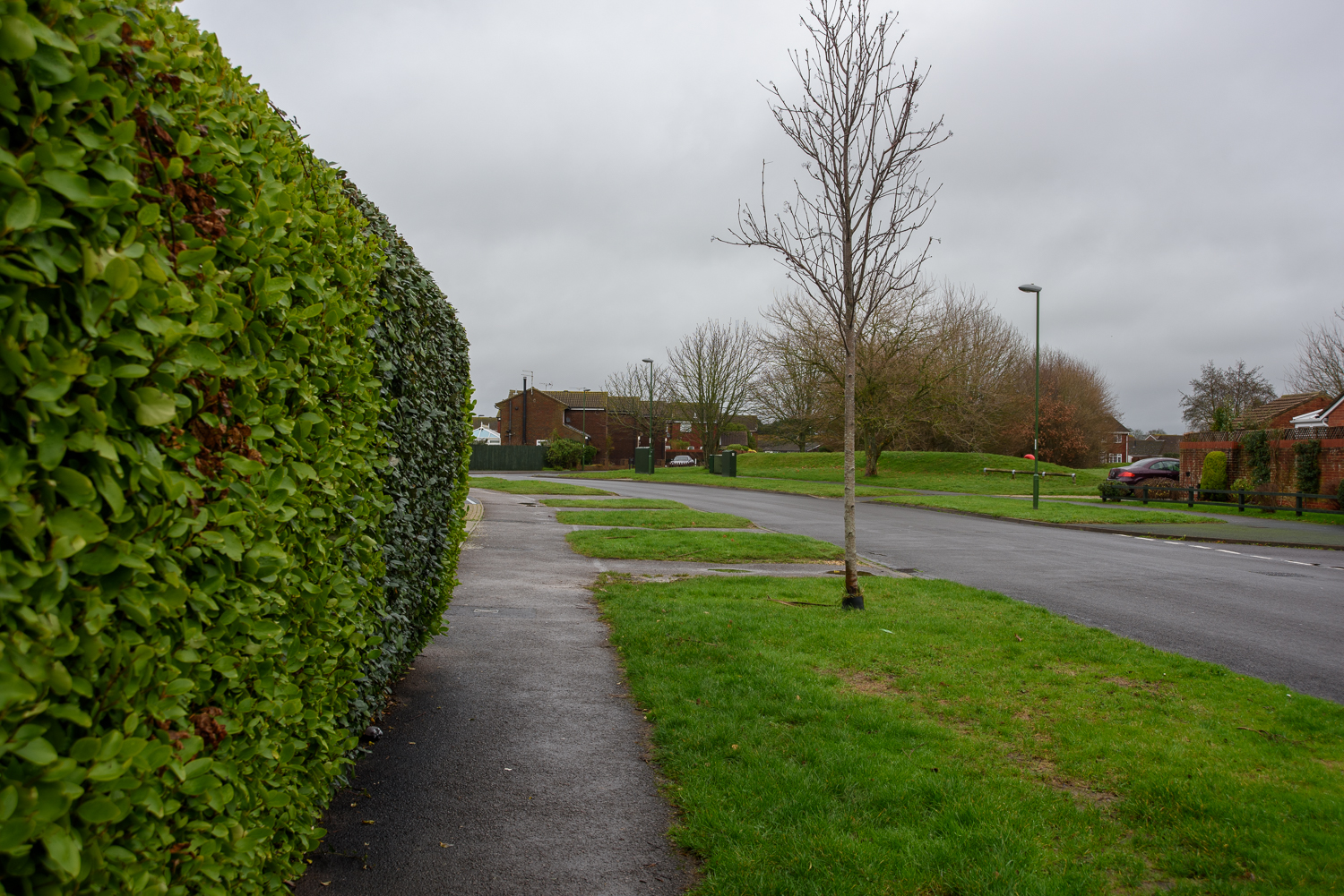
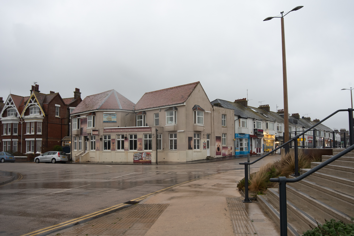
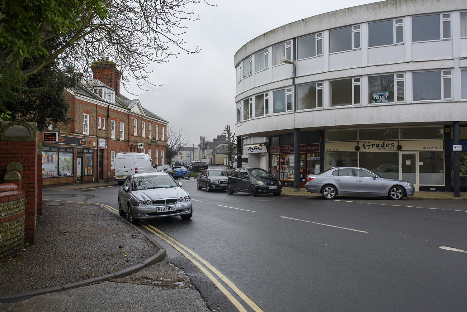
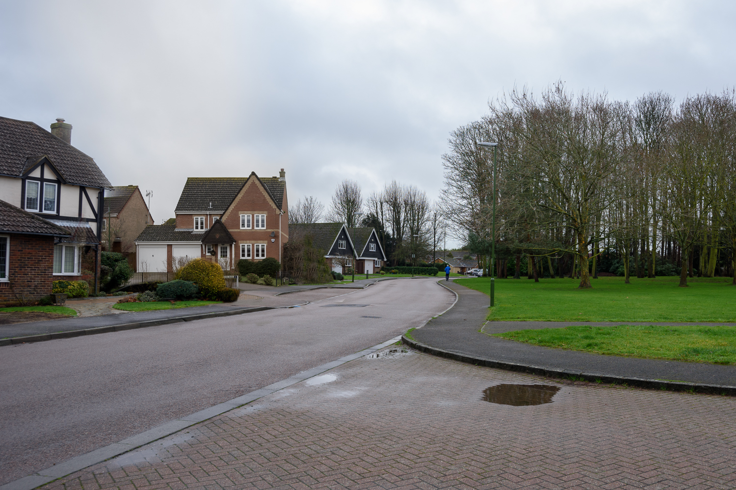
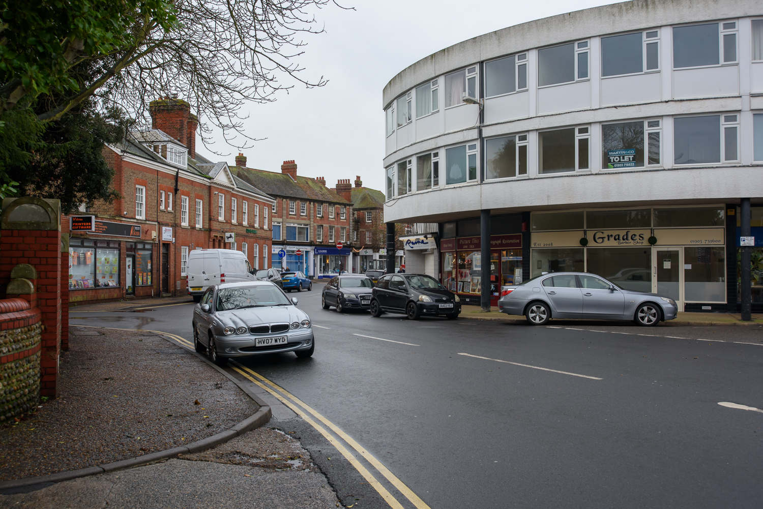
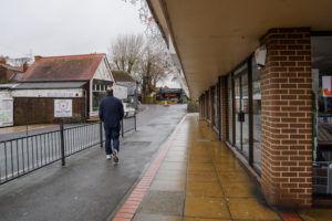
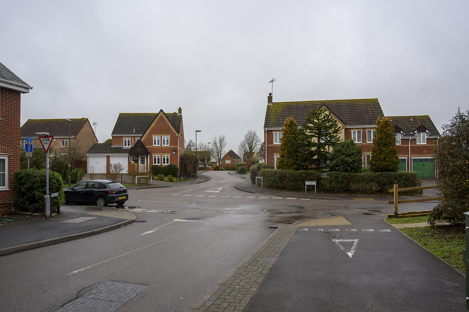
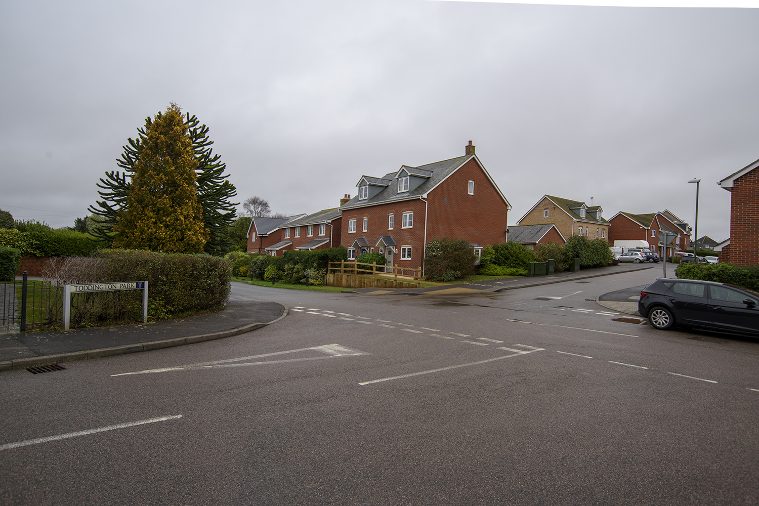
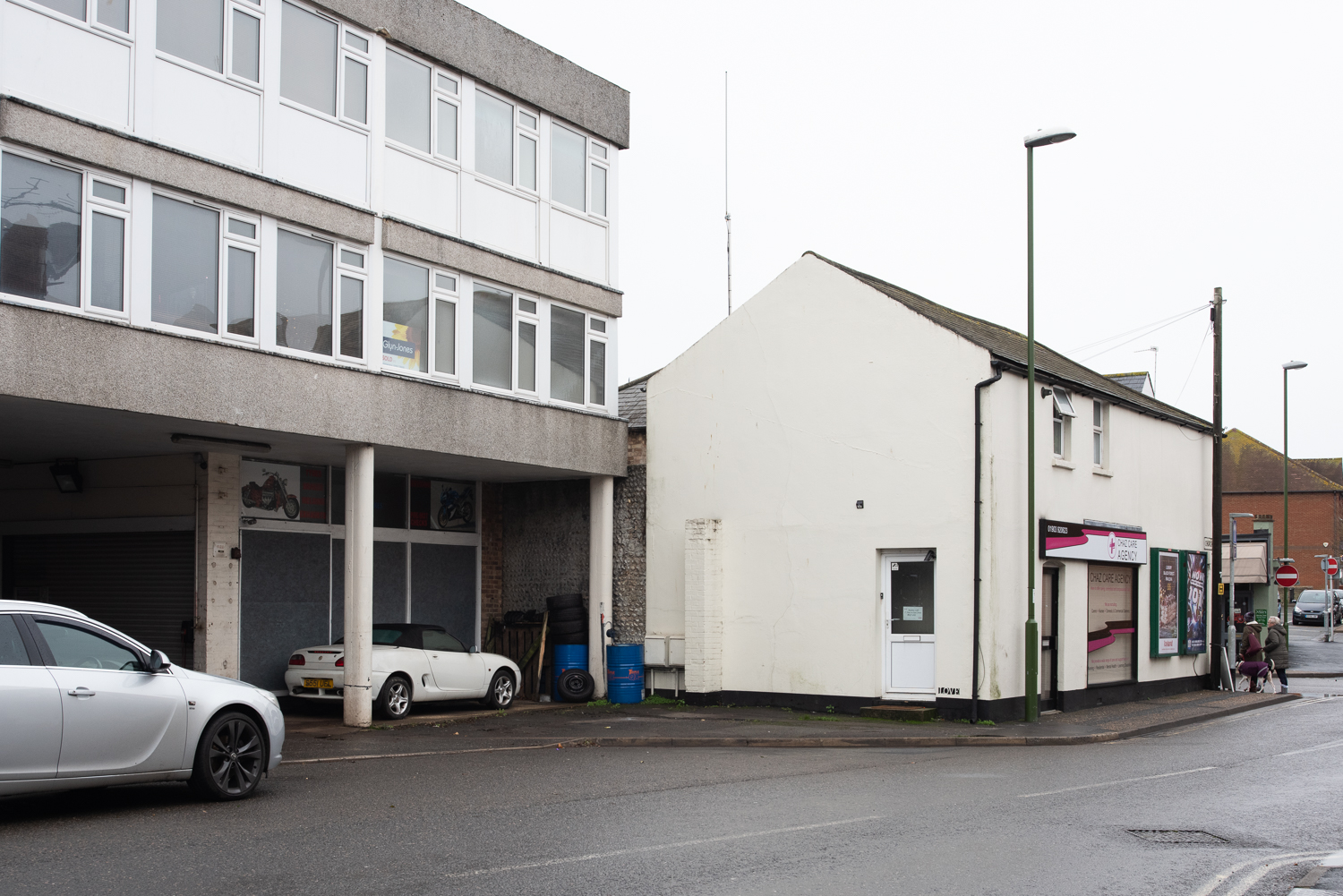
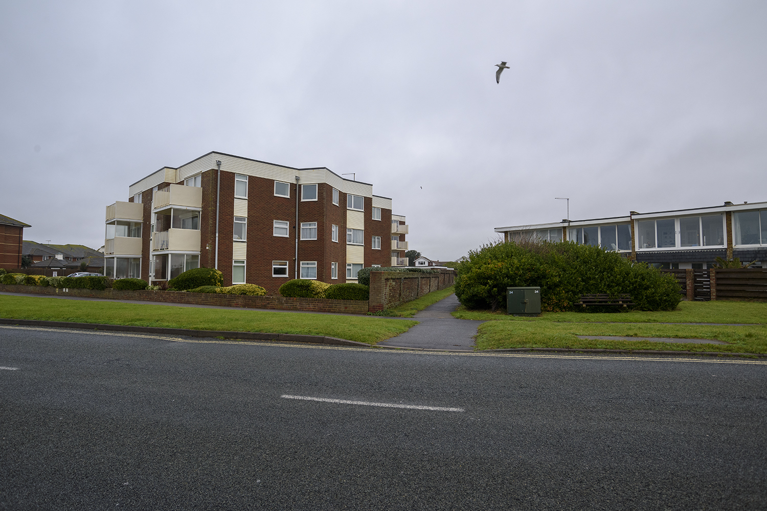
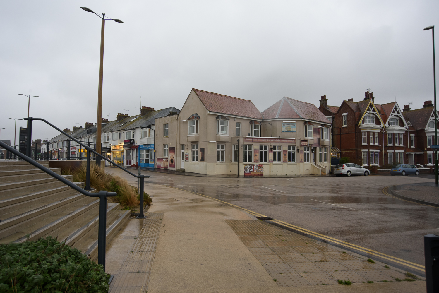
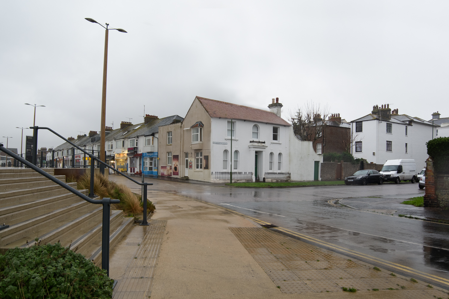
Real Corners Reconstructed is an exercise in what is real and what is not. Focusing on mundane street corners that people pass everyday, I have taken a series of images in and around Littlehampton in West Sussex. I have then used these images to create a second set of composite images, ‘reconstructing’ the corners in order to test whether they are distinguishable from the real ones. They are presented on double sided postcards without title or comment so that the viewer can make up their own mind as to the validity of each image and to which set it belongs. Here on the blog, they are shown randomly.
Planning and Research
In researching for this assignment, I was struck by the fact that Dorothea Lange was given a ‘list’ of scenes to capture and wondered about the ‘truth’ of the images that were published. Her photo ‘Migrant Mother’ is acclaimed more for it’s aesthetic appeal than the story it told. Today’s viewers are bombarded by imagery, do they even notice it’s ‘fake’?
The idea for the street corners was inspired by Chris Dorley-Brown‘s ‘Corners’ series. I like the idea of not knowing what’s around the corner and it reminded me of an image by Guy Bourdin which I came across during the Expressing Your Vision course. I was also intrigued by Sarah Pickering’s Public Order series, where nothing is quite what it seems at first viewing. This led me to the concept of reconstructing real street corners to create new views
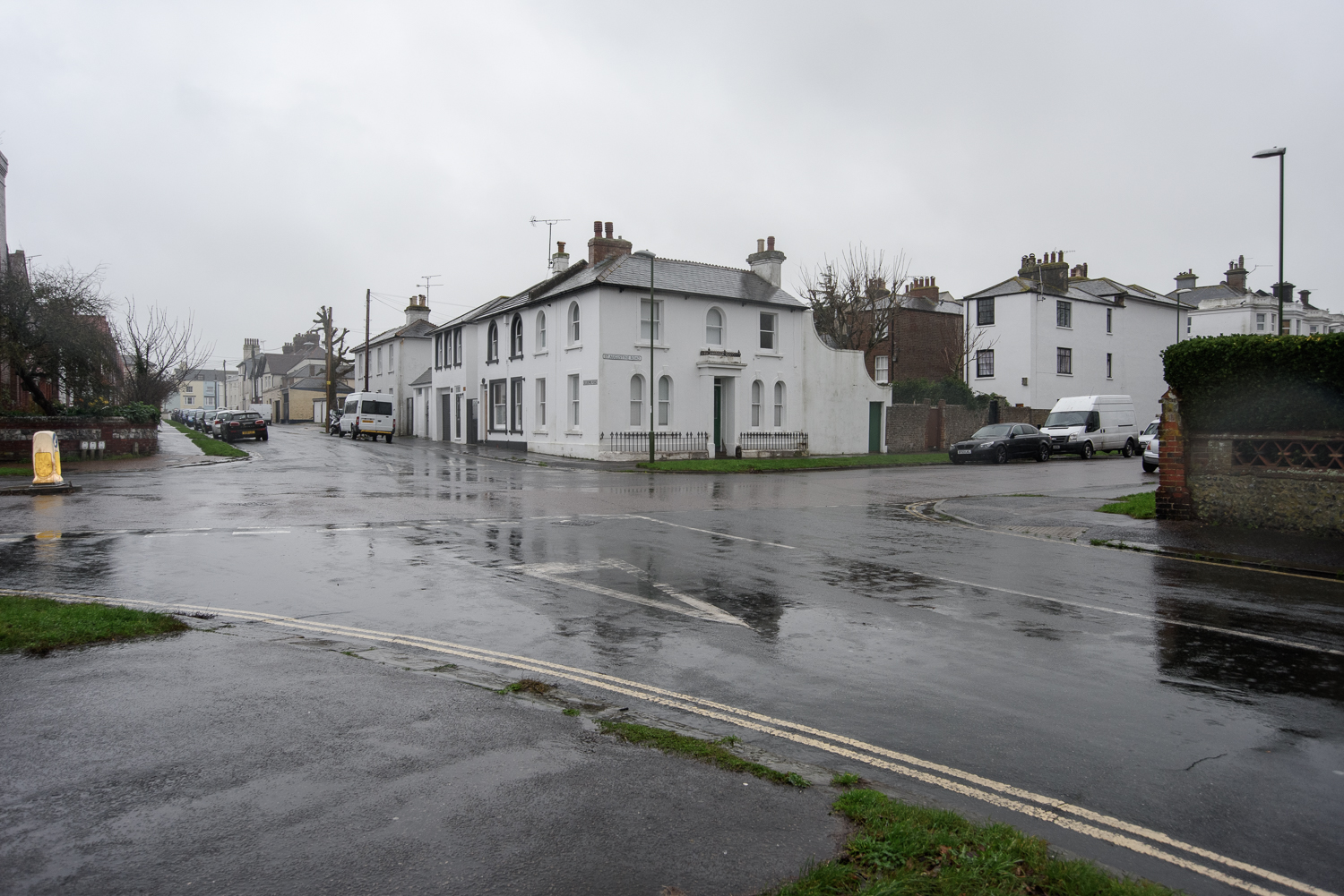
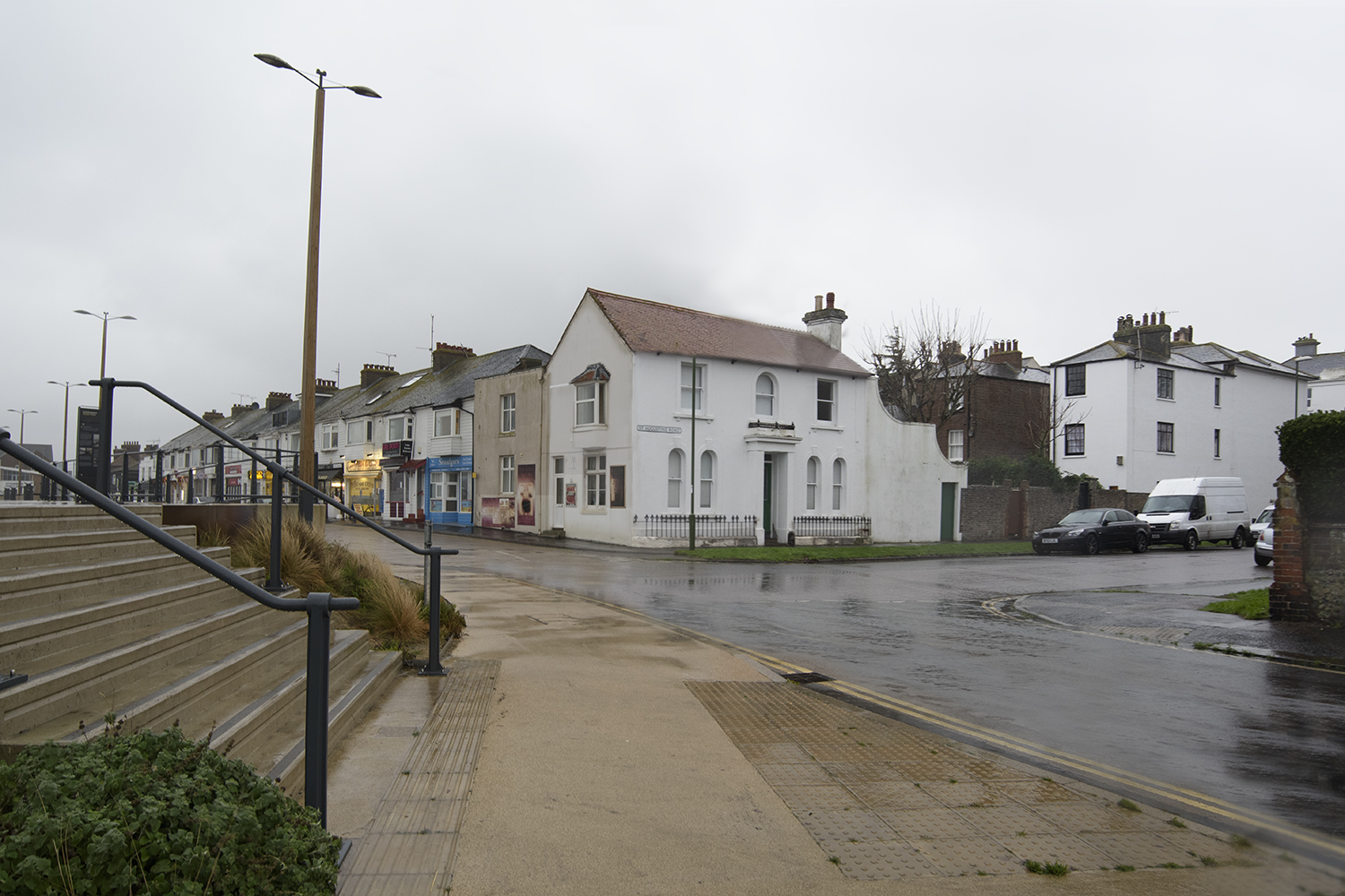
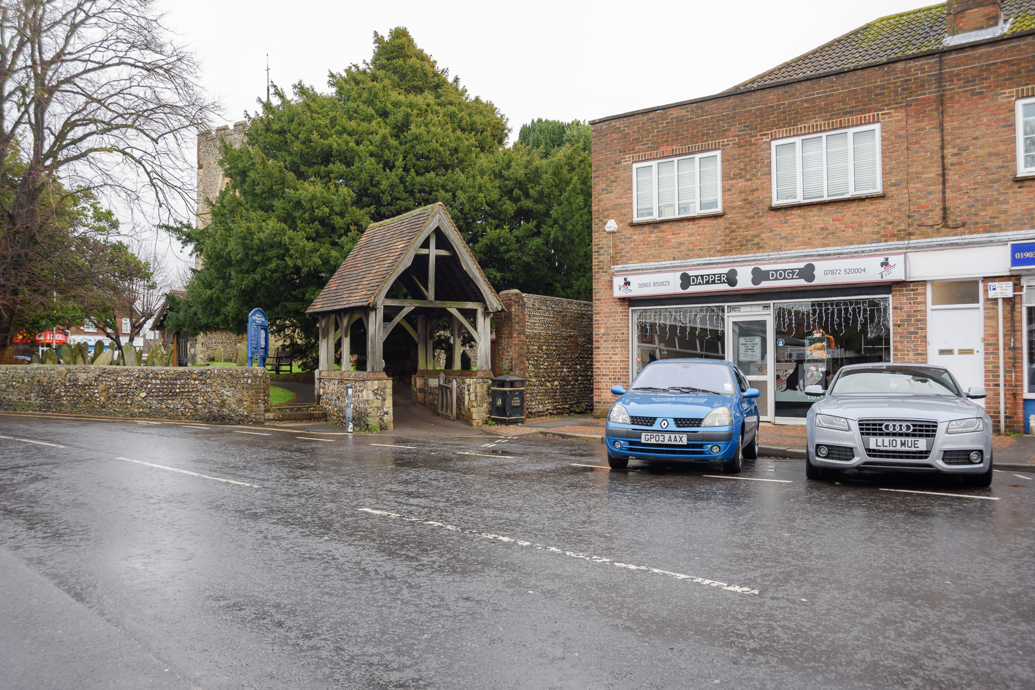
Debra Flynn. Real Corners Reconstructed #1, 2018
Debra Flynn. Real Corners Reconstructed #2, 2018
Debra Flynn. Real Corners Reconstructed #3, 2018
Debra Flynn. Real Corners Reconstructed #4, 2018
Debra Flynn. Real Corners Reconstructed #5, 2018
Debra Flynn. Real Corners Reconstructed #6, 2018
Debra Flynn. Real Corners Reconstructed #7, 2018
Debra Flynn. Real Corners Reconstructed #8, 2018
Debra Flynn. Real Corners Reconstructed #9, 2018
Debra Flynn. Real Corners Reconstructed #10, 2018
Debra Flynn. Real Corners Reconstructed #11, 2018
Debra Flynn. Real Corners Reconstructed #12, 2018
Debra Flynn. Real Corners Reconstructed #13, 2018
Debra Flynn. Real Corners Reconstructed #14, 2018
Approach
There were a number of things which needed to be considered for these images. The corners needed to be shot with the same depth of field (f/8) so that they were easier to match, they also needed to have similar sized buildings or areas that could easily be masked and the angles needed to align. Shooting on days that were grey and overcast meant that the light was flat and defused which meant that shadows and time of day were less important.
Selecting Images that could be used for the composites was quite instinctive and I had an idea when I took them, which they might marry up with. This didn’t always work as getting the perspective right was probably the most difficult thing to get right in photoshop. Below is an example where it just didn’t work.
an example of an image I couldn’t the the perspective right in
to read the Technical Information Sheet click here – (spoiler alert: don’t read this until you’ve made your decision as to which images are real and which are reconstructed)
Reflection
To obtain some feedback on this idea I gave a copy of the prints to my family during a family get together and some of my work colleagues. I was actually surprised and pleased by the level of conversation it generated between the people in the room. Those that knew the area found them a bit ‘freaky’ because even they were getting confused about which were real and which were reconstructed. In the end they were all trying to examine them in detail trying to work it out. No one actually got every set right. I found getting feedback as I was developing the idea very useful and definitely helped me improve my approach. As a result I changed the presentation and amended a couple of the images.
I am very happy with the concept and I think the images work well as a set but I think I might like to introduce a greater variety for the final set. I do feel that I have met my own brief on considering my work, the approach I take and how I convey that to the viewer.
Assessment Criteria
For this assignment, I have demonstrated the following points:
Demonstration of technical and visual skills – Materials, techniques, observational skills, visual awareness, design and compositional skills.
Quality of outcome – Content, application of knowledge, presentation of work in a coherent manner, discernment, conceptualisation of thoughts, communication of ideas.
Demonstration of creativity – Imagination, experimentation, invention.
All images were taken using a Nikon D810 Camera with a Nikkor 18-35mm 1:3.5-4.5 AF D Lens at f/8 to ensure consistency of depth of field. IOS and shutter speed varied depended on exposure, but tried to keep ISO the same and wanted to match images.
All images to were taken handheld at my eye level in order to maintain plain of field for photo merging and were taken on different days in December 2018.
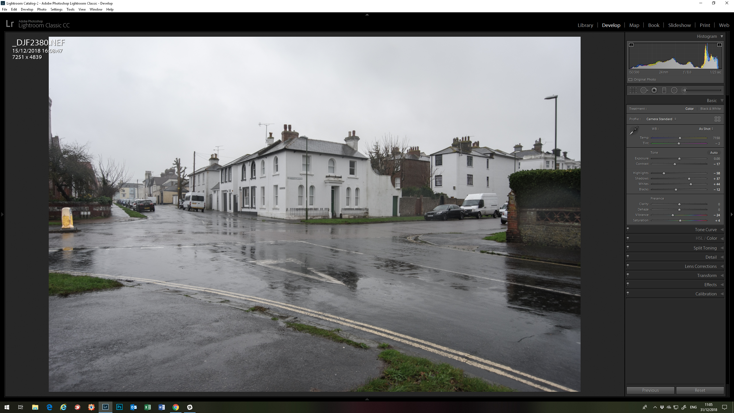
Editing
The images were edited in Adobe Lightroom:
Basic – profile converted to ‘Camera Standard’, highlights and shadows adjusted, vibrance decreased
Detail – Luminosity adjusted
Lens Correction – adjust to Nikkor lens
Tone curve added to some images to brighten them
example of Lighroom editing screen
Image set 1 – The Real Corners
Debra Flynn. Real Corners Reconstructed #1, 2018
Debra Flynn. Real Corners Reconstructed #3, 2018
Debra Flynn. Real Corners Reconstructed #4, 2018
Debra Flynn. Real Corners Reconstructed #8, 2018
Debra Flynn. Real Corners Reconstructed #11, 2018
Debra Flynn. Real Corners Reconstructed #13, 2018
Debra Flynn. Real Corners Reconstructed #14, 2018
Image set 2 – The Reconstructed Corners
All of the images were composited in Photoshop, using layer masks, cloning and tone curves. Details of how each image was constructed are listed below:
Image #2 was created using images #1 and #8 using the left side of. The colour of then end of the building was changed and the roof of the one building extending to create corner building.
Debra Flynn. Real Corners Reconstructed #8, 2018
Debra Flynn. Real Corners Reconstructed #1, 2018
Debra Flynn. Real Corners Reconstructed #2, 2018
Image #5 is a mirror image of image #8, but with all the signs reversed so that the writing is the right way round.
Debra Flynn. Real Corners Reconstructed #5, 2018
Debra Flynn. Real Corners Reconstructed #8, 2018
Image #6 is created from images #14 and #1 – In this image it was the background that was changed leaving the viewer to believe that the corner leads to a different place. In testing this was the image that the majority of viewer got wrong.
Debra Flynn. Real Corners Reconstructed #14, 2018
Debra Flynn. Real Corners Reconstructed #1, 2018
Debra Flynn. Real Corners Reconstructed #6, 2018
Image #7 is created from two images below: One of the houses in the street was replaced with one from another corner.
Debra Flynn. Real Corners Reconstructed #11, 2018
Debra Flynn. Real Corners Reconstructed #7, 2018
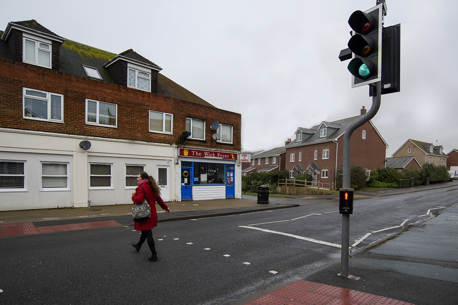
Image # 9 was created from from the two images below. Leaving the traffic lights was deliberate in order to try and bring images together. It also required a bit of perspective warping to try and get the perspective right. I have to confess that the ‘original’ image is also not original as I added the lady crossing the crossing from another image (Oops)
Debra Flynn. Real Corners Reconstructed #13, 2018
Debra Flynn. Real Corners Reconstructed #9, 2018
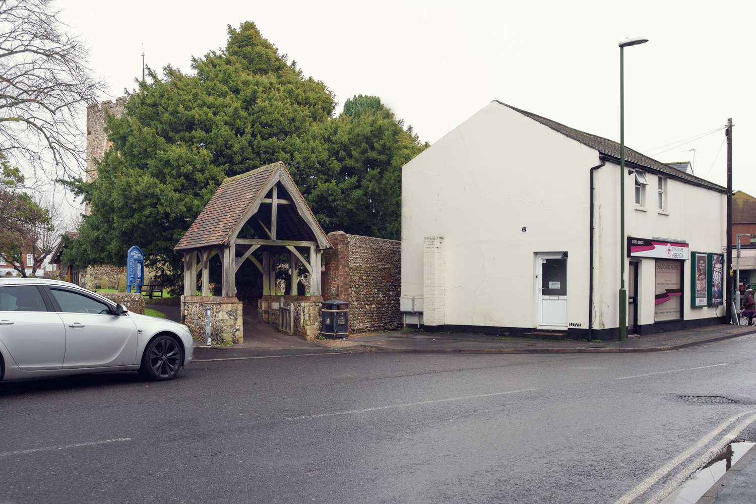
Image #10 – used two images of internal corners. I also retained the car on the left to try and maintain the perspective.
Debra Flynn. Real Corners Reconstructed #3, 2018
Debra Flynn. Real Corners Reconstructed #10, 2018
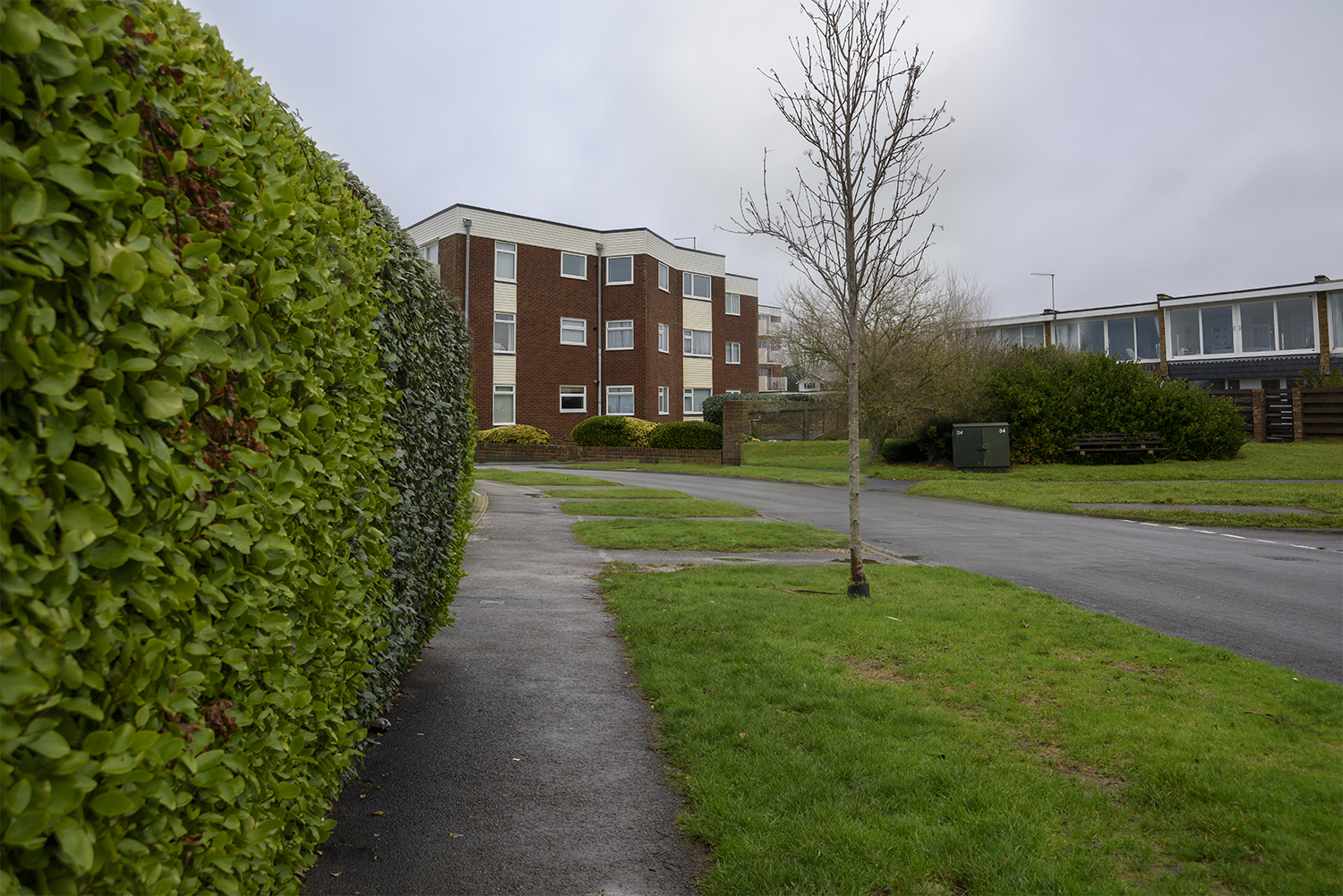
Image #12 – This seafront appartment block sits quite comfortably behind this hedge on the corner. A reflection of a lamp post in one of the windows was removed as somone picked that up during my testing. Otherwise this was one of the ones viewers got wrong.
I have been working on an idea inspired by Chris Dorley-Brown’s Corner’s series. It also reminded me of an image I liked when I was doing EYV, by Guy Bourdin.
“The aim of the assignment is to help you explore the convincing nature of documentary, even though what the viewer thinks they see may not in fact be true.”
brief for assignment from Context & Narrative p 45
I have played with the idea of taking images of corners in the town where I live. The first set will be the real images and second set will be ‘reconstructed’ corners.
These four images are the first I’ve tried to test my idea, the first two images are the real images and the second two are ‘reconstructed’. The third images is an amalgamation of the first two images and the fourth image is a mirror image of the second image, but I have reversed all of the signs so that they still read properly.
The fact that these were taken on dull grey days, means that the light is flat and the sky is almost monotone. This makes it easier to merge the images so I think I will use that idea for the rest of the set.
So having thought about the Yangtze River examples, and the different approaches taken by the various photographers, I like the idea of exploring the town I live in from two points of view. I moved the south coast in my late 20s so don’t have the benefit of school acquired knowledge of the area. I have photographed the seafront quite a lot and used the promenade for “The Square Mile”, the first assignment in my last course but was more interested in how people use the space.
I’ve decided to research the history of the town to see if I can use this as the perspective for the first set of images.
On reflection: I am going to park this idea, as I don’t think it meets the brief, but I do like it, so want to record it in order to remember at a later date
I have been struggling with this piece, trying to think of something inivitive and yet simple. I have used my new job as an excuse not to get on with it! to be fair it has been a bit, but I was really struggling with what story?, how will I find the time.
As a proverbial ‘kick up the bum’ to try and get myself back on track, I decided to have a look at some other students blogs to see how they had approached this. In doing so I came across some tutor feedback to one student which I think became my eureka moment!
“Overall Comments . . . . . . This assignment is essentially about the same subject matter, but shot in two different ways. It is a test of the input of the photographer to produce two viewpoints (often in both senses of the word). To see yourself and your work objectively like this – questioning how you produce work and what this communicates – is a difficult task . . . . .
“Suggested reading/viewing I suggest you look at three projects on the Yangtze river. Comparing different photographers work in this way should illustrate how it is the photographer and (in this case) their differing methodologies, which can produce very different outcomes. This relates directly to this assignment, where the subject matter can be largely similar, yet the results diverse. The Yellow River by Zhang Kechun http://www.zhangkechun.com/the-yellow-river/ Mother River by Yann Wang Preston http://www.yanwangpreston.com/projects/images and Nadav Kander’s The long river https://www.lensculture.com/articles/nadav-kander-yangtze-the-long-river I recommend reading On Being a Photographer: a Practical Guide by David Hurn and Bill Jay, LensWork Publishing, Portland (2007). This book is more about a photographer’s approach, attitude and their mind-set, rather than technicalities (as the title might suggest).”
Looking at the three examples above, I was particularly struck by the work of Nadav Kander but also the difference in the approaches to the three bodies of work. Some subtle and some less so. Kander was definitely struck by the pace of change and how people were feeling because of it, where as Wan Preston’s images were very structured and placed based.
This has given me a much clearer idea of my goal with this set of images now. I found a cheap copy of ‘On being a photographer’ so will have a look at that when it arrives and in the meantime will have a think about my subject for this assignment.