“It is difficult not to read Woodman’s many self-portraits – she produced over five hundred during her short lifetime – as alluding to a troubled state of mind. She committed suicide at the age of twenty-two.” (Bright, 2010, p.25)
Francesca Woodman (1958–81) explored issues of gender representation and the use
of the female body in her work. Self-portraits dominate her substantial portfolio, often
portraying dark psychological states and disturbing scenes. She uses her body, locations and props to evoke a sense of surrealism, mystery and vulnerability. In Space2, for example, her body almost disappears into the blur of movement. This visual strategy recurs in her work and, since her death, has been interpreted as Woodman using photography both to present herself to the camera as an exhibitionist and to help herself disappear.
Look up Francesca Woodman’s images online. What evidence can you find for Bright’s
analysis?
I think that perhaps Bright is reading Woodman’s images with the hindsight of her subsequent death. I think it is natural for us all to explore our existence in time and space. Especially as in this instance she was possibly responding to an assignment brief, whilst studying at university. The title Space2, is actually Space squared.
https://www.tate.org.uk/art/artworks/woodman-space-providence-rhode-island-ar00350
https://www.nationalgalleries.org/art-and-artists/artists/francesca-woodman
http://users.rider.edu/~suler/photopsy/surreal.htm
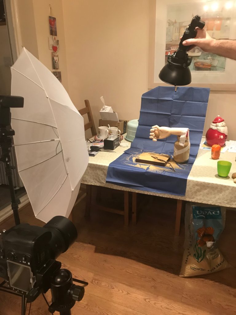
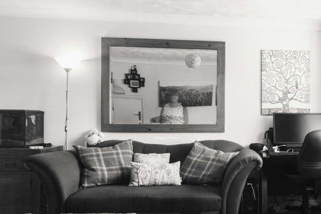
as a human being we can move around and occupy different parts of a space, whilst the space itself can not move. I have tried this out myself using long exposure to put myself in the image but not in the image at the same time. Looking at the idea of only passing through time and leaving traces of oneself.
f/29, ISO 64, 10 sec, 35 mm 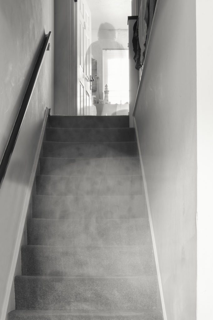
f/25, ISO 100, 15.0 sec,
35 mm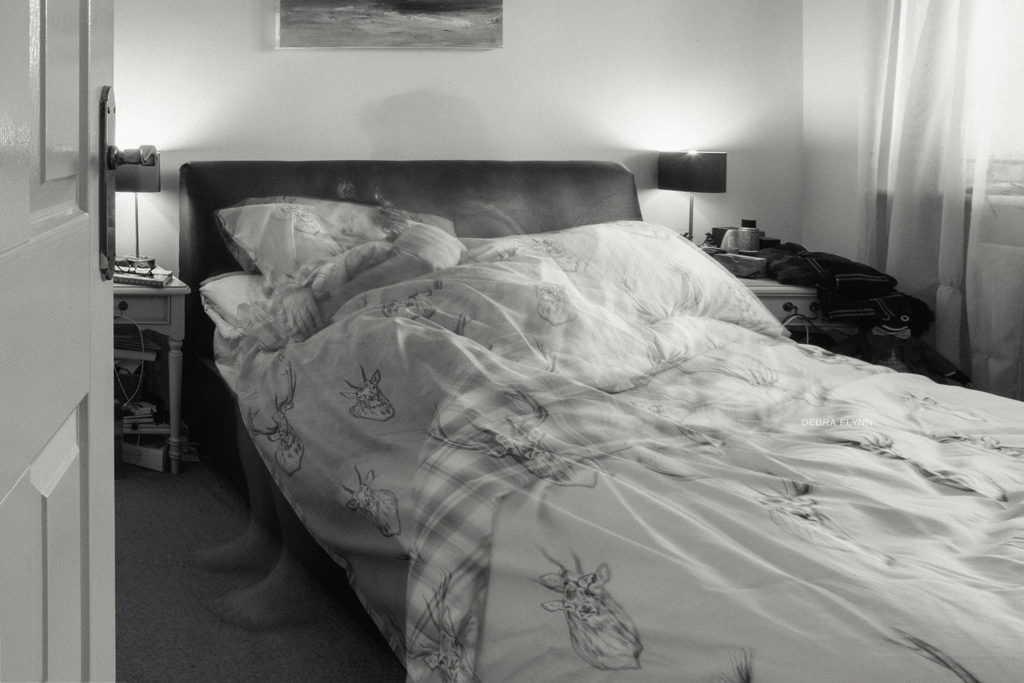
f/29, ISO 100, 13 sec, 28 mm
I like the smoky effect left by moving through the space. I was wearing a white top. In woodman’s images she was in an empty room. I liked the idea of being in and around my home.
Max Klinger – german surrealist painter, Max Klinger (18 February 1857 – 5 July 1920) was a German symbolist painter, sculptor, printmaker, and writer. Klinger was born in Leipzig and studied in Karlsruhe. An admirer of the etchings of Menzel and Goya, he shortly became a skilled and imaginative engraver in his own right.
I have always enjoyed surrealism in my photography, I like the idea of adding symbolism as well.
Brooke Shaden – https://brookeshaden.com/gallery/surrealist self portraits – this is a photographer whose work I have followed for a time. However, I find her quite dark, she follows themes of rebirth and feel a little like Woodman’s work. Personally, I prefer images that are more hopeful and uplifting.