Create at least two sets of photographs telling different versions of the same story. The aim of the assignment is to help you explore the convincing nature of documentary, even though what the viewer thinks they see may not in fact be true. Try to make both sets equally convincing so that it’s impossible to tell which version of the images is ‘true’.
Real Corners Reconstructed
I have understood this brief to be about how I as a photographer consider my work, the approach I take and how I convey that to the viewer.
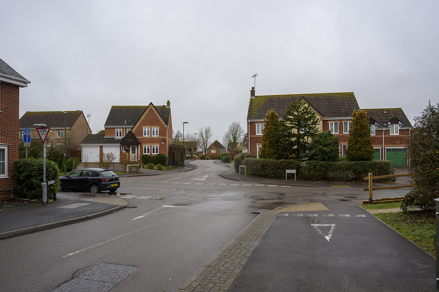
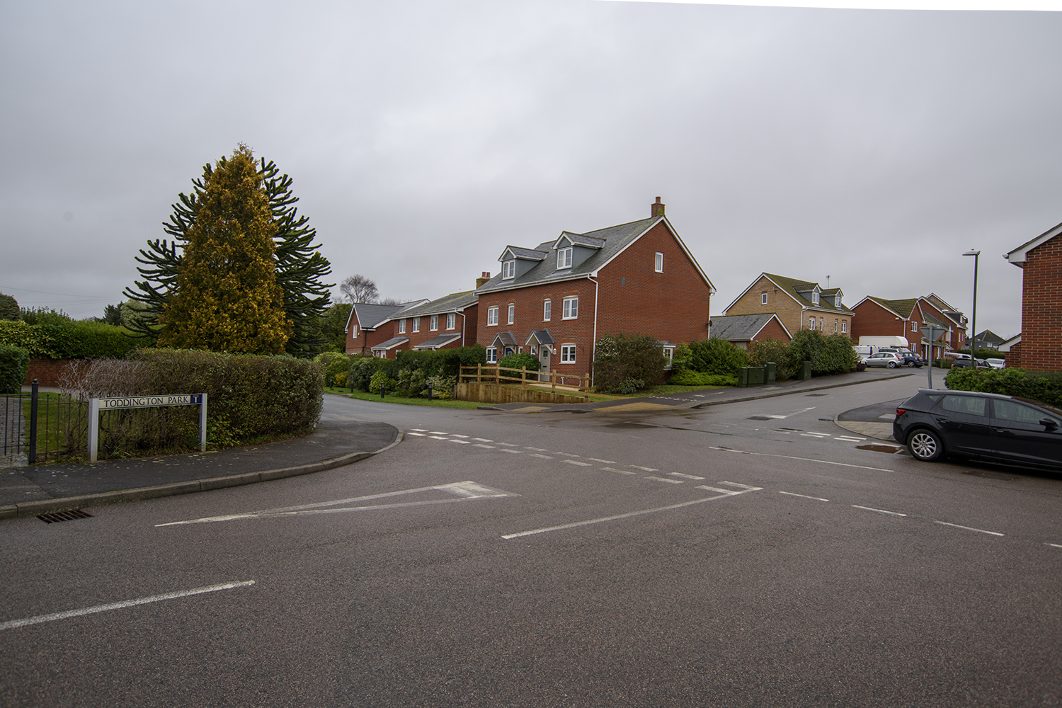
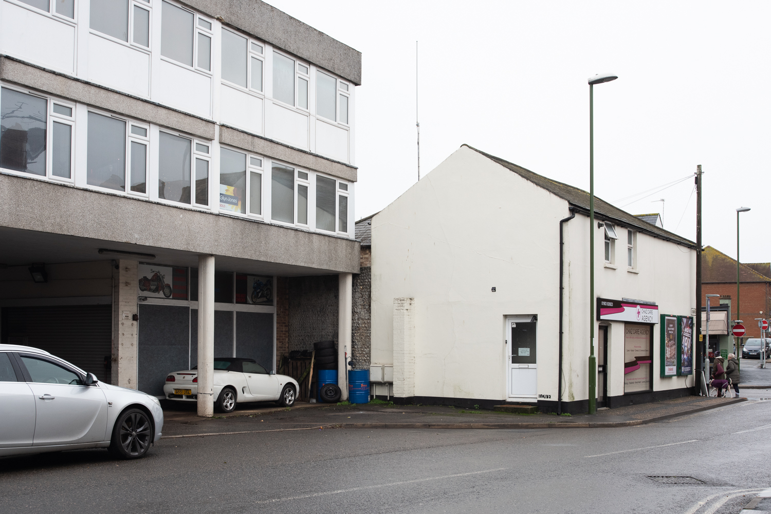
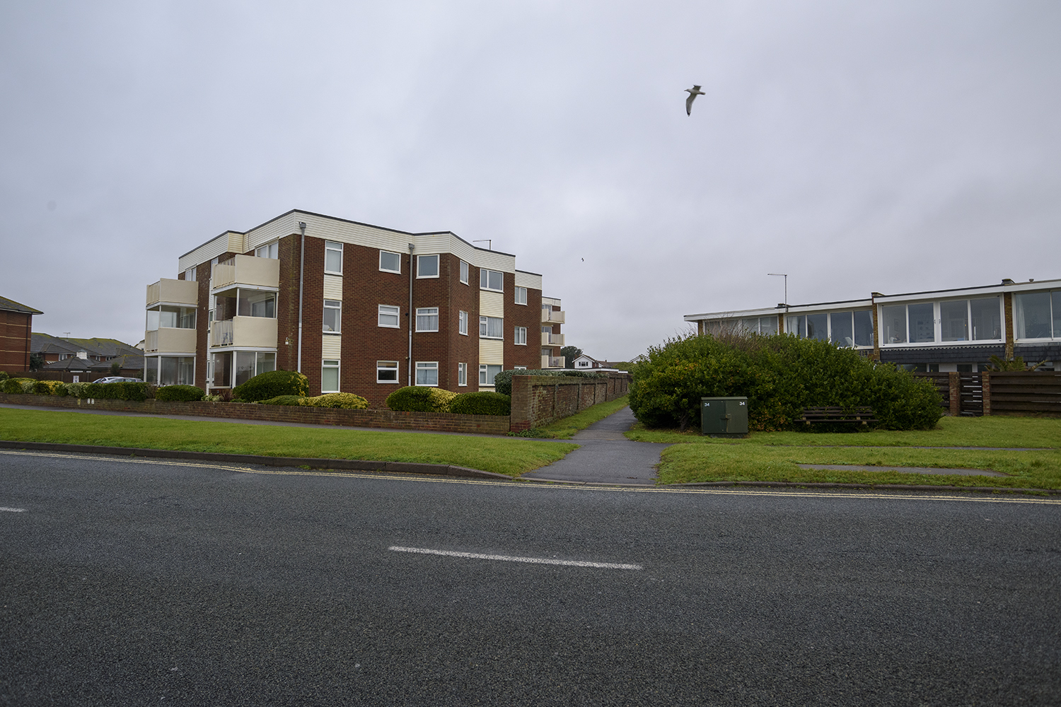
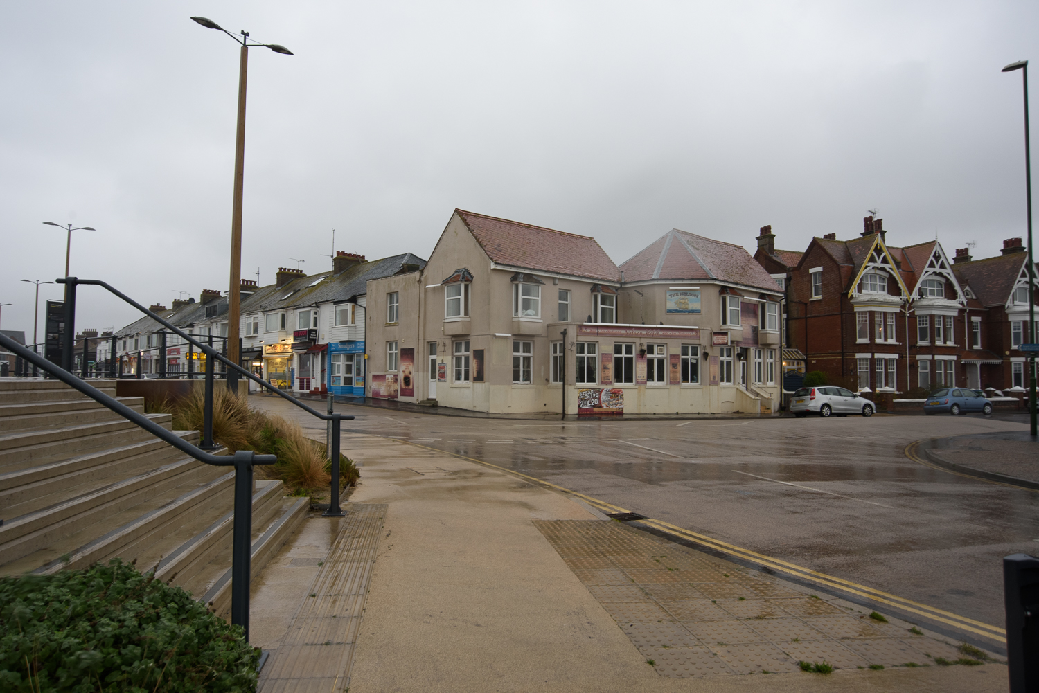
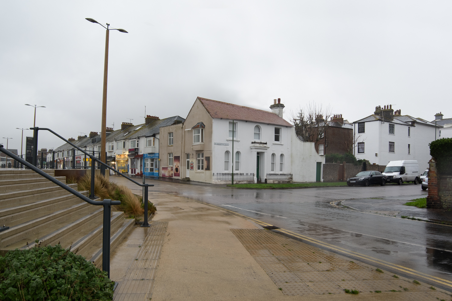
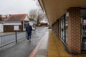
Real Corners Reconstructed is an exercise in what is real and what is not. Focusing on mundane street corners that people pass everyday, I have taken a series of images in and around Littlehampton in West Sussex. I have then used these images to create a second set of composite images, ‘reconstructing’ the corners in order to test whether they are distinguishable from the real ones. They are presented on double sided postcards without title or comment so that the viewer can make up their own mind as to the validity of each image and to which set it belongs. Here on the blog, they are shown randomly.
Planning and Research
In researching for this assignment, I was struck by the fact that Dorothea Lange was given a ‘list’ of scenes to capture and wondered about the ‘truth’ of the images that were published. Her photo ‘Migrant Mother’ is acclaimed more for it’s aesthetic appeal than the story it told. Today’s viewers are bombarded by imagery, do they even notice it’s ‘fake’?
The idea for the street corners was inspired by Chris Dorley-Brown‘s ‘Corners’ series. I like the idea of not knowing what’s around the corner and it reminded me of an image by Guy Bourdin which I came across during the Expressing Your Vision course. I was also intrigued by Sarah Pickering’s Public Order series, where nothing is quite what it seems at first viewing. This led me to the concept of reconstructing real street corners to create new views
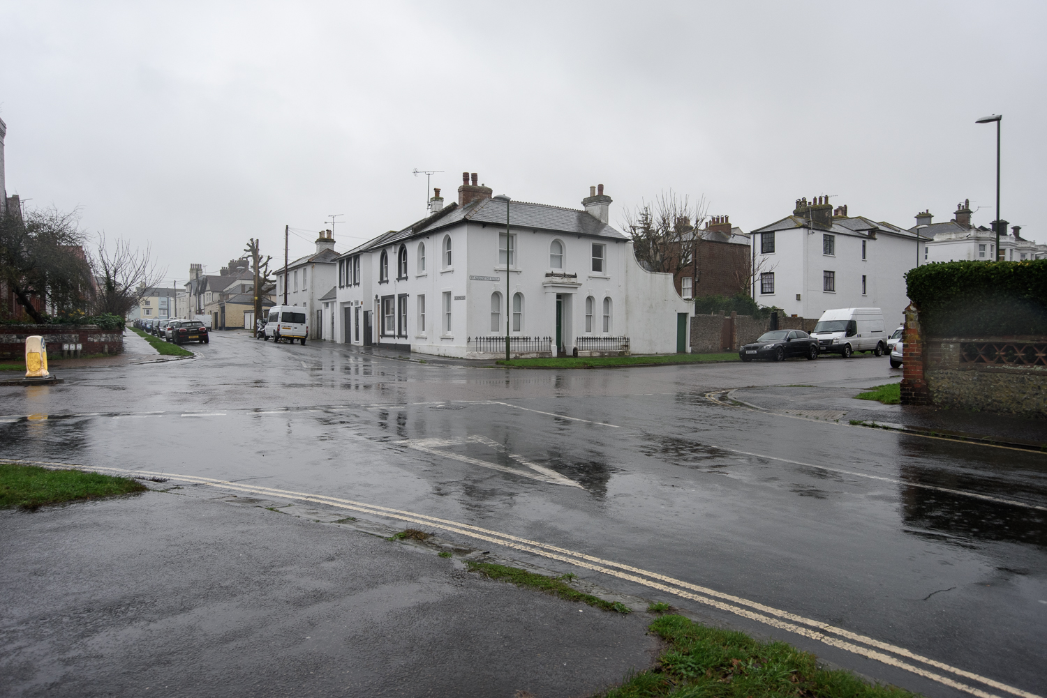
Debra Flynn. Real Corners Reconstructed #1, 2018 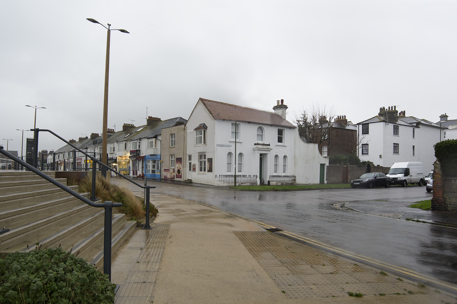
Debra Flynn. Real Corners Reconstructed #2, 2018 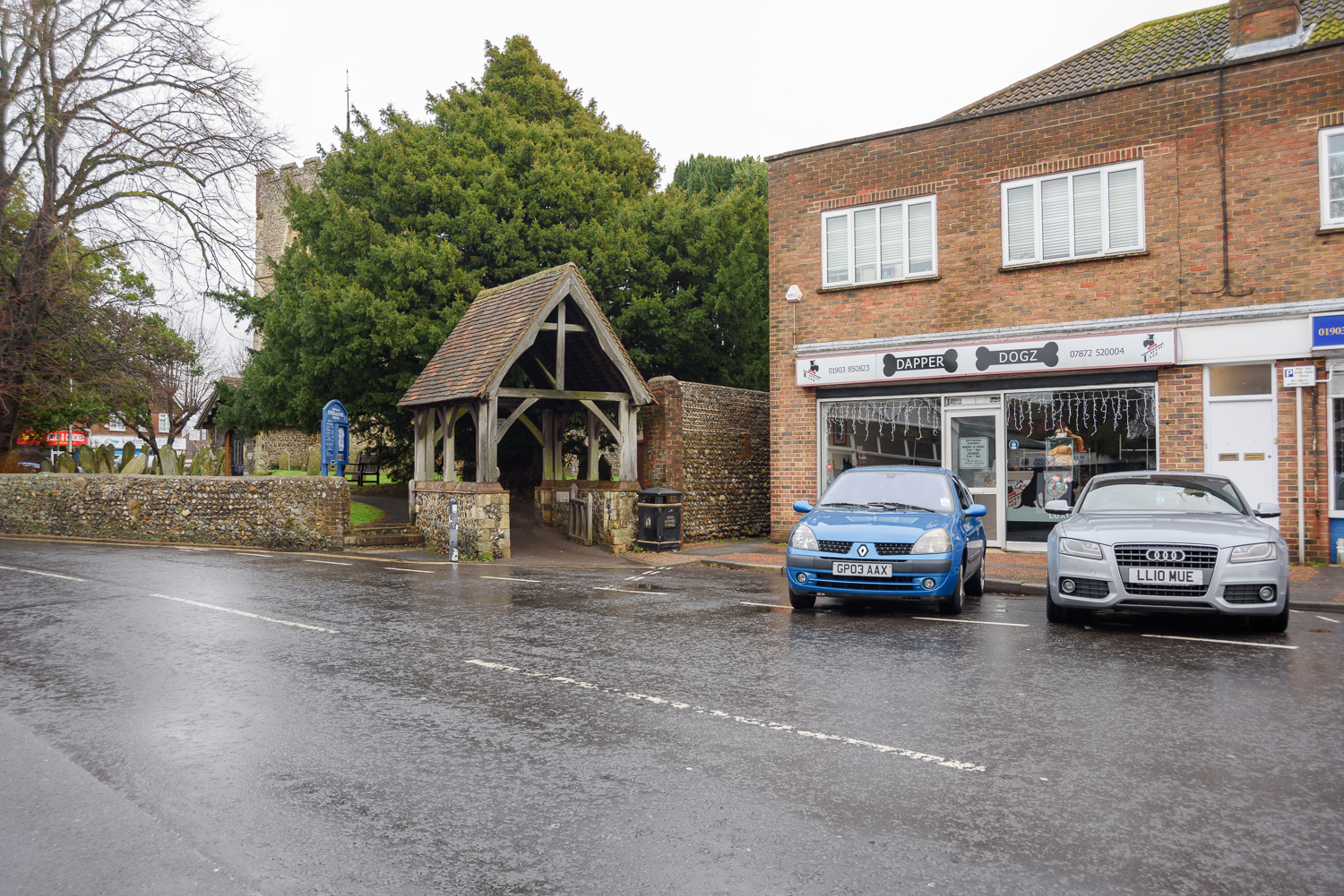
Debra Flynn. Real Corners Reconstructed #3, 2018 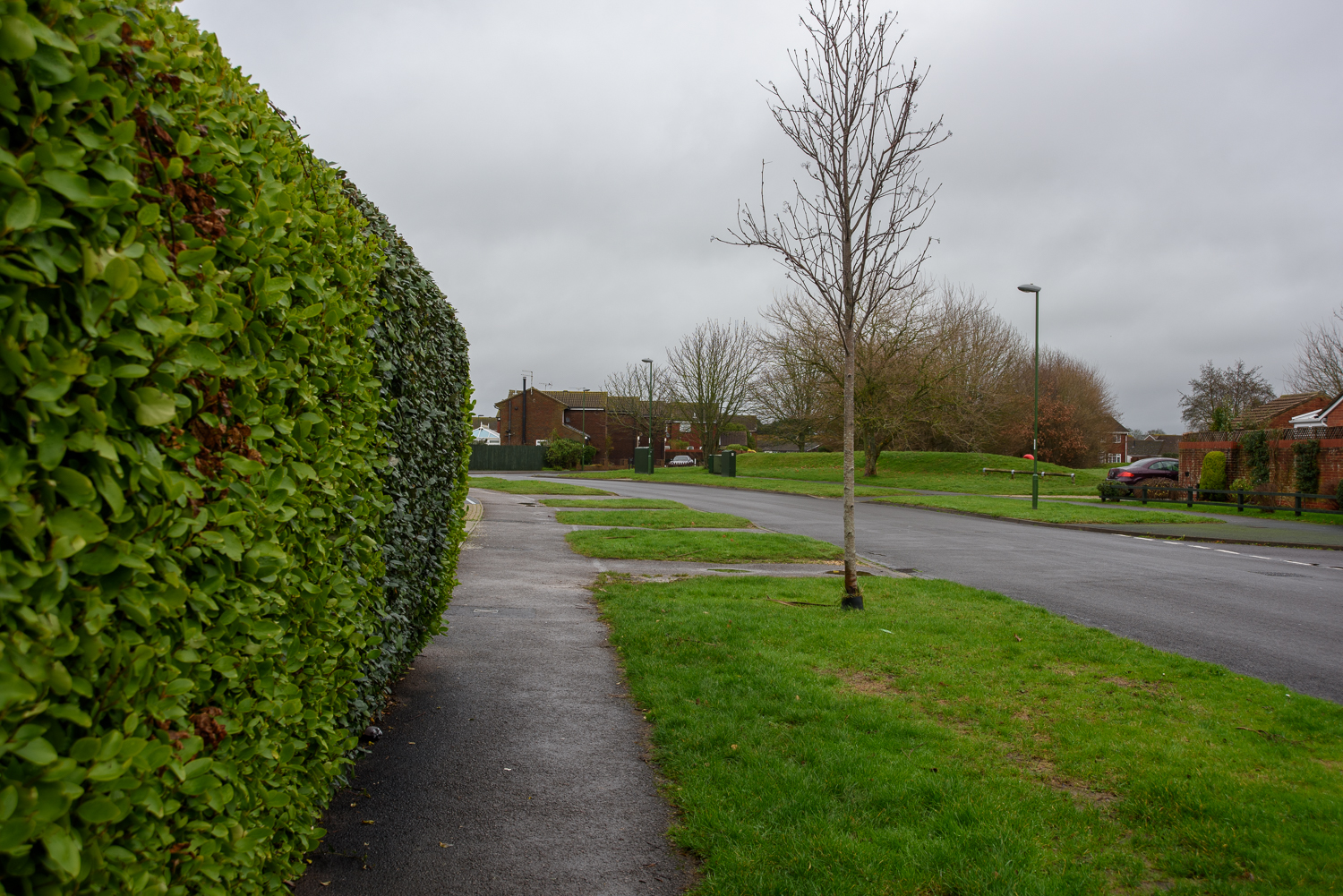
Debra Flynn. Real Corners Reconstructed #4, 2018 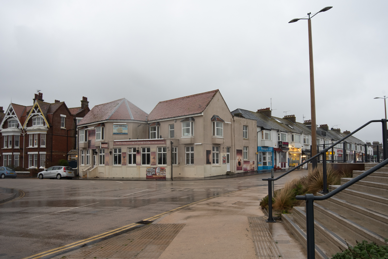
Debra Flynn. Real Corners Reconstructed #5, 2018 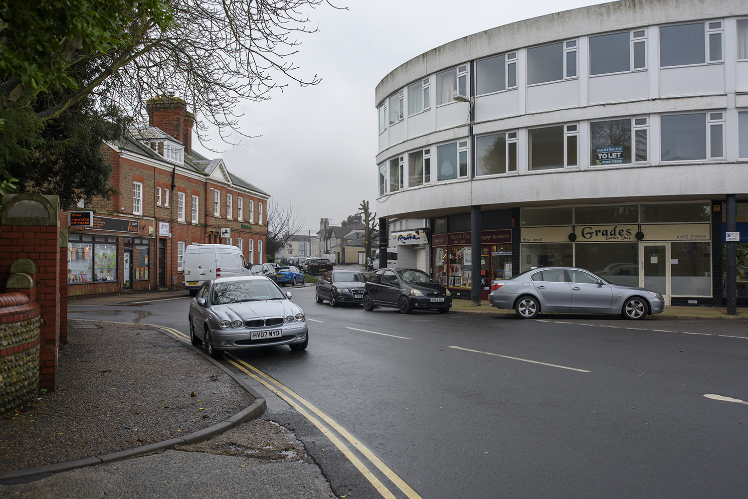
Debra Flynn. Real Corners Reconstructed #6, 2018 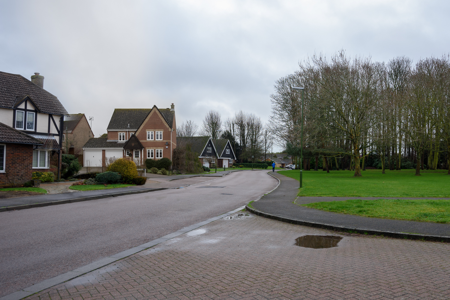
Debra Flynn. Real Corners Reconstructed #7, 2018 
Debra Flynn. Real Corners Reconstructed #8, 2018 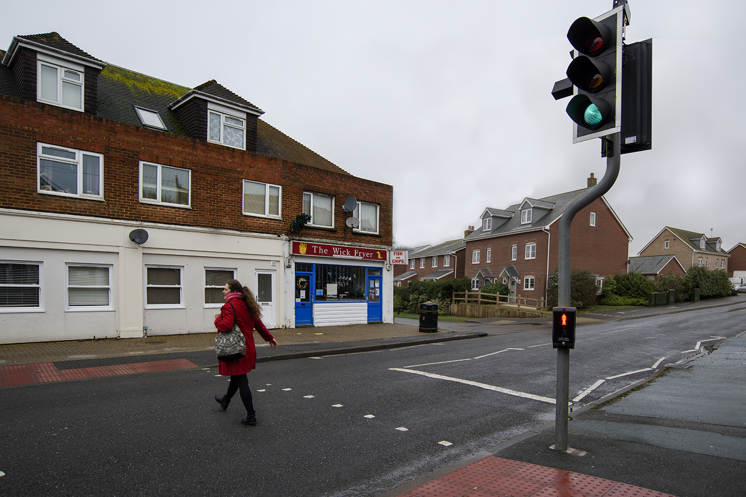
Debra Flynn. Real Corners Reconstructed #9, 2018 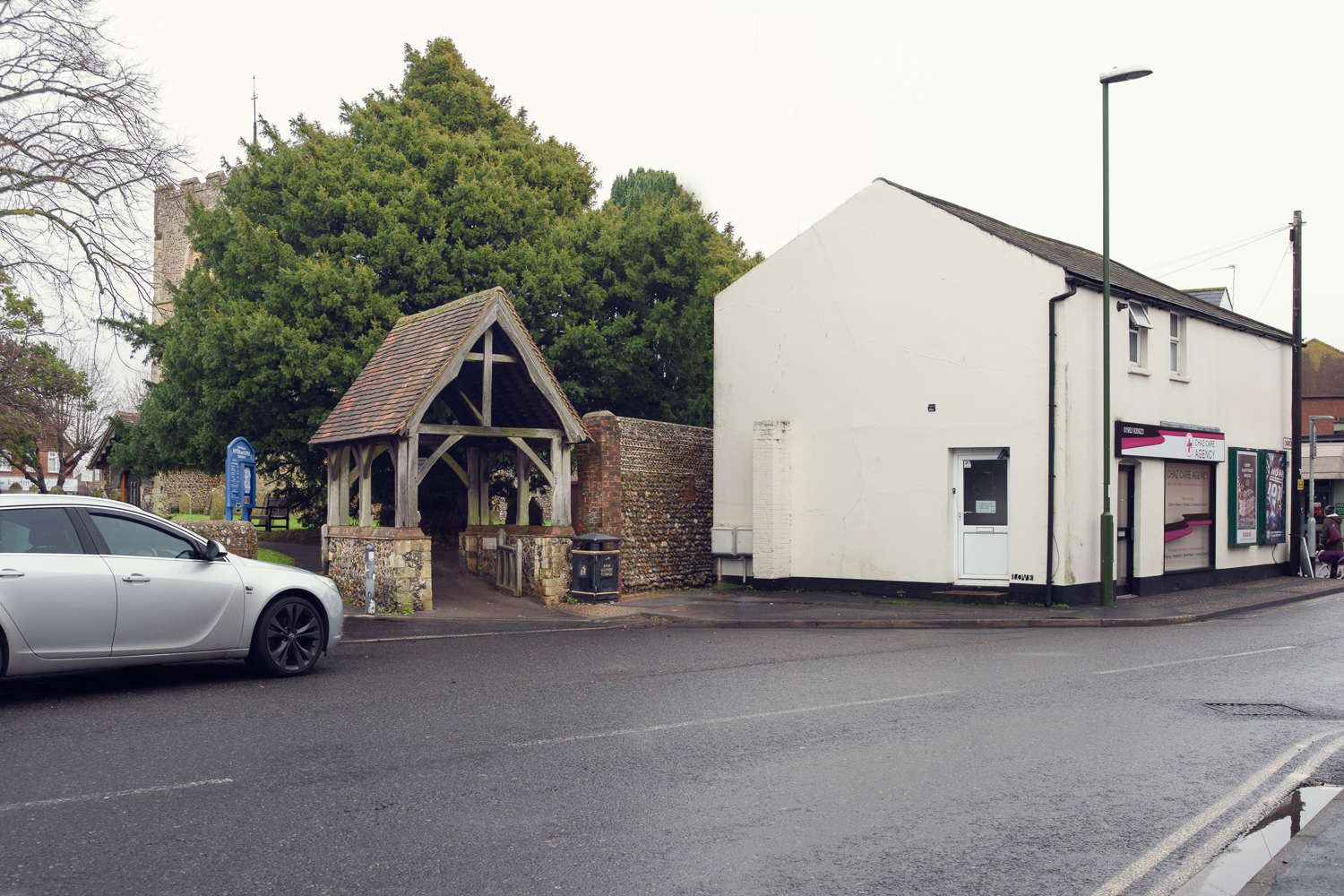
Debra Flynn. Real Corners Reconstructed #10, 2018 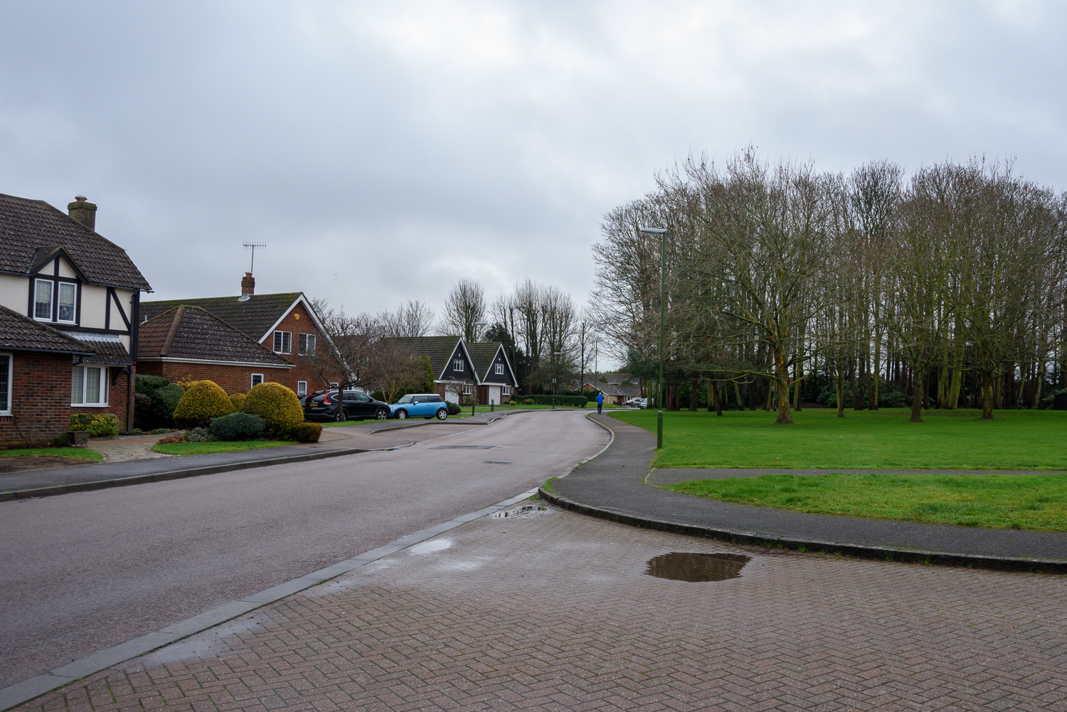
Debra Flynn. Real Corners Reconstructed #11, 2018 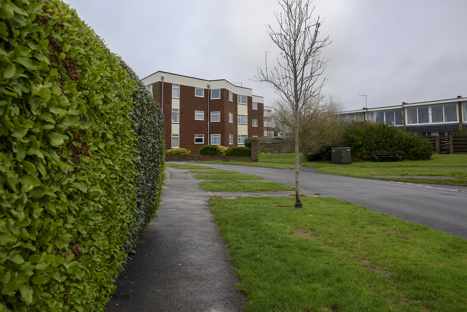
Debra Flynn. Real Corners Reconstructed #12, 2018 
Debra Flynn. Real Corners Reconstructed #13, 2018 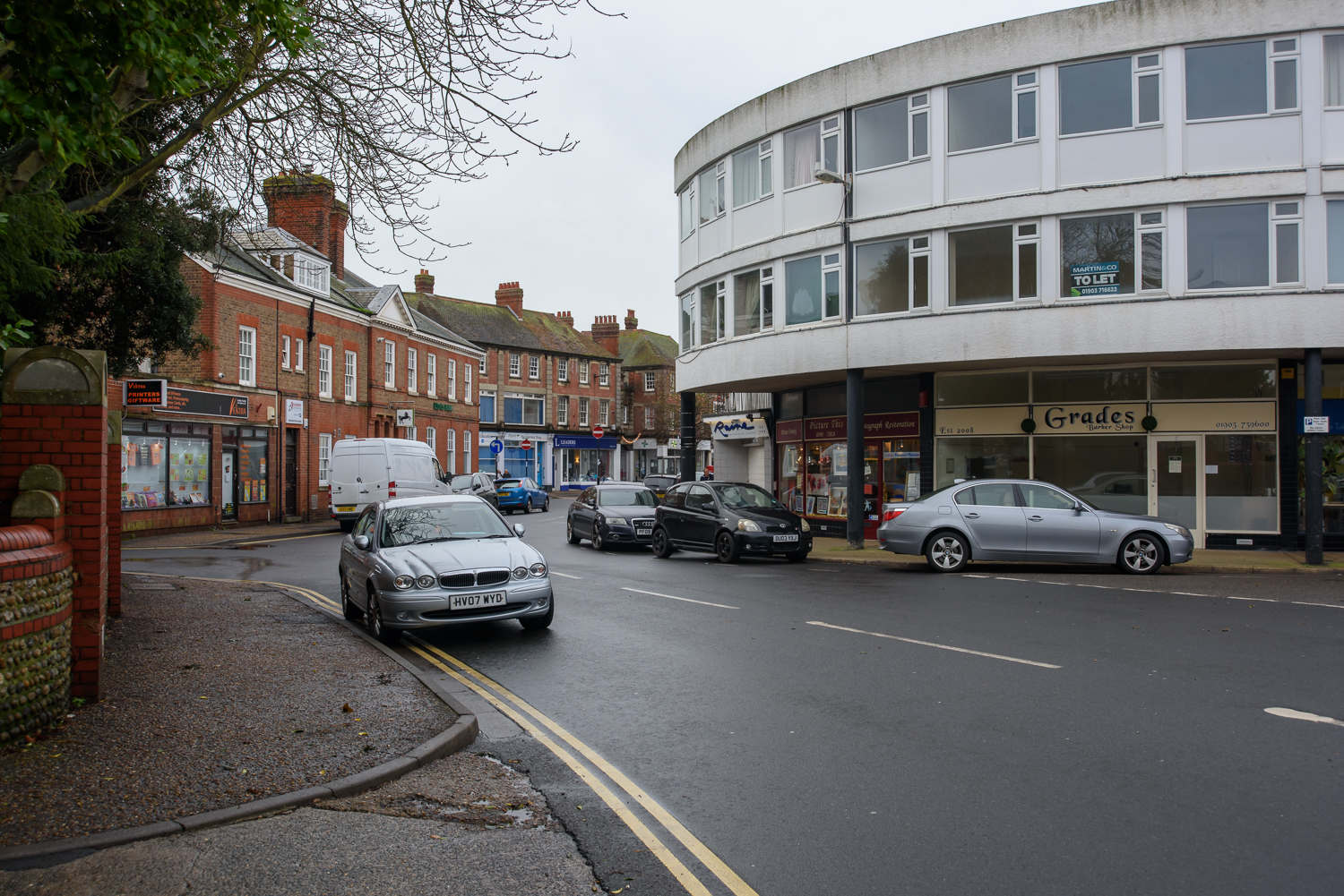
Debra Flynn. Real Corners Reconstructed #14, 2018
Approach
There were a number of things which needed to be considered for these images. The corners needed to be shot with the same depth of field (f/8) so that they were easier to match, they also needed to have similar sized buildings or areas that could easily be masked and the angles needed to align. Shooting on days that were grey and overcast meant that the light was flat and defused which meant that shadows and time of day were less important.
Selecting Images that could be used for the composites was quite instinctive and I had an idea when I took them, which they might marry up with. This didn’t always work as getting the perspective right was probably the most difficult thing to get right in photoshop. Below is an example where it just didn’t work.
Contact sheets can been seen here
to read the Technical Information Sheet click here – (spoiler alert: don’t read this until you’ve made your decision as to which images are real and which are reconstructed)
Reflection
To obtain some feedback on this idea I gave a copy of the prints to my family during a family get together and some of my work colleagues. I was actually surprised and pleased by the level of conversation it generated between the people in the room. Those that knew the area found them a bit ‘freaky’ because even they were getting confused about which were real and which were reconstructed. In the end they were all trying to examine them in detail trying to work it out. No one actually got every set right. I found getting feedback as I was developing the idea very useful and definitely helped me improve my approach. As a result I changed the presentation and amended a couple of the images.
I am very happy with the concept and I think the images work well as a set but I think I might like to introduce a greater variety for the final set. I do feel that I have met my own brief on considering my work, the approach I take and how I convey that to the viewer.
Assessment Criteria
For this assignment, I have demonstrated the following points:
- Demonstration of technical and visual skills – Materials, techniques, observational skills, visual awareness, design and compositional skills.
- Quality of outcome – Content, application of knowledge, presentation of work in a coherent manner, discernment, conceptualisation of thoughts, communication of ideas.
- Demonstration of creativity – Imagination, experimentation, invention.
- Context – Reflection, research, critical thinking.