Briony Campbell – The Dad Project

Briony Campbell‘s Essay written in 2011, 2 years after her father’s death gives a more reflective and object view of her ‘Dad Project’, than her first draft.

The Dad Project by Briony Campbell, Nov 2011 [accessed 01.01.2019  

Briony Campbell – webpage

The project is personal and emotional and although she found it difficult to do at the time, it has become very intrinsic to her and her work.  She has been struck by how sharing her work has helped her grieve but also the impact it has on others.


But after the terminal diagnosis, it served to comfort my mourning. by Briony Campbell

I understand her comment about remembering that new viewers to the work are just experiencing this impact and she must remember this in responding to their reactions.

She says that the work is ‘an ending without an ending’? – I believe she means that because this is personal about her life that it can’t / won’t be packed away in box some place once the project is finished.  It will always be with her and help her to remember her dad.

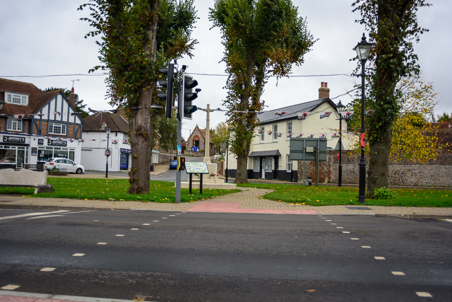
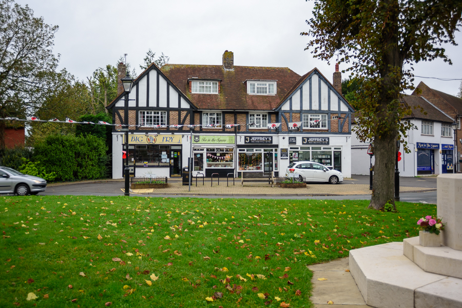
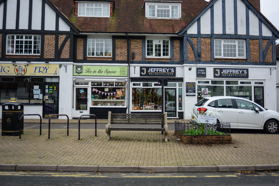
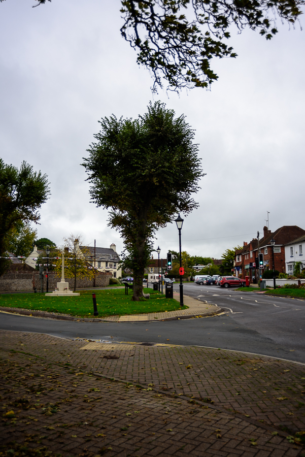
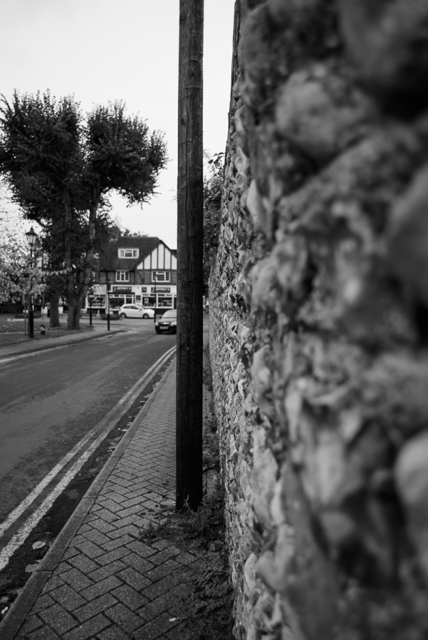
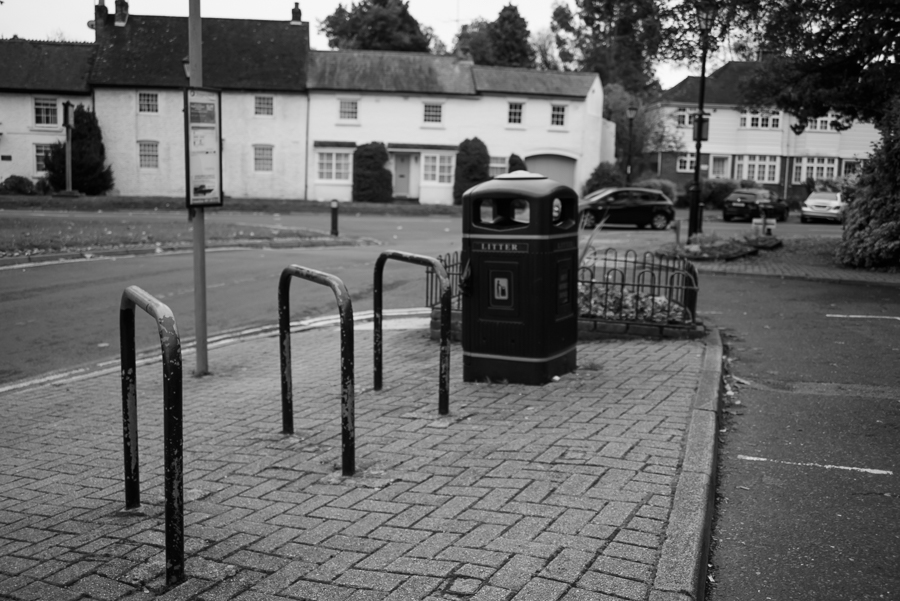
My own reaction was very raw, my own father passed away 4 years ago and this brought back many memories for me.  I would love to have such images of him.  It is a bit of a taboo in our country to photograph the dying process of our loved ones, but it is also a part of life, we photograph birth and weddings, why not death.  Whilst I don’t like having my photo taken, I have come to realise that how important they become when someone is no longer here, but for me, like Briony, I want to capture the real person, not the person in wedding and christening photos.

Another photographer who has used grief for a body of work which I much admire is Kirsty Mitchell.  The work and subsequent book is called Wonderland.  She created this a tribute to her mother who had died from cancer.  It took her six years.  Her website here, tells the story 

Google search for photographer Kirsty Mitchell’s Wonderland

For me both of these stories are personal and thought provoking.  The accompanying narrative in both cases is well written and in some cases quite raw.  I think this helps the viewer really engage, understand and relate to subject matter and set of images.

Assignment 1 – Complete!

Having taken an age to get into this assignment, I actually got quite hooked by the concept in the end.

I am actually quite pleased with the set of images I’ve produced.  They have generated quite a lot of conversation between my family over Christmas and I had a room of about 10 people arguing about which were real and which not.

My biggest reflection comes from the fact that feedback and discussion helped my refine some of the images and think more about how to present them.  This is something I will utilise in future assignments.  I also reflect on how much I enjoy manipulating images and making something new from what is already there.

and finally, I opened the introduction of “on being a photographer’ by David Hurn and Bill Jay and came across this quote from Abraham Maslow:

The purpose of life is to become actually what we are potentially”

I love this quote and it will be my new year’s resolution!

To see Assignment 1 – Two sides of the Story – click here

Assignment 1 – Two sides of the Story – Ideas and Planning (i)

https://www.bjp-online.com/2018/05/dorley-brown-corners/


Sandringham Road & Kingsland Road 15th June 2009
 10:42am – 11:37am, from The Corners © Chris Dorley-Brown

Corners ideas

I have been working on an idea inspired by Chris Dorley-Brown’s Corner’s series.   It also reminded me of an image I liked when I was doing EYV, by Guy Bourdin.  

“The aim of the assignment is to help you explore the convincing nature of documentary, even though what the viewer thinks they see may not in fact be true.”

brief for assignment from Context & Narrative p 45

I have played with the idea of taking images of corners in the town where I live. The first set will be the real images and second set will be ‘reconstructed’ corners.

These four images are the first I’ve tried to test my idea, the first two images are the real images and the second two are ‘reconstructed’.  The third images is an amalgamation of the first two images and the fourth image is a mirror image of the second image, but I have reversed all of the signs so that they still read properly.

The fact that these were taken on dull grey days, means that the light is flat and the sky is almost monotone.  This makes it easier to merge the images so I think I will use that idea for the rest of the set.

Assignment 1 – Two sides of the Story – Ideas and Planning

So having thought about the Yangtze River examples, and the different approaches taken by the various photographers, I like the idea of exploring the town I live in from two points of view.  I moved the south coast in my late 20s so don’t have the benefit of school acquired knowledge of the area.  I have photographed the seafront quite a lot and used the promenade for “The Square Mile”, the first assignment in my last course but was more interested in how people use the space.

I’ve decided to research the history of the town to see if I can use this as the perspective for the first set of images.

A history of Littlehampton: [accessed 14.12.18]   http://www.localhistories.org/littlehampton.html

Old pictures of Littlehampton [accessed 14.12.18]:   https://www.gravelroots.net/history/199.html#here

On reflection: I am going to park this idea, as I don’t think it meets the brief, but I do like it, so want to record it in order to remember at a later date

Assignment 1 – Two sides to the Story – Research

Eureka!

I have been struggling with this piece, trying to think of something inivitive and yet simple.  I have used my new job as an excuse not to get on with it! to be fair it has been a bit, but I was really struggling with what story?, how will I find the time.

As a proverbial ‘kick up the bum’ to try and get myself back on track, I decided to have a look at some other students blogs to see how they had approached this.  In doing so I came across some tutor feedback to one student which I think became my eureka moment!

“Overall Comments
. . . . . . This assignment is essentially about the same subject matter, but shot in two different ways. It is a test of the input of the photographer to produce two viewpoints (often in both senses of the word). To see yourself and your work objectively like this – questioning how you produce work and what this communicates – is a difficult task . . . . .

https://scottishzoecontextandnarrative.wordpress.com/2018/05/11/assignment-1-response-to-tutor/

source: https://scottishzoecontextandnarrative.wordpress.com/2018/05/11/assignment-1-response-to-tutor/ [accessed 14.12.18]

“Suggested reading/viewing
I suggest you look at three projects on the Yangtze river. Comparing different photographers work in this way should illustrate how it is the photographer and (in this case) their differing methodologies, which can produce very different outcomes. This relates directly to this assignment, where the subject matter can be largely similar, yet the results diverse. The Yellow River by Zhang Kechun http://www.zhangkechun.com/the-yellow-river/  Mother River by Yann Wang Preston http://www.yanwangpreston.com/projects/images and Nadav Kander’s The long river https://www.lensculture.com/articles/nadav-kander-yangtze-the-long-river  I recommend reading On Being a Photographer: a Practical Guide by David Hurn and Bill Jay, LensWork Publishing, Portland (2007). This book is more about a photographer’s approach, attitude and their mind-set, rather than technicalities (as the title might suggest).”

Looking at the three examples above, I was particularly struck by the work of Nadav Kander but also the difference in the approaches to the three bodies of work.  Some subtle and some less so.  Kander was definitely struck by the pace of change and how people were feeling because of it, where as Wan Preston’s images were very structured and placed based.

This has given me a much clearer idea of my goal with this set of images now.  I found a cheap copy of ‘On being a photographer’ so will have a look at that when it arrives and in the meantime will have a think about my subject for this assignment.

Project 4 – Exercise

Sarah Pickering – Public Order

Exercise

Look at some more images from this series on the artist’s website.

• How do Pickering’s images make you feel?

• Is Public Order an effective use of documentary or is it misleading?
Make some notes in your learning log.

resources used to complete this exercise:

http://www.sarahpickering.co.uk/Works/Pulic-Order/workpg-01.html [accessed 18.11.2018]

https://www.tate.org.uk/art/art-terms/d/documentary-photography [accessed 18/11/2018

Sarah Pickering, Denton Underground Station, 2003
google search of Sarah Pickering's images

how do these images make me feel?:

Well I think they are a bit unsettling. At first glance they looked ‘not quite right’ but as I looked at the them it is obvious that they are fake.  Then I became interested in looking at the marks on the walls and wondering what scenario was being played out in the exercises being played out there

The images work well together and you get a real sense of the story, but individually I don’t think they say much.  

Is Public Order an effective use of documentary or is it misleading?:

The Tate website describes ‘Documentary Photography as: 

“Documentary photography is a style of photography that provides a straightforward and accurate representation of people, places, objects and events, and is often used in reportage”

At first I wasn’t sure this is documentary photography, but I suppose that if you take the images as their reality and not the set they are portraying then it could be.  with no action actually taking place, you are left to imagine what might happen here and therefore, I think it’s a bit misleading

Paul Seawright – Sectarian Murder

Research point

Look online at Paul Seawright’s work, Sectarian Murders:

  • How does this work challenge the boundaries between documentary and art? Listen to Paul Seawright talk about his work at: http://vimeo.com/76940827 [accessed24/02/14]
  • What is the core of his argument? Do you agree with him?
  • If we define a piece of documentary photography as art, does this change its meaning?

Video accessed 27.10.2018

Seawright describes himself as a  photographic artist and is talking about his images as art rather than journalistic.  He describes a balance between it being too explicit and leaving some room for the viewer to access the meaning.  

He is wanting his viewer to take time to look at the images and learn more from them and their context in taking that time.  He compares this to journalisic images which he says need to give up their explicit meaning quickly, so that the viewer can keep turning the page.  

In both Seawright’s sets of Sectarian Murders (Above) and Hidden (below), he hints at previous aggression and conflict, by showing what is left in the places where it happened.  That coupled with the factual text under the images allows the view to look around his images as he describes in the video.

All of images in Sectarian Murders are complex and you see different things each time you look.  However, they are much more than just a documentary images, there is an artistic quality to the composition.  It appears that he has tried to give a feel of area and from a person’s point of view.

I think I do agree that presenting documentary photography as art it does change the meaning.  Seawright’s images definitely take on the ‘aftermath’ aproach showing us the place where something HAS happened.  The viewer has to react to the context and or narrative that goes alongside the image.  It makes you look for the meaning in the photo

Had these images just been shown in the media, they would have been looked over quickly.  I kind or relate it to the annual poppy festival, it’s a way reconnecting people with things that have happened so that they don’t happen again. 

Palestinian Protester

Captured on October 22 by Mustafa Hassouna of Turkey's Anadolu Agency (Getty Images)

This image just came up in my facebook feed: it was taken just a few days ago by a photojournalist in Gaza, Palestine.  I think this demonstrates beautifully the distinction between photojournalism and art.

The image went viral on social media, such as twitter because of is likeness to a famous painting by Delacroix’s, Liberty Leading the People.

Eugene Delacroix’s Liberty Leading the People

The first article I read about this focused more on the asethics of the image and likeness to the artwork than the real story and context in which this image was taken and that shocked me!

But having researched more, it seems that the argument about art versus reality is allowing other writers to push forward the realities of this very real modern day struggle.

Another article by the Independent argues that we should not be romanticising about this and gives a more balanced report.

The Aljazeera News told how Laleh Khalili, a SOAS University professor person, who posted the image on twitter also linked it to Delcroix’s painting generating agreement from other users and ‘creating the narrative’.

google search for Palestinian Protesters, showing less iconic images, which over more context and reality

Like Dorothea Lange’s migrant mother, the man in the image, Aed Abu Amro, may not personally benefit from this image, but he may indirectly bring the situation to a wider audience.

As it was reported that this idea of ‘liberty’ has been floated before in Gaza, one one wonders if like Lange, the photographer was sent out with list of images to get.  After all it is quite clear from the google search that many people carry flags whilst they are protesting!

Project 3 Exercise

Exercise
Find a street that particularly interests you – it may be local or further afield. Shoot 30 colour images and 30 black and white images in a street photography style.

In your learning log, comment on the differences between the two formats.
What difference does colour make? Which set do you prefer and why?

I found this a very interesting exercise.  I like black and white photos, but usually just convert them from colour.  So actually taking them in black and white gave it a new perspective.

In order to take photos in black and white I had to learn how to set my camera to Monochrome in the shooting menu and then because I use a DSLR,  I had to use the live view on the screen rather than the viewfinder, which obviously doesn’t change.

I chose this village street, because it had a number of different elements that I thought might be interesting. Ultimately though, the time of day and the lighting didn’t add much value to the images.

I decided to take the colour photos first and then take black and white ones, as I didn’t want to mix them up.  This turned out to be a good plan because as I had taken them in RAW, Lightroom subsequently converted them all back to colour when I downloaded them.

For the purposes of this exercise, jpgs would have probably been sufficient.

As it was a very ‘bland’ day, lighting and weather wise , the colour images are only enhanced where there are blocks of green or dashes of colour to lift them, but they do give a feel of the time of year and almost deserted streets.

The black and white images however, don’t offer the same information about time of year.  They could have been taken at any time.  I also found that they are much more structured and detailed.  There are not some many images of the trees and flowers and more of buildings and items where there is a greater contrast between the elements of the image.


I’m not sure I really have a favourite set of these images. They both do different things.  I think on balance I prefer the colour ones here.  Only because you get a better sense of time of year.

Lewis Hine

One of the first things I learned about Lewis Hine, is that he took a photo I have known of many years!   One of the GPs I used to work for had this image on his wall.


Famous image of workers on the Empire State Building by Lewis Hine

I think it demonstrates how this image is now considered for it’s aesthetics rather than any social issues that Hine may or may not have been trying to highlight at the time.


google search for images by Lewis Hine

https://www.youtube.com/watch?v=pOIvdhmMaOEhttps://www.youtube.com/watch?v=uU_4aJpEl34

www.bbc.co.uk/news/av/magazine-17673213/lewis-hine-the-child-labour-photos-that-led-to-change

www.bbc.co.uk/news/av/magazine-17673213/lewis-hine-the-child-labour-photos-that-led-to-change