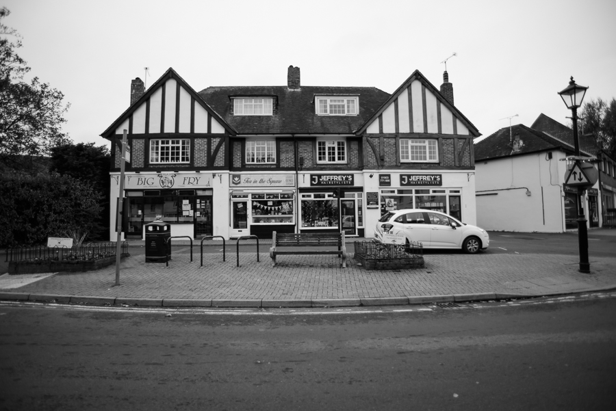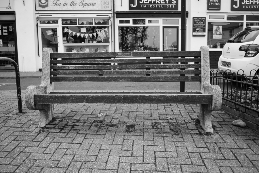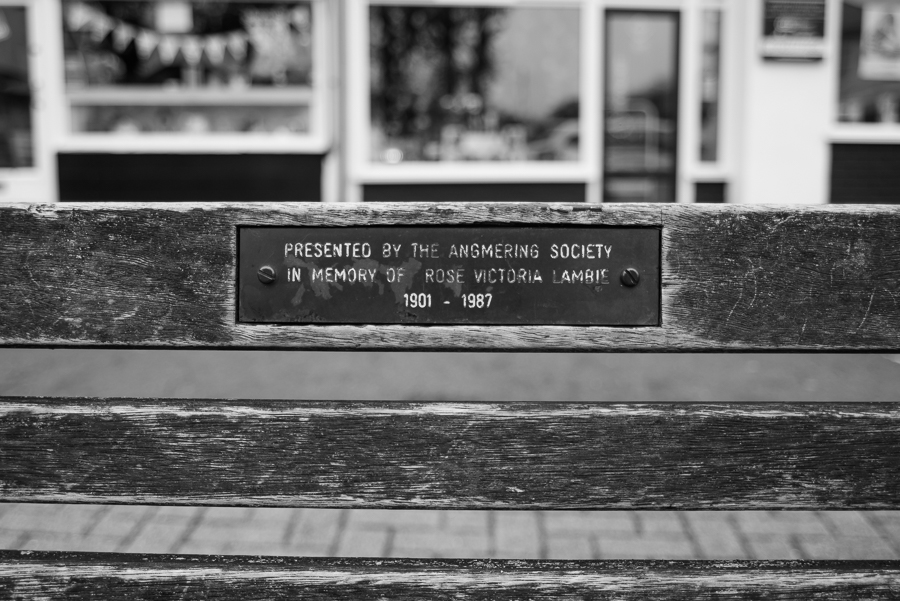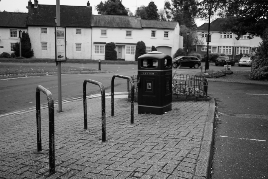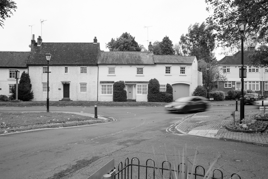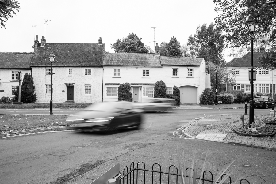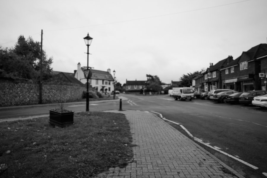
Photographing the unseen
Start by doing some reflecting in your learning log. What kinds of subjects might be seen as un-photographable? How might you go about portraying them using photography? List a few examples of things you’re experiencing now or have recently been thinking about. This doesn’t have to be too in-depth or revealing, but it can be if you want. Equally, it might be something as apparently trivial as how you’re going to fit everything into your busy day. At first you may come up with literal examples, but the more you think about them the more those ideas will develop into specific and more original ones.
Make a list of at least seven ideas. Try and keep to things you have a personal interest in or curiosity about. Keep a notebook with you at all times and make notes when ideas strike you as interesting. (This is good practice for all stages of the degree and beyond.
Ideas books are something to be revisited time and again for ideas and hints for the photographer you’re becoming.)
Now implement one of your ideas. Aim for a tightly edited and visually consistent series
of 7–10 images.
So here’s the reflecting in my learning log 😉
I was immediately drawn to this one of the two options and did keep my notebook with me at all times. In fact it’s amazing how many times, I woke in the middle of the night and added something to it.


What kinds of subjects might be seen as un-photographable?
- Connections (between people or environment) you can place a person within an environment or next to another person, but it’s very difficult actually capture the emotional connection between the two things.
- time – you can photograph the effects of time on a person or object but how do you capture time or the concept of time itself.
- Memories –
- Emotions / feelings
- thoughts
- touch
- dreams
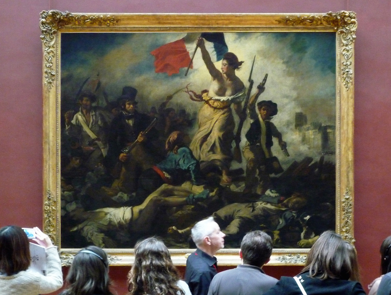
- ideologies – religion / politics
- sound
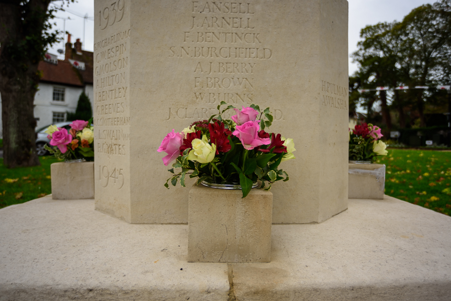
- absence
- love
most of these things are things that are experienced by a person within by your senses.
Fraenkel Gallery 2013 – The unphotographable [accessed 02.01.2019]
The Unphotographable, s an interesting article about an ambitious exhibition exploring the history of that which cannot be photographed. A lot of these images are abstracted and distorted, does this imply that to represent something unseen, it has to be unrecognisable. they are said to represent sound, absence and love.
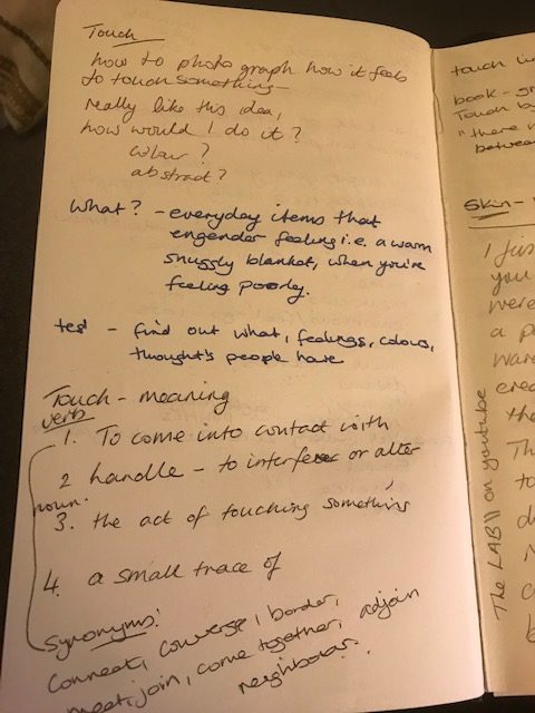
Touch – this is the one that really interests me – I’m really drawn the idea of trying to capture how it feels to touch something. Not photographing the act of touching an item but trying to represent how it feels.
The video I found here about photographers trying to represent food they were eating blindfolded. The results were really different and very interesting.
As photography is a visual medium and I want to create a visual representation of the feeling, it seems logical to remove the visual element of my senses and try to create an image that is inspired by touching something.
My idea is therefore to ask 10 different people to give me an object to touch whilst being blindfolded. I will write a brief and ask people to help me. I will expand on this more in a separate post.