Exercise 2: Reflective Day [2nd May 2021]
Choose a day that you can spend out and about looking with no particular agenda. Be conscious of how images and texts are presented to you in the real world – on billboards, in magazines and newspapers, and online, for example.
Make notes in your learning log on some specific examples and reflect upon what impact the text has on how you read the overall message.
Consider the following:
- Does the text close the image down (i.e. inform or direct your reading) or open it up (i.e. allow for your personal interpretation to play a part in creating the final meaning)?
- What do you think was the intention of the creator in each instance?


For this exercise, I started with a walk around Worthing town centre. Worthing is a south coast seaside town, but in general the shops are similar to most town high streets across the UK. I took photos of shop fronts, billboards and signs.
The gallery above shows the images I took, below I will look at a few specific examples’
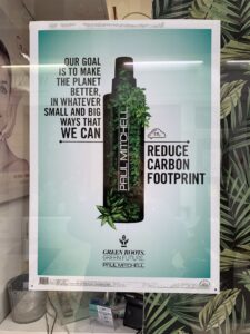
Product poster in shop window of a hairdressers
The text in this image does not describe the product at all, therefore it complimentary and open. The bottle could represent any of the products this organisation makes and the image itself has been manipulated to include green leaves sprouting out of the bottle. The text is relating the product to the current social conscious of wishing to reduce the carbon footprint because of the damage it is doing to the planet. The text doesn’t even claim to do that but just that they wish to! The bottle itself is plastic and filled with chemicals! Colour is also important in this image as it reinforces the green (natural) message. Interestingly the display of this image is also managed by placing a nature based green wallpaper behind it.
The intention is to create the impression that these products are natural and safe and using them will help the save the planet.
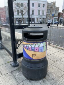
Rubbish Bin in town centre
The text on this image is almost not visible. The word ‘welcome‘ is written on the flag. Again an open image that is almost in complete contrast the use of the object on which it is placed. This image is orientational in that it depicts a beach reminding the viewer they are in a seaside town. The ‘welcome’ text is for the benefit of tourists and holiday makers rather than the local population.
The Image itself is doing most of the work here, it is bright simple and clean. I think the intention is to make it noticeable to passers by so that they use it to put their rubbish in, but also reinforce the clean beach message. Perhaps the word ‘welcome’ on the flag is saying you’re welcome here if you throw your rubbish away and don’t litter the beach or the streets?
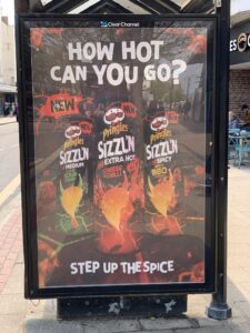
Billboard advert on a bus stop
Unlike the first image, this billboard advert is both directional and open. The product is clearly displayed telling the viewer what it is, however it also has the added text at the top and bottom which promotes the idea that you need to be brave to eat this food.
Again colour reinforces the message. The red/orange fiery colours promote the spicy nature of the crisps. by asking a question, the creator is giving a challenge to the viewer: try me if you think you’re brave enough! The intent is to sell this product.
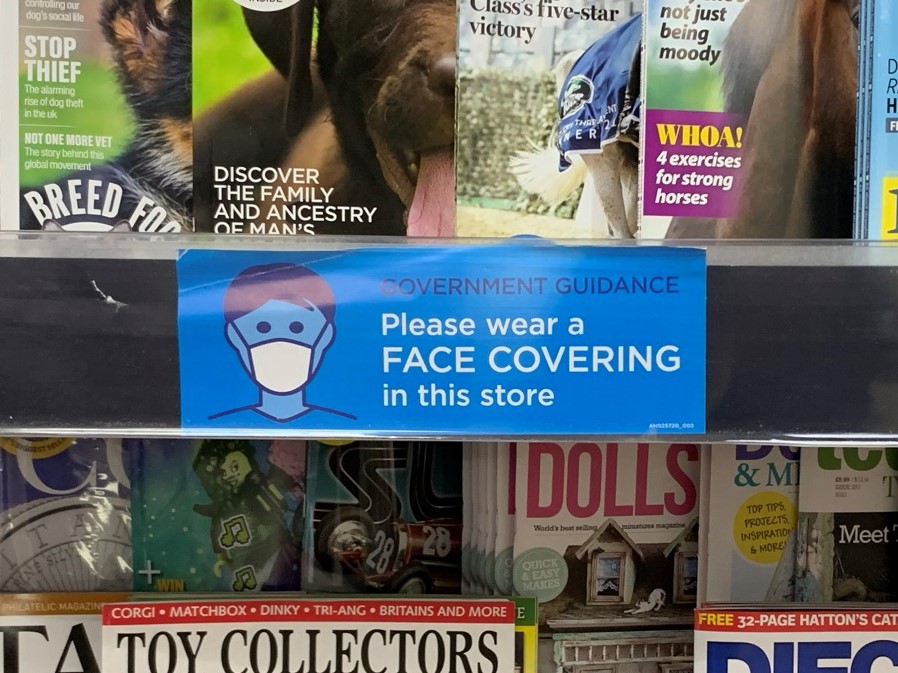
Guidance notice on a book shelf
This use of image and text is directional and provides information and instruction as to what is required by the viewer. The image is a simple line drawing and there is a very limited colour palette. The white elements in the image are the most visible indicating they are the most important. In amongst all of the magazine covers it stands out clearly.
The intention here is very clear, and the viewer is left in no doubt what is required.