OCA tutor Dawn Woolley wrote a regular blog on the weareoca website called ‘Looking at Adverts’.
Read one of Dawn’s articles and write a blog post or make a comment on the site in response.
Dawn Woolley wrote 17 Blogs on ‘Looking at Adverts’ from September 2014 – April 2017, covering subjects such as:
- each object adding information
- an advert imagery borrowed from a well know photographer (Rodchenko)
- Lurpak
- Coop Bank
- Seasonal Advertising
- lining products to other things to add value
- fetishism
- if a great poster can win an election
- beach bodies
- selfies
- selling ice-cream
- photoshop techniques and ‘real world’ images
- violence and suffering
- Christmas adverts
- playing with dolls
- photography matters
- anti-aging
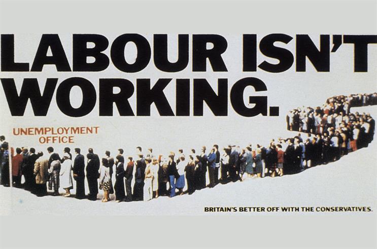
Having reviewed the list above, I decided to read the one that most stood out to me. That is No 8 – “If a great poster can win an election”. (Woolley) [accessed 19/04/2021]. The images on the webpage didn’t load so I had to search the images from the descriptions in the blog.
I also followed the links at the bottom of the blog to Sam Delaney’s articles in Guardian which also considered the impact of the posters used in political campaigns.
Woolley’s says that “this was the first ‘US style’ political advert to be produced in the UK”, although she doesn’t explain what ‘US Style’ means. The implication is that because the poster was ‘controversial’ in that it wasn’t a ‘real’ line of unemployed people and that it contained the name of the opposition party that the Labour party’s protestations about the poster actually got it more noticed than it might have been, reinforcing the message.
This shows that the image that accompanies the text doesn’t have to be literal representation of the message. In fact the line of people adds meaning with the addition of the ‘Employment Office’ text underneath. This a classic example of selling the benefit, not the product and the ‘what’s in it for me’
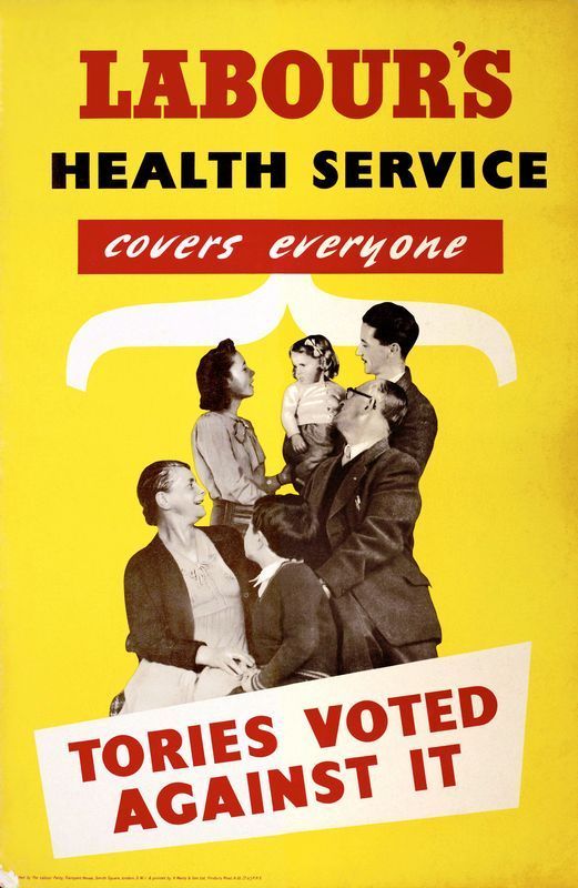
Labour’s 1979 election poster
In contrast to the Conservative poster, Labour’s photo feels old fashioned, even for 1979. The depiction of the family in sepia, wearing clothes that look like they’re from the generation before doesn’t really depict a modern health service. The ‘Tories voted against it” tag line is also something that happened in the past, whilst the Conservative is talking about the conditions at the time of the election. Therefore, I think people would relate better to conservative poster as it was dealing with the prevailing issues of high unemployment and minors strikes that were happening at the time.
In Sam Delaney’s article in the Guardian “The 10 Best British Political Posters” (Delaney) he initimates that the best posters, either make us laugh, raise negative thoughts about the opposition and / or promise the voter something.
He feels that posters are important because even people with lower reading capabilities will understand the message an image is conveying.
“Posters will always be important because if you can’t get your message across in five or six words then, chances are, your message isn’t right in the first place,”
Jeremy Sinclair, Saatchi and Saatchi creative director
References:
Delaney, Sam. “Attack Is the Best Form of Defence: The Golden Rules of Political Campaigning.” The Guardian, 11 Feb. 2015, www.theguardian.com/politics/2015/feb/11/political-campaigning-advertising-golden-rules. Accessed 19 Apr. 2021.
—. “The 10 Best British Political Posters.” The Guardian, 3 Apr. 2015, www.theguardian.com/artanddesign/2015/apr/03/the-10-best-british-political-posters.
Wearn, Lynda. “Exercise 4.1 Looking at Adverts – Dawn Wooley.” Lynda’s Identity & Place, 29 May 2019, lyndasidentityplace.wordpress.com/2019/05/29/exercise-4-1-looking-at-adverts-dawn-wooley/. Accessed 19 Apr. 2021.
Woolley, Dawn. “Looking at Adverts: 8 | the Open College of the Arts.” Www.oca.ac.uk, 4 Sept. 2015, www.oca.ac.uk/weareoca/film/looking-at-adverts-8/. Accessed 19 Apr. 2021.