End of Course Evaluation and Reflection

Photography 1: Expressing Your Vision

Reflection

One thing I have learned about photography is that there is always something new to learn technically and artistically.  This is one of the reasons I wanted to take this course.  I have been taking photos all of my life and it is a passion, however, I have also felt for quite a long time now that I don’t just want to ‘take’ a photo of just anything, I want it to mean something; say something to me; but what I want to say, I’ve never quite nailed and ultimately been dissatisfied with the results.  Primarily I’m a people photographer, so I felt that somewhere inside me there is something I want to say about me.  Expressing your vision has started me on that journey of self-discovery but it is also equipping me with the technical skills to achieve it.

I have used my blog debraflynnphotography.co.uk/EYV-blog to record all of course work, assignments and learning log.

A few things that have stood out for me completing this course are:

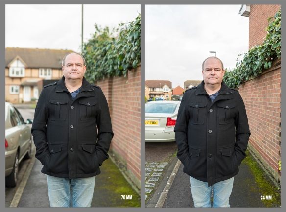
  • I have really enjoyed having a structured way of progressing, revisiting my camera instruction manual was such a useful thing to have done. Although already a confident ‘Manual’ mode user, I have increased my knowledge about settings, depth of field, choice of lens and lighting.
  • Researching ideas and planning what I want to do before taking the images. I really think this has helped with the final results and I have been much happier with the outcomes.
  • I always looked at other work but haven’t really studied other photographers before starting this course. I didn’t think I would be very interesting, but it has been a revelation.  Learning about them and, in some instances actually listening to them, put their work in context has really helped me to think about me and what I’m trying to achieve.  What I would like people to think about my work.
  • Part 5 about view point, really made me think about how my work is presented and indeed what work I want to do.
  • That I don’t have to fit into any genre or style, I can be as creative or not, as I want and produce work that means something to me. And; if I’m not happy with it, I can do it again.  In the words of my tutor “follow your bliss”.
  • Printing my images has really given me a new perspective on taking them to. They look different in print and somehow feel more tangible and meaningful. I have enjoyed choosing different papers to print them on which does change the look and feel.
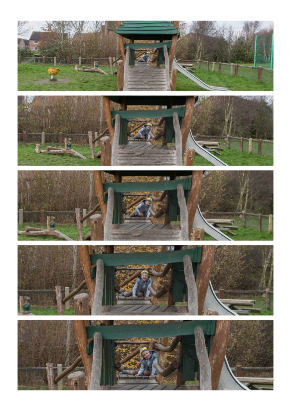
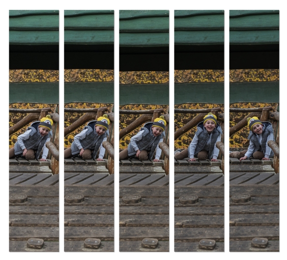
  • I like working in sets rather than individual images

What I think I’ve learned about me as a photographer:

I was delighted that my tutor thought Assignments 3 and Assignment 4 were good and didn’t require me to make any changes and I am most proud of those two assignments as I think they are closest to showing me as a photographer.  However I think the most growth and learning came out of Assignment 2 and Assignment 5 which I reworked following my tutor’s feedback.  Being receptive to another person’s critical eye can really enhance your own vision.  Clive seemed to really understand what I was trying to achieve from each assignment and was able to help me refocus and rework the assignment.  I also found that seeing your images through another’s eyes and listening to their feedback lets you know whether or not it has the impact you wanted.  I completed the rework of Assignment 2 after completing the rest of the course and actually found going back to it later was a valuable lesson, as with the hindsight of the finishing rest of the course, it felt that the images were better composed and the set works better as a whole.

I now have the burgeoning ideas of what it is I’m trying to say:  There’s something about juxtaposition and not being able to see everything, hidden emotion and light and dark.  I really connected with the work Mona Kuhn, Tony Ray-Jones, Maja Daniels and Christopher Doyle.  I know it’s in there, I aim to tease it out during the course of my further studies.

In all I feel that I have made a good start to the degree course and have successfully attained the stated aims and objectives.  I have added some links to each of the aims which I believe demonstrate these outcomes, but I believe my whole blog is testament to my achievements http://debraflynnphotography.co.uk/EYV-blog/

link to PDF version

What’s in the box – the physical submission is boxed and ready to go:

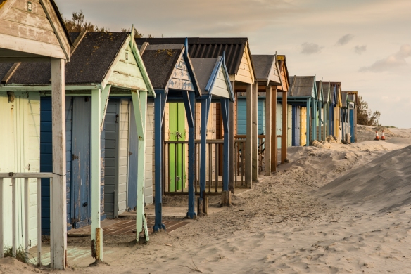
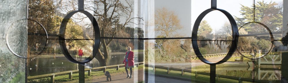
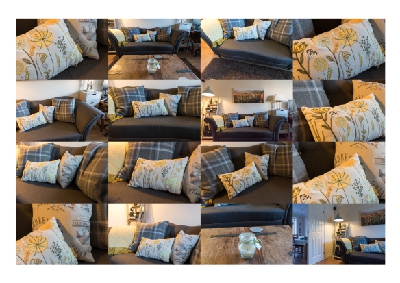
a few of my favourite images from the assignments:

This slideshow requires JavaScript.


5.2 – Assessment Criteria – Context

Exercise 5.2

Select an image by any photographer of your choice and take a photograph in response to it. You can respond in any way you like to the whole image or to just a part of it, but you must make explicit in your notes what it is that you’re responding to. Is it a stylistic device such as John Davies’ high viewpoint, or Chris Steele Perkins’ juxtapositions? Is it the location, or the subject? Is it an idea, such as the decisive moment?
Add the original photograph together with your response to your learning log.  Which of the three types of information discussed by Barrett provides the context in this case? Take your time over writing your response because you’ll submit the relevant part of your learning log as part of Assignment Five. 

The image I have selected is John Wilhelm, who is a Swiss photographer who considers himself to be an artist only using his own images to create surreal photos of his children and family.

image by John Wilhelm

too see John’s work click here:  https://www.johnwilhelm.ch

One of my passions is digital manipulation and this kind of photography is something that I have done quite a bit of.  The image I have created, in ‘homage’ to John’s work, picks up the themes of daisies, children and miniatures.

Debra Flynn. Daisy Pinata, 2018

images used to create the image above

In his essay Terry Barrett (to read click here) suggests there are three sources of context: 

  • internal context – the picture itself, it’s name, who made it and when
  • external context – how and where it is presented 
  • original context – the understanding of the environment in which the photographer physically and psychologically made the image.

all of these elements can affect how the image is perceived or understood by the viewer.

Robert Doisneau. Paris Cafe, 1958

This is described by Barrett, using Robert Doisneau’s image of a couple drinking wine in a Paris cafe.  It has been published 5 separate times in different forms and each time it’s context has been altered.

  1. by Doisneau in a set called Paris cafes
  2. by the Temperance League extolling the perils of drinking alcohol.
  3. by a French scandal sheet with a caption about prostitution
  4. by a photo gallery in New York as an artwork
  5. in a book about modern art, suggesting it be a ‘possible seduction’.

Depending on which description the image is given at any one time (internal context) or the place where it is seen or published (external context) the viewers understanding of the image can be changed.  To really understand the context of the image the viewer should endeavour to understand the environment which caused the photographer to make in the image in the first place. (original context) i.e. when, where and why was it taken, what was the political or moral environment in which it was taken and what was the viewpoint of the photographer.

As a photographer, this makes me think very much about how and where I present my images.  In these times of Facebook and Instagram, 500 px etc photographs are rarely printed and once uploaded to the internet are pretty much free to be used by anyone.  Particularly when creating an image like the one by John Wilhelm and my ‘homage’ to it, there is a lot of work gone into collecting the right photos, and then digitally creating the image, to then just upload it to social media where it can be used at will, does that denigrate my hard work or reduce it the level of the selfies flooding the internet?  It’s a difficult one, because like most photographers I want to share my work for others to enjoy too.

Contextualising my image:

internal context: Debra Flynn. Daisy Pinata, 2018

external context: published on instagram / facebook (see here

original context: as the photographer, I physically have the equipment and computer software to produce this image, including the knowledge, skill and artistic vision to create the image.  Psychologically; I am drawn to the surreal and adding a bit of magic to children’s lives.  In the examples below, all but one are members of my family.

link to Assignment 5 – Photography is simple (reworked)

references:

www.terrybarrettosu.com/pdfs/B_PhotAndCont_97.pdf 

Click to access Barrett-1986-Photographs-Contexts.pdf


4.5 – Assessment Criteria – Creativity

Exercise 4.5
Make a Google Images search for ‘landscape’, ‘portrait’, or any ordinary subject such
as ‘apple’ or ‘sunset’. Add a screengrab of a representative page to your learning log
and note down the similarities you find between the images.
Now take a number of your own photographs of the same subject, paying special
attention to the ‘Creativity’ criteria at the end of Part One. You might like to make
the subject appear ‘incidental’, for instance by using juxtaposition, focus or framing.
Or you might begin with the observation of Ernst Haas, or the ‘camera vision’ of Bill
Brandt.
Add a final image to your learning log, together with a selection of preparatory
shots. In your notes describe how your photograph differs from your Google Images
source images of the same subject.

a google search for ‘pink tuplips’

The image I have chosen from my set of images, is one where the tulips appear to be incidental in the picture.  However, they were actually placed there deliberately behind the statue to get this image.

tulips incidental in the image

I liked Chris Steele-Perkins’ shots of mount fuji which showed it in juxtapostion against the everyday life that is carrying on around it.

https://www.prixpictet.com/portfolios/earth-shortlist/chris-steele-perkins/

with such a well known flower it was very difficult to come up with something new, but the act of doing so, made me look harder at the subject and decide if there were different angles, or positions I could place them to get different light on.

The contacts below show the different ideas I had for capturing this flower. Mostly I went for prominent in the frame, but I also tried the incidental shots. 


3.3.2 What matters is to look

3.3.2.  Find a good viewpoint, perhaps fairly high up (an upstairs window might do)
where you can see a wide view or panorama. Start by looking at the things
closest to you in the foreground. Then pay attention to the details in the middle
distance and, finally, the things towards the horizon. Now try and see the whole
landscape together, from the foreground to horizon (you can move your eyes).
Include the sky in your observation and try to see the whole visual field together,
all in movement (there is always some movement). When you’ve got it, raise your
camera and take a picture. Add the picture and a description of the process to
your learning log.

To complete this exercise, I needed a to take jolly jaunt during my lunch hour, up to High down Hill, which is the highest point locally and has a 360 degree views.

As I stood at top the Highdown Hill, looking down over North Worthing.  I followed the instructions and started by looking close to me and moving my eyes further away into the distance and then up to the sky.  i was surprised just how much the human eye can see and perceive in one go.

At first the scene looked fairly static but the more I looked, the more I started to see, and even the slightest movement was apparent.  In this exercise I took the image when I saw the movement, but in actual fact it was so far away that the camera  didn’t really capture it.  in the image below I have shown where the movement was, a double decker bus.  I was able to watch the bus approaching the gap, and took the image as it reached the gap.  So I feel that I did capture the decisive moment, even though it’s very small 🙂

this view captures a train passing the level crossing.  I first spotted the flashing red lights and then saw the train approaching from the right. I waited until the train reached the lights before taking the shot.

I have marked the movement and the train in this second image

3.1 – The Frozen Moment

Exercise 3.1
Using fast shutter speeds, try to isolate a frozen moment of time in a moving subject.  Depending on the available light you may have to select a high ISO to avoid visible blur in the photograph. Try to find the beauty in a fragment of  time that fascinated John Szarkowski. Add a selection of shots, together with relevant shooting data and a description of your process (how you captured the images), to your learning log.

Well what better to do on New’ Year’s Day than go and try to stop time 🙂 !

Our idea was to go and watch some silly nutters running into the sea in the morning, but when we got there the beach was bare!!  Presumably the rain, wind and rough high tide combined to discourage anyone.  Either that or it was cancelled .

Anyway, we finally found ourselves on the beach at Littlehampton where the combination of rolling waves, shoreline birds and mad people running, gave me the opportunity to capture some motion and stop the action.

As instructed I set the camera onto shutter priority, and because it was wet and raining, but still relatively bright, I put the ISO on 640, so that I could keep the speed as high as possible.  I was also using a Tamron 70-200 2.8 lens, which is fairly heavy especially in conjunction with the camera so wanted to ensure I could combat any camera shake as well. 

I am pleased with the outcome of this exercise.  Using shutter priority did make things easier, as I wasn’t worrying about the settings once set up, which meant I could concentrate on watching the scene for movement. 

For most of the shots I tried to stand as still as possible, but with some of the bird shots, I did try panning along with the flight and as I was able to keep the shutter speed up, that was quite successful.

I think that in order to stop motion, you also need to actually see that movement is happening, i.e. if you took a photo of a car, stopping all motion, then it could just be parked!, where as a person running or a bird in flight is still moving in the image even though the motion is stopped.  That’s why I chose to take photos of things that look different when they’re are moving to how they look when they are still.

I agree with Flusser’s view that ‘framing a photograph is not just space, but also time. The human eye certainly doesn’t see all of the different movement of a birds wings, by just watching.

Contact Sheets for this shoot can be seen here: contact sheets

Water Drops

Also tried to emulate Harold Edgerton’s mild drop coronet, 1957 by having a go a milk drops in water.  It took thousands of shots to get a few good ones, but was really enjoyable and a little bit addictive.  In this instance shutter speed is coupled with flash lighting and coloured gels to stop the action.

Technical Notes:

  • 35 mm camera with 105 mm macro lens
  • f/14 & f/20 with ISO100, 105 mm, 1/200 (to sync with flashes)
  • 2 flash guns with various coloured gels, fired with triggers, set at between 1/8 & 1/4
  • remote shutter

for water:

  • tray of water with black plastic on bottom to give reflections
  • black back ground
  • used clear water with xanthium gum added (makes it thicker)
  • and a mixture of skimmed milk and cream

set up for water drop images

contacts for this shoot can be seen here 

2.2 – The distorting lens

For this exercise, I have taken a photo where the subject is in front of a background with depth.

The first shot was taken at a focal length of 70 mm and the second shot at 24 mm.  In order to keep the subject at a similar size in the frame, I had to move forward to take the second shot.

_DJF2654_RalphX2.jpg

When putting the images side by side it is really easy to see how the combination of focal length and viewpoint is affected by ‘perspective distortion’.

Perspective distortion is a normal effect of viewing an object.  It is thought that the human eye is similar to a 50 mm (full frame) lens, which is about half way between this two images.  Therefore, if you wanted to take an image that best represented how it is seen then use a 50 mm lens.  Our eyes would however, see a much wider field as our field of vision is probably closer to the 24 mm lens, as shown in excercise 2.1 

Other things I have noted in these two images, are that although both were taken at an aperture of f/4,  the 2nd (24mm) photo, has much more of the foreground is in focus and secondly, the background is much further away and sharper.

For a portrait like this, I think I would prefer the 70 mm version, as the subject stands out more in the image, and I also prefer the angle. (notwithstanding the fact that he doesn’t have a street light coming out of his head!!). There seems to be more definition between him and the background.  However, the 24 mm focal length would be better for Landscapes where keeping things in focus throughout the image is more desirable.

I wonder if the fact that I am only 5 ft 2″ has an impact on this, as in having to get closer to keep the subject in the centre of the image, I ended up looking up a bit? If had been taller would this be an issue?


2.1 – The distorting lens

Exercise 2.1

Find a scene that has depth. From a fixed position, take a sequence of five or six shots at different focal lengths without changing your viewpoint. (You might like to use the specific focal lengths indicated on the lens barrel.)

Technical Information:

exercise 2.1 metadata

screenshot of metadata shown in Adobe Lightroom

It was only after completing this exercise, that I realised that I had set the camera manually rather than using aperture priority. So I have now changed the priority mode and will use if for the subsequent exercises in this Part.

Nikon D810 Camera (fx sensor)

The focal lengths used were:

  • 24 mm
  • 38 mm
  • 46 mm
  • 58 mm
  • 70 mm

using a Tamron SP 24-70mm F2.8 Di VC USD A007N Lens

f/5.6
1/40 sec
ISO 400

Photos were taken in RAW, imported into Adobe Lightroom for minimal editing and saved as 1500 px Jpgs.  None of the images have been cropped or straightened.

This slideshow requires JavaScript.

The lens I was using has a zoom range from fairly wide at 24 mm up to a mid range zoom of 70 mm.  This is the lens I tend to use as my ‘go to’ everyday lens.

The first and widest photo, gives an overall view and helps place the climbing frame in its place. As the images scroll through, you do get a sense of moving towards the subject and the subject becomes more dominant to eye, so you look less at the surrounding elements in the image.

focal length exercise 2.1.jpg

In this experiment, I have blown up a section of each of the photographs so that they are almost the same size. Obviously, the 24 mm needed to be blown up much more than the 70 mm photograph, but interestingly quality in the detail at this magnification, doesn’t seem to be that different.

focal length comparison

but when magnified even more, you can start to see the difference in the amount of detail that has been recorded between the 24 mm shot on the left and the 70 mm shot on the right:

_DJF2593_more zoom

Had my objective been to focus in on the boy, then getting closer and zooming would have been a better option to get a sharper image.  However, in the context of him being a part of the wider photo, the quality is ok

Exercise 1.4 – Frame

Brief:

Using the viewfinder grid display in your camera, take a number of shots, composing each shot within a single section of the grid.  Ignore the rest of the frame:

With working full time at this time of year, I have struggled to get out to take photographs during daylight hours, so I decided to take a series of photos for this exercise using the cushions in my lounge.

Exercise 1.4 - Framing.jpg

Framing using small sections of the Viewfinder Grid

This slideshow requires JavaScript.

view full size images here

In these images, I have used the center of the yellow flower as the focal point for most of the photographs.  I have placed them in this grid collage roughly in the area of the viewfinder in which I composed each of the images.

None of the images have been cropped and have had minimal editing.

Technical Information:

Because of low light, I used a camera mounted on a tripod so that I could use a slower shutter speed  in order to maintain sharpness and reduce noise. The majority of shots were taken at f/8, except for number 7 (see below), which was taken at f/2.8.  Shutter speed was around 1/4 sec or 1/5 sec, ISO 400 and metering set to matrix.

D810_viewfiender

My camera’s viewfinder grid, looks like this

I used the viewfinder and the focus select button to make sure I was focusing in the area of the grid I wanted to compose.

In framing each image I found I was doing more than just moving the ‘point’ around the frame, but was really trying to make a composition within a small part of the screen.  I tried to disregard the rest of the frame as directed, which is quite difficult to do, but still produced some surprises when reviewing the images. So I obviously managed to do it.

Image Evaluation:

Exercise 1.4 - Framing_reviewed.jpg

evaluation of how my eyes travelled around the image

Observations:

  • There are both ‘points’ and ‘lines’ in each image.
  • The eye isn’t always drawn to the focal point of the image, i.e. No 3
  • For images 10, 14 and 16; having only concentrated on the composition in part of the image, areas of distraction have been missed which take the viewers eyes away from the focal point.  However, for image 16 this has added a dimension to the story of the picture that none of the others do.
  • No 2 has strong lines which take your eyes into and around the image.  When I took this I was only looking at the sofa at the top of the image, so was pleasantly surprised by this image.

Reflection:

Trying different areas of the frame to compose the photograph, almost forces you to look at things from different angles and give very different images of the same subject, which makes for more interesting results.

I have used settings that mean that pretty much everything in the frame is in focus.  I would like to try this again, using a shallower depth of field to see how this effects the results.

Exercise 1.4 – research

Research :

researching what is the difference between framing and cropping:

why-framing-should-be-your-first-priority-and-cropping-second

Difference Between Framing and Cropping

Framing is the arrangement of elements within the confines of the imaging device. In other words, you have a rectangular surface area (film or digital sensor) that is going to image your photograph. The act of framing is you making a determination as to how you are going to fill that surface area with your subject. So, what is cropping?

Cropping is a tool meant to fine-tune an image in post-production. With film it’s done using an enlarger and with digital it’s done by cutting down the size of the resolved image.

From this I understand, that in order to maximise the full potential of your camera, you should fill as much of the frame as possible with what you actually want in the finished image.  That means that you should take a little more time, wherever you can to compose the image in the frame.

As I have a 36 megapixel camera and I know that I am sometimes lazy about moving closer or composing, because I know have plenty of  resolution and can crop what I don’t want.  However, I am now thinking how much sharper my photos could be if I make more effort to frame the photos properly.

For Victor Burgin (b. 1941), composition is ‘a device for retarding…recognition of the frame’ (Burgin, 1980, p.56). Looking back at some of your compositional exercises from earlier in Part One, would you agree that in the less successful shots there is the feeling of a ‘cropped view’ rather than a ‘transparent window to the world’?

Alfred Stieglitz’s (1864–1946) cloudscapes, the Equivalents, illustrate Burgin’s point. They don’t appear to be composed at all; instead they’re ‘equivalent’ in that any section of the sky would seem to do as well as any other. Because there’s no sense of composition our eye is drawn to the edges, to the frame. The sense of a cropped rather than a composed view is what makes the Equivalents so uniquely photographic – ‘a naked function of the cut’ (Foster et al., 2004, p.147).

I think this means that if an image is composed well, the viewer will be engaged with the contents of the image, whereas if it isn’t the viewers eyes are likely to go to the edges of the frames, wondering what they’re not seeing.


Exercise 1.3 (1) & (2) Line

Exercise 1.3 (1) Line
Take a number of shots using lines to create a sense of depth. Shooting with a wide-
angle lens (zooming out) strengthens a diagonal line by giving it more length within
the frame. The effect is dramatically accentuated if you choose a viewpoint close to
the line.

Exercise 1.3.1-cropped
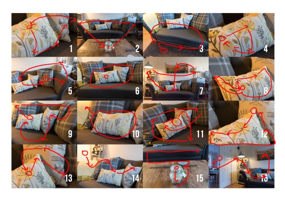
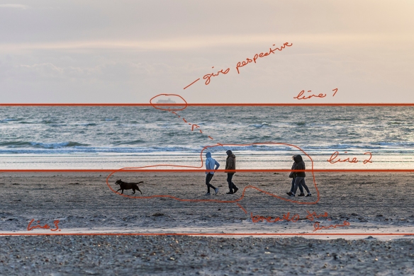
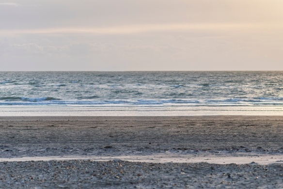
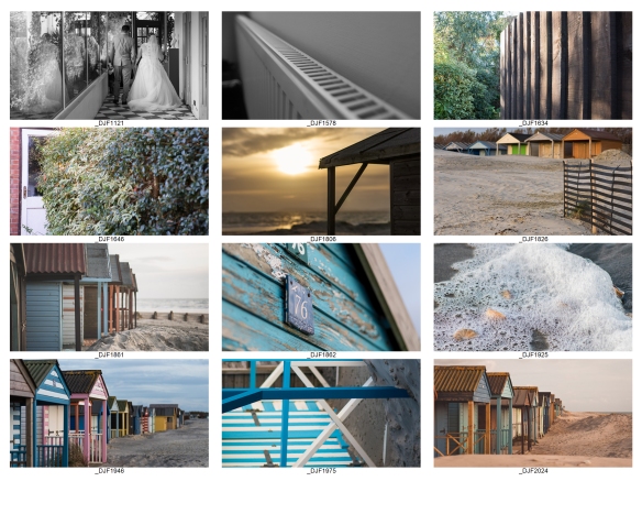
Exercise 1.3 (2) Line
Take a number of shots using lines to flatten the pictorial space. To avoid the effects
of perspective, the sensor/film plane should be parallel to the subject and you may
like to try a high viewpoint (i.e. looking down). Modern architecture offers strong
lines and dynamic diagonals, and zooming in can help to create simpler, more
abstract compositions.

Exercise 1.3.2-cropped
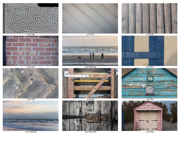
Review your shots from both parts of Exercise 1.3. How do the different lines relate
to the frame? There’s an important difference from the point exercises: a line can
leave the frame. For perpendicular lines this doesn’t seem to disrupt the composition
too much, but for perspective lines the eye travels quickly along the diagonal and
straight out of the picture. It feels uncomfortable because the eye seems to have no
way back into the picture except the point that it started from. So for photographs
containing strong perspective lines or ‘leading lines’, it’s important that they lead
somewhere within the frame.


Exercise Review:

There is definitely a different feel to both sets of photographs. In exercise 1.3 (1), I tried placing the leading lines in different parts of the frame and I noticed that in most of them, I have left space around the line which emphasizes it, whereas, in exercise 1.3 (2) many the lines are terminated at the edges of the photograph.  The flat views are great for detail shots or strong regular shapes.

The hypothesis above states that ” So for photographs containing strong perspective lines or ‘leading lines’, it’s important that they lead somewhere within the frame”

To test this I took a photo where there appeared to be a definite ‘thing’ at the end of the ‘lead line’ namely two traffic cones.  In the second photograph I took them out of the picture, to see if it did indeed affect the viewers comfort.  Personally, I didn’t think it made much difference, but this may be because the line extends almost to the other side of the frame anyway.

_DJF1817_DJF1817a

Although the photo below was taken with flat lines in mind, those being the different horizons between land, sea and sky, the addition of the people and boat, give it perspective which create an invisible line.  So for the image to have worked as a flat photo, I would have to taken it without either of those elements in it.

_DJF1809-Edit-Edit

Here the people and ship have been removed to show how the flat image would look.

_DJF1809-Edit-Edit1