Exercise 1.4 – Frame

Brief:

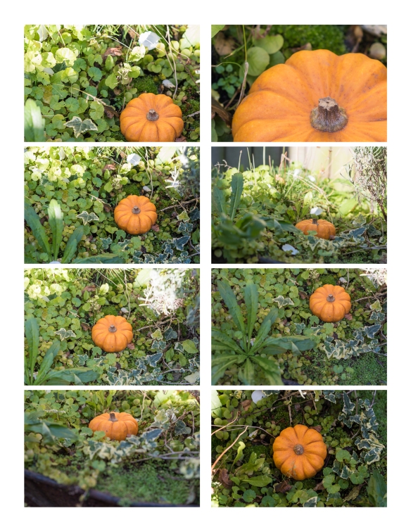
Using the viewfinder grid display in your camera, take a number of shots, composing each shot within a single section of the grid.  Ignore the rest of the frame:

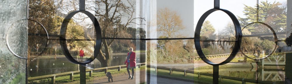
With working full time at this time of year, I have struggled to get out to take photographs during daylight hours, so I decided to take a series of photos for this exercise using the cushions in my lounge.

Exercise 1.4 - Framing.jpg

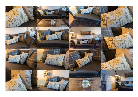
Framing using small sections of the Viewfinder Grid

This slideshow requires JavaScript.

view full size images here

In these images, I have used the center of the yellow flower as the focal point for most of the photographs.  I have placed them in this grid collage roughly in the area of the viewfinder in which I composed each of the images.

None of the images have been cropped and have had minimal editing.

Technical Information:

Because of low light, I used a camera mounted on a tripod so that I could use a slower shutter speed  in order to maintain sharpness and reduce noise. The majority of shots were taken at f/8, except for number 7 (see below), which was taken at f/2.8.  Shutter speed was around 1/4 sec or 1/5 sec, ISO 400 and metering set to matrix.

D810_viewfiender

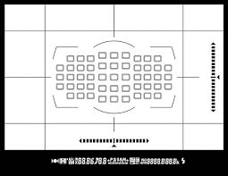
My camera’s viewfinder grid, looks like this

I used the viewfinder and the focus select button to make sure I was focusing in the area of the grid I wanted to compose.

In framing each image I found I was doing more than just moving the ‘point’ around the frame, but was really trying to make a composition within a small part of the screen.  I tried to disregard the rest of the frame as directed, which is quite difficult to do, but still produced some surprises when reviewing the images. So I obviously managed to do it.

Image Evaluation:

Exercise 1.4 - Framing_reviewed.jpg

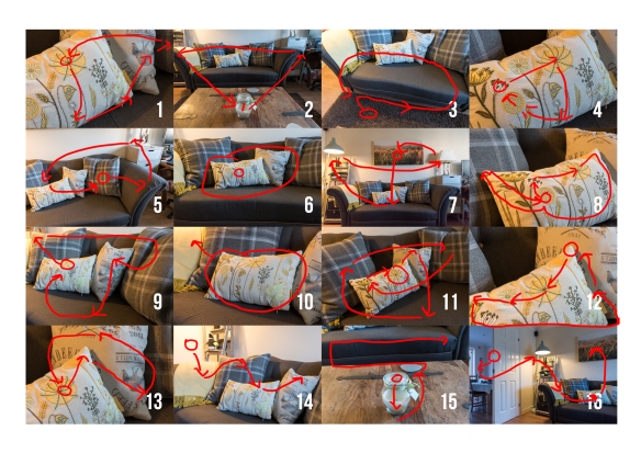
evaluation of how my eyes travelled around the image

Observations:

  • There are both ‘points’ and ‘lines’ in each image.
  • The eye isn’t always drawn to the focal point of the image, i.e. No 3
  • For images 10, 14 and 16; having only concentrated on the composition in part of the image, areas of distraction have been missed which take the viewers eyes away from the focal point.  However, for image 16 this has added a dimension to the story of the picture that none of the others do.
  • No 2 has strong lines which take your eyes into and around the image.  When I took this I was only looking at the sofa at the top of the image, so was pleasantly surprised by this image.

Reflection:

Trying different areas of the frame to compose the photograph, almost forces you to look at things from different angles and give very different images of the same subject, which makes for more interesting results.

I have used settings that mean that pretty much everything in the frame is in focus.  I would like to try this again, using a shallower depth of field to see how this effects the results.

Project 3 – Surface and Depth

Research Blog

JPEGs by Thomas Ruff

2006-RUFTH0605

JPEGs by Thomas Ruff

All images that appear on the internet and/or printed in books and magazines today are digitised.  Nearly all images are digital even if they originated in non-digital or pre-digital forms. Given this fact it is surprising how few of them ever wish to address the fact that they exist as masses of electronic information that take visual form as pixels. Ruff has done a great deal to introduce into photographic art what we might call an ‘art of the pixel’, allowing us to contemplate at an aesthetic and philosophical level the basic condition of the electronic image. Of course he does this not by showing us the images on screens but by making large scale photographic prints, blowing them up far beyond their photorealist resolution. This might be the  first time some of these images have ever taken a material form.

extract from David Campany's blog/essay

http://davidcampany.com/thomas-ruff-the

http://jmcolberg.com/weblog/2009/04/review_jpegs_by_thomas_ruff/

The tremendous beauty of some of the images notwithstanding, the concept itself seems to rely a bit too much on the technique itself. What else is there? Make no mistake, there is nothing wrong with producing beautiful images or images that are “just” beautiful. And everything would be fine if there hadn’t been so many attempts to convince me that in reality “jpegs” is more.

extract from Joerg Colberg's review

These two articles are reviewing Thomas Ruff’s book; JPEGs.  In this book he has collected photos from different archives to create his own archive of iconic photos.  He has taken the concept that even though many of the images were created on film, they are all now stored in digital format which he found on the ‘web’.

In Joerg’s article he says that the photographer is stating that the idea behind the photos is that even when stored in poor resolution they still have an aesthetical quality.  the Question is: is this photography or art?  He also makes the point that an individual image can be part of many different archives, each with a different focus. I would relate this _DJF1817to ‘collections’ in Adobe Lightroom, where a single photograph could be in a number of different collections based on the focus of that particular collection.

eg: my beach huts image could be a member of various collections, such as, Beaches, Golden Hour, or Structures.

The 9/11 images were iconic, but of terribly low resolution. With the […] jpeg structure and the results from work with image structures I managed to modify the terribly poorly resolved but still visually aesthetical images my way. ‘Terribly beautiful’ images they were.” In a nutshell, this is the idea behind jpegs.

I find it interesting that he has taken a very modern phenomenon of  pixelated photos and printed them.  It’s a bit of a reversal of mediums.

This book was made in 2009, most mobile phones, ipads and computers these days have very high resolution screens, so we are used to seeing all of our media in a very photorealistic way, so it actually requires us to look closely at pixelated image to make sense of it. (Was that his point?).  I believe most people would continue searching for a better quality image rather than look at a low resolution, pixalated photo these days.

In order to relate this to my own work, I took two recently taken photographs and attempted to create the same effect by re-sizing the photographs to 180 x 270 pixels, and saving at ‘zero quality’ compression using Photoshop’s ‘save for web’.

As David Campney noted that the photos are best appreciated in printed form, I also printed them out, to see how they looked.

jpegs_Lachlan

jpgs_beachhuts

Conclusion:

I initially struggled a bit with the concept, and didn’t get why anyone would want to lower the resolution of an image, but then most photographers edit and amend their images to present them in a format they choose.  Therefore, I think there is an argument that photography is just about shape and form, and that humans can understand meaning in images even if they are not realistic.

I wonder, however, how far you can degrade an image before it is no longer recognisable or meaningful? I took the same two images and used the dry brush filter in photoshop to deconstruct the photos even further.

Aesthetically interesting but no longer recognisable?  As with Thomas Ruff’s, JPEGs, if you hadn’t already seen the realistic version, would they still have meaning? This is something that might be interesting to explore further.


Thomas Kellner

Aside

I came across this photographer whilst reading another learning blog by Derek Youd. I thought it was really interesting and did some further research as I felt it carried on the theme of deconstructing image to create something different.

Whereas Thomas Ruff has taken existing images and reduced them to pixels, Thomas Kellner has interestingly taken images of one subject in order to create something new, but which seems to also encompass the original.


http://lenscratch.com/2017/03/thomas-kellner/

German photo artist Thomas Kellner has spent much of his photo career deconstructing architecture.  He calls his methodology  “visual analytical synthesis” where he thoughtfully plans a series of photographs in order to create a picture out of contact sheets. “His work is often referred to Cubism considering that his creative process includes a construction but the results resemble a deconstruction.”

I particularly liked this image of Big Ben:

Kellner_14_01

Exercise 1.4 – research

Research :

researching what is the difference between framing and cropping:

why-framing-should-be-your-first-priority-and-cropping-second

Difference Between Framing and Cropping

Framing is the arrangement of elements within the confines of the imaging device. In other words, you have a rectangular surface area (film or digital sensor) that is going to image your photograph. The act of framing is you making a determination as to how you are going to fill that surface area with your subject. So, what is cropping?

Cropping is a tool meant to fine-tune an image in post-production. With film it’s done using an enlarger and with digital it’s done by cutting down the size of the resolved image.

From this I understand, that in order to maximise the full potential of your camera, you should fill as much of the frame as possible with what you actually want in the finished image.  That means that you should take a little more time, wherever you can to compose the image in the frame.

As I have a 36 megapixel camera and I know that I am sometimes lazy about moving closer or composing, because I know have plenty of  resolution and can crop what I don’t want.  However, I am now thinking how much sharper my photos could be if I make more effort to frame the photos properly.

For Victor Burgin (b. 1941), composition is ‘a device for retarding…recognition of the frame’ (Burgin, 1980, p.56). Looking back at some of your compositional exercises from earlier in Part One, would you agree that in the less successful shots there is the feeling of a ‘cropped view’ rather than a ‘transparent window to the world’?

Alfred Stieglitz’s (1864–1946) cloudscapes, the Equivalents, illustrate Burgin’s point. They don’t appear to be composed at all; instead they’re ‘equivalent’ in that any section of the sky would seem to do as well as any other. Because there’s no sense of composition our eye is drawn to the edges, to the frame. The sense of a cropped rather than a composed view is what makes the Equivalents so uniquely photographic – ‘a naked function of the cut’ (Foster et al., 2004, p.147).

I think this means that if an image is composed well, the viewer will be engaged with the contents of the image, whereas if it isn’t the viewers eyes are likely to go to the edges of the frames, wondering what they’re not seeing.


Exercise 1.3 (1) & (2) Line

Exercise 1.3 (1) Line
Take a number of shots using lines to create a sense of depth. Shooting with a wide-
angle lens (zooming out) strengthens a diagonal line by giving it more length within
the frame. The effect is dramatically accentuated if you choose a viewpoint close to
the line.

Exercise 1.3.1-cropped
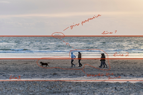
Exercise 1.3 (2) Line
Take a number of shots using lines to flatten the pictorial space. To avoid the effects
of perspective, the sensor/film plane should be parallel to the subject and you may
like to try a high viewpoint (i.e. looking down). Modern architecture offers strong
lines and dynamic diagonals, and zooming in can help to create simpler, more
abstract compositions.

Exercise 1.3.2-croppedReview your shots from both parts of Exercise 1.3. How do the different lines relate
to the frame? There’s an important difference from the point exercises: a line can
leave the frame. For perpendicular lines this doesn’t seem to disrupt the composition
too much, but for perspective lines the eye travels quickly along the diagonal and
straight out of the picture. It feels uncomfortable because the eye seems to have no
way back into the picture except the point that it started from. So for photographs
containing strong perspective lines or ‘leading lines’, it’s important that they lead
somewhere within the frame.


Exercise Review:

There is definitely a different feel to both sets of photographs. In exercise 1.3 (1), I tried placing the leading lines in different parts of the frame and I noticed that in most of them, I have left space around the line which emphasizes it, whereas, in exercise 1.3 (2) many the lines are terminated at the edges of the photograph.  The flat views are great for detail shots or strong regular shapes.

The hypothesis above states that ” So for photographs containing strong perspective lines or ‘leading lines’, it’s important that they lead somewhere within the frame”

To test this I took a photo where there appeared to be a definite ‘thing’ at the end of the ‘lead line’ namely two traffic cones.  In the second photograph I took them out of the picture, to see if it did indeed affect the viewers comfort.  Personally, I didn’t think it made much difference, but this may be because the line extends almost to the other side of the frame anyway.

_DJF1817_DJF1817a

Although the photo below was taken with flat lines in mind, those being the different horizons between land, sea and sky, the addition of the people and boat, give it perspective which create an invisible line.  So for the image to have worked as a flat photo, I would have to taken it without either of those elements in it.

_DJF1809-Edit-Edit

Here the people and ship have been removed to show how the flat image would look.

_DJF1809-Edit-Edit1

Exercise 1.2 – Point

Exercise 1.2 – Point 

  1. Take two or three photographs in which a single point is placed in different parts
    of the frame.


_DJF8632

Image 1: – ISO 200, 85 mm, f/4, 1/320 sec

The point I chose to photograph was the small black hollow in the stalk of this ‘munchkin’ pumpkin.

I started by placing the point directly in the centre of the image. Something most people try to avoid, I think it works for this image.


_DJF8615-2

Image 2: – ISO 200, 85 mm, f/4, 1/160 sec

The second photograph is zoomed in much closer, but still uses the same ‘point’ but in the bottom right hand corner on the intersection of the thirds.

This is something I tend to use a lot in my compositions so it feels comfortable to me.

_DJF8627

Image 3: – ISO 200, 85 mm, f/4, 1/400 sec

The final point is again on the right of the picture.  Again I feel more comfortable placing my focal point on the right.

Is this because I read left to right?

The point seems clearer in the first two images. The point is formed by the whole end of the stalk which appears lighter.


I was interested to discover if this still works without the contrasting colours and therefore, I have converted the same images to black and white to see if that alters the feel of the composition.

This was a simple black and white conversion in Lightroom, but I did add a little contrast and brightened the oranges.

Logic to evaluation:  How can you evaluate the pictures? How do you know whether you’ve got it right or not? Is there a right place and a wrong place for the point? For the sake of argument, let’s say that the right place shouldn’t be too obvious and that the point should be clear and easy to see. As there’s now a ‘logic’ to it, you can evaluate your composition according to the logic of the point.

Using the ‘logic’ given above I would evaluate the photos as follows:

Image 1: The ‘point’ is directly in the centre of the image, the colour surrounding it and the raidial lines on the pumpkin draw your eye towards it.   The foliage around the pumpkin also appears to be circular, although on the black and white version the whites on the left of the photo are more distracting.  I would evaluate this is a successful composition.

Image 2: The ‘point’ is on intersection of the bottom third and right third.  It is surrounded by a block of colour which draws the eye to the darker colour in the centre of it. So again I would evaluate this as a successful composition.

Image 3: The ‘point’ is not in an specific place, but I would estimate it to be in a quarter way down the photograph on the right hand side. Although the point is very small in this photo, and there are other elements such as a large plant in the bottom left corner, your eyes still settle on the stalk in the middle of the pumpkin. It is also the most in focus element in the photograph. The single Ivy to the left of the pumpkin, is a bit distracting though.  I would evaluate this photo as mostly successful.

It is very illuminating to see that the same point of interest can be captured in may different ways and each tells a different story even though you are looking at the same thing.

2. Take a number of images in which a point is placed in relationship to the frame

Staying with the pumpkin idea, I made a series of photos where the point was place in different places in relation to the frame.  I also chose to change the angle and plane of some of the photos.

pumpkins contact sheet.jpg

the ‘Point’ in relation to the frame

I reviewed all of the photos with a view to observing the way my eye ‘scans’ the surface of the image.

Noting how:
• a point attracts attention out of proportion to its size
• the eye looks for connections between two points
• placing a point close to the edge seems to animate both the point and the frame.

As a comparison to my results, I asked my husband to also undertake the exercise, having not seen the photos before. This was to see if my knowledge of the photos effected the way I scanned the photos.

In general both results are very similar, we found that:

  • bright highlights draw the eye first
  • the ‘point’ was the first or second point of view in the majority of cases.
  • other elements in the image can either lead they eye to the point or become a distraction.

I also looked at some photos from the BBCs Week in Pictures page.  http://www.bbc.co.uk/news/in-pictures-41776819 to see if they contained a point and whether it’s placement had an impact on the image:

PhotoScan

Exercise 1.1 part 2

Exercise to: Take three or four exposures of the same scene. don’t change anything on the camera and keep the framing the the same.

The photos below are the result of this experiment:

pics and histograms
shots taken in ‘P*’ Programme Mode, hand held at 9:00 pm – f/5.6, 1/125 sec, 50mm, ISO 4000

As expected each of the shots looks identical, but on taking them into Lightroom and cycling through them, I could see small changes in the histograms.  They don’t really show in the photos above but are noticeable when going from one to another.

Exercise 1.2 – Point – research

Exercise 1.2 – Point – research

“The point is the most fundamental design element. It has to be small within the
frame and its position is generally more important than its form (see the example of
the white polystyrene cup underneath the chair opposite).”

So the first thing I want to understand is the meaning of the word ‘Point‘ in the statement above.

point

student image from cg_ph4eyv_240117

As you review your photographs, observe the way your eye ‘scans’ the surface of the
image. Note how:
• a point attracts attention out of proportion to its size
• the eye looks for connections between two points
• placing a point close to the edge seems to animate both the point and the frame.


from:    http://www.gdbasics.com/html/point/point.html

Point A point marks a position in space. In pure geometric terms, a point is a pair of x, y coordinates. It has no mass at all. Graphically, however, a point takes form as a dot, a visible mark. A point can be an insignificant fleck of matter or a concentrated locus of power. It can penetrate like a bullet, pierce like a nail, or pucker like a kiss. A mass of points becomes texture, shape, or plane. Tiny points of varying size create shades of  gray.

https://creativemarket.com/blog/10-basic-elements-of-design


https://photography.tutsplus.com/tutorials/6-elements-of-design-for-striking-photographs–photo-2574

Exercise 1.1

So the first exercise I’ve been asked to put my camera on Auto!!! Eeek I haven’t used auto for about 3 years now, and in fact my camera doesn’t even have an ‘auto’ setting!! I think the closest I can get to ‘auto’ is the ‘P’ button, but yet again I don’t think I’ve every used it, so my first action will be to research how to use it and what it’s for.

Programme Mode ‘P’

After watching a couple YouTube videos, I now understand that Programme mode controls the aperture and shutter speed, leaving you to control the ISO based on the lighting conditions you have, i.e. if it’s light and bright you can keep it on ISO 100 or if it dark you can set an ISO of say 4000.

The camera will automatically choose and aperture and shutter speed to achieve the correct exposure for the subject you are shooting.

You can also put it into P* (flexible programme) mode which then allows you to adjust either of the other settings. EG if you need a faster shutter speed because you are photographing sport, you can make it faster and the camera will automatically adjust the aperture to compensate, thus maintaining the correct exposure.

IMG_0856

notes made whilst watching YouTube Video

IMG_0857


I could see this being very useful, if you needed to take photos of an event where you don’t have lots of time and if you’re not worried about the depth of field, but if you’re trying to create a set of photos with a similar ambiance you might struggle if the camera is making all the choices for you.

Personally, I think this could be useful in P* mode especially if your photographing in changeable conditions.

I’m going to try using this to complete Exercise 1.1


references: YouTube Videos: