Exercise 1.4 – research

Research :

researching what is the difference between framing and cropping:

why-framing-should-be-your-first-priority-and-cropping-second

Difference Between Framing and Cropping

Framing is the arrangement of elements within the confines of the imaging device. In other words, you have a rectangular surface area (film or digital sensor) that is going to image your photograph. The act of framing is you making a determination as to how you are going to fill that surface area with your subject. So, what is cropping?

Cropping is a tool meant to fine-tune an image in post-production. With film it’s done using an enlarger and with digital it’s done by cutting down the size of the resolved image.

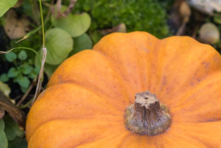
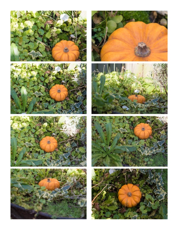
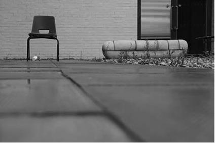
From this I understand, that in order to maximise the full potential of your camera, you should fill as much of the frame as possible with what you actually want in the finished image.  That means that you should take a little more time, wherever you can to compose the image in the frame.

As I have a 36 megapixel camera and I know that I am sometimes lazy about moving closer or composing, because I know have plenty of  resolution and can crop what I don’t want.  However, I am now thinking how much sharper my photos could be if I make more effort to frame the photos properly.

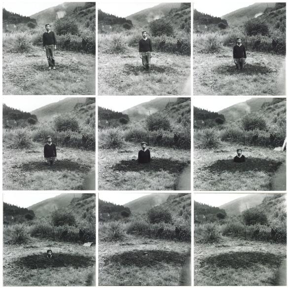
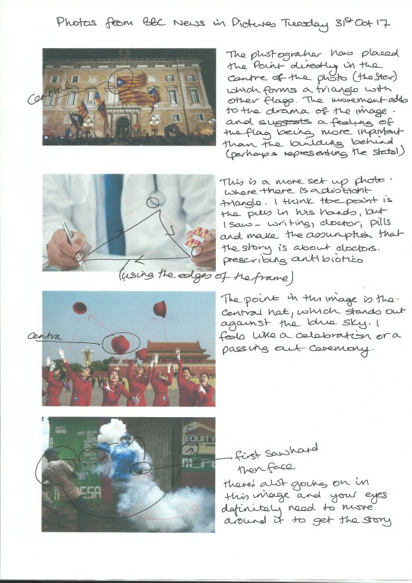
For Victor Burgin (b. 1941), composition is ‘a device for retarding…recognition of the frame’ (Burgin, 1980, p.56). Looking back at some of your compositional exercises from earlier in Part One, would you agree that in the less successful shots there is the feeling of a ‘cropped view’ rather than a ‘transparent window to the world’?

Alfred Stieglitz’s (1864–1946) cloudscapes, the Equivalents, illustrate Burgin’s point. They don’t appear to be composed at all; instead they’re ‘equivalent’ in that any section of the sky would seem to do as well as any other. Because there’s no sense of composition our eye is drawn to the edges, to the frame. The sense of a cropped rather than a composed view is what makes the Equivalents so uniquely photographic – ‘a naked function of the cut’ (Foster et al., 2004, p.147).

I think this means that if an image is composed well, the viewer will be engaged with the contents of the image, whereas if it isn’t the viewers eyes are likely to go to the edges of the frames, wondering what they’re not seeing.


Exercise 1.3 (1) & (2) Line

Exercise 1.3 (1) Line
Take a number of shots using lines to create a sense of depth. Shooting with a wide-
angle lens (zooming out) strengthens a diagonal line by giving it more length within
the frame. The effect is dramatically accentuated if you choose a viewpoint close to
the line.

Exercise 1.3.1-cropped
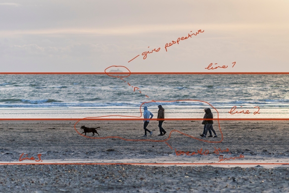
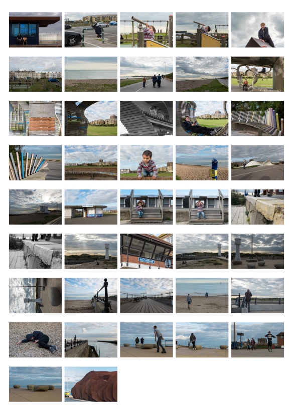
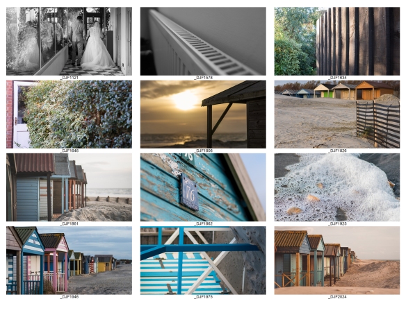
Exercise 1.3 (2) Line
Take a number of shots using lines to flatten the pictorial space. To avoid the effects
of perspective, the sensor/film plane should be parallel to the subject and you may
like to try a high viewpoint (i.e. looking down). Modern architecture offers strong
lines and dynamic diagonals, and zooming in can help to create simpler, more
abstract compositions.

Exercise 1.3.2-cropped
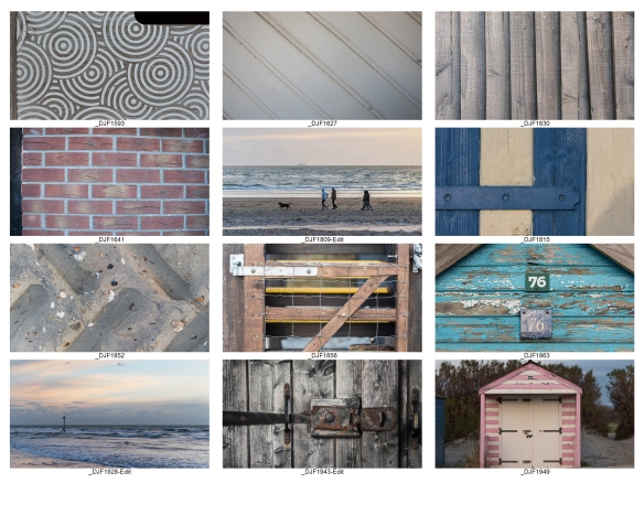
Review your shots from both parts of Exercise 1.3. How do the different lines relate
to the frame? There’s an important difference from the point exercises: a line can
leave the frame. For perpendicular lines this doesn’t seem to disrupt the composition
too much, but for perspective lines the eye travels quickly along the diagonal and
straight out of the picture. It feels uncomfortable because the eye seems to have no
way back into the picture except the point that it started from. So for photographs
containing strong perspective lines or ‘leading lines’, it’s important that they lead
somewhere within the frame.


Exercise Review:

There is definitely a different feel to both sets of photographs. In exercise 1.3 (1), I tried placing the leading lines in different parts of the frame and I noticed that in most of them, I have left space around the line which emphasizes it, whereas, in exercise 1.3 (2) many the lines are terminated at the edges of the photograph.  The flat views are great for detail shots or strong regular shapes.

The hypothesis above states that ” So for photographs containing strong perspective lines or ‘leading lines’, it’s important that they lead somewhere within the frame”

To test this I took a photo where there appeared to be a definite ‘thing’ at the end of the ‘lead line’ namely two traffic cones.  In the second photograph I took them out of the picture, to see if it did indeed affect the viewers comfort.  Personally, I didn’t think it made much difference, but this may be because the line extends almost to the other side of the frame anyway.

_DJF1817_DJF1817a

Although the photo below was taken with flat lines in mind, those being the different horizons between land, sea and sky, the addition of the people and boat, give it perspective which create an invisible line.  So for the image to have worked as a flat photo, I would have to taken it without either of those elements in it.

_DJF1809-Edit-Edit

Here the people and ship have been removed to show how the flat image would look.

_DJF1809-Edit-Edit1

Exercise 1.2 – Point

Exercise 1.2 – Point 

  1. Take two or three photographs in which a single point is placed in different parts
    of the frame.


_DJF8632

Image 1: – ISO 200, 85 mm, f/4, 1/320 sec

The point I chose to photograph was the small black hollow in the stalk of this ‘munchkin’ pumpkin.

I started by placing the point directly in the centre of the image. Something most people try to avoid, I think it works for this image.


_DJF8615-2

Image 2: – ISO 200, 85 mm, f/4, 1/160 sec

The second photograph is zoomed in much closer, but still uses the same ‘point’ but in the bottom right hand corner on the intersection of the thirds.

This is something I tend to use a lot in my compositions so it feels comfortable to me.

_DJF8627

Image 3: – ISO 200, 85 mm, f/4, 1/400 sec

The final point is again on the right of the picture.  Again I feel more comfortable placing my focal point on the right.

Is this because I read left to right?

The point seems clearer in the first two images. The point is formed by the whole end of the stalk which appears lighter.


I was interested to discover if this still works without the contrasting colours and therefore, I have converted the same images to black and white to see if that alters the feel of the composition.

This was a simple black and white conversion in Lightroom, but I did add a little contrast and brightened the oranges.

Logic to evaluation:  How can you evaluate the pictures? How do you know whether you’ve got it right or not? Is there a right place and a wrong place for the point? For the sake of argument, let’s say that the right place shouldn’t be too obvious and that the point should be clear and easy to see. As there’s now a ‘logic’ to it, you can evaluate your composition according to the logic of the point.

Using the ‘logic’ given above I would evaluate the photos as follows:

Image 1: The ‘point’ is directly in the centre of the image, the colour surrounding it and the raidial lines on the pumpkin draw your eye towards it.   The foliage around the pumpkin also appears to be circular, although on the black and white version the whites on the left of the photo are more distracting.  I would evaluate this is a successful composition.

Image 2: The ‘point’ is on intersection of the bottom third and right third.  It is surrounded by a block of colour which draws the eye to the darker colour in the centre of it. So again I would evaluate this as a successful composition.

Image 3: The ‘point’ is not in an specific place, but I would estimate it to be in a quarter way down the photograph on the right hand side. Although the point is very small in this photo, and there are other elements such as a large plant in the bottom left corner, your eyes still settle on the stalk in the middle of the pumpkin. It is also the most in focus element in the photograph. The single Ivy to the left of the pumpkin, is a bit distracting though.  I would evaluate this photo as mostly successful.

It is very illuminating to see that the same point of interest can be captured in may different ways and each tells a different story even though you are looking at the same thing.

2. Take a number of images in which a point is placed in relationship to the frame

Staying with the pumpkin idea, I made a series of photos where the point was place in different places in relation to the frame.  I also chose to change the angle and plane of some of the photos.

pumpkins contact sheet.jpg

the ‘Point’ in relation to the frame

I reviewed all of the photos with a view to observing the way my eye ‘scans’ the surface of the image.

Noting how:
• a point attracts attention out of proportion to its size
• the eye looks for connections between two points
• placing a point close to the edge seems to animate both the point and the frame.

As a comparison to my results, I asked my husband to also undertake the exercise, having not seen the photos before. This was to see if my knowledge of the photos effected the way I scanned the photos.

In general both results are very similar, we found that:

  • bright highlights draw the eye first
  • the ‘point’ was the first or second point of view in the majority of cases.
  • other elements in the image can either lead they eye to the point or become a distraction.

I also looked at some photos from the BBCs Week in Pictures page.  http://www.bbc.co.uk/news/in-pictures-41776819 to see if they contained a point and whether it’s placement had an impact on the image:

PhotoScan

Exercise 1.1 part 2

Exercise to: Take three or four exposures of the same scene. don’t change anything on the camera and keep the framing the the same.

The photos below are the result of this experiment:

pics and histograms
shots taken in ‘P*’ Programme Mode, hand held at 9:00 pm – f/5.6, 1/125 sec, 50mm, ISO 4000

As expected each of the shots looks identical, but on taking them into Lightroom and cycling through them, I could see small changes in the histograms.  They don’t really show in the photos above but are noticeable when going from one to another.

Exercise 1.2 – Point – research

Exercise 1.2 – Point – research

“The point is the most fundamental design element. It has to be small within the
frame and its position is generally more important than its form (see the example of
the white polystyrene cup underneath the chair opposite).”

So the first thing I want to understand is the meaning of the word ‘Point‘ in the statement above.

point

student image from cg_ph4eyv_240117

As you review your photographs, observe the way your eye ‘scans’ the surface of the
image. Note how:
• a point attracts attention out of proportion to its size
• the eye looks for connections between two points
• placing a point close to the edge seems to animate both the point and the frame.


from:    http://www.gdbasics.com/html/point/point.html

Point A point marks a position in space. In pure geometric terms, a point is a pair of x, y coordinates. It has no mass at all. Graphically, however, a point takes form as a dot, a visible mark. A point can be an insignificant fleck of matter or a concentrated locus of power. It can penetrate like a bullet, pierce like a nail, or pucker like a kiss. A mass of points becomes texture, shape, or plane. Tiny points of varying size create shades of  gray.

https://creativemarket.com/blog/10-basic-elements-of-design


https://photography.tutsplus.com/tutorials/6-elements-of-design-for-striking-photographs–photo-2574

Exercise 1.1

So the first exercise I’ve been asked to put my camera on Auto!!! Eeek I haven’t used auto for about 3 years now, and in fact my camera doesn’t even have an ‘auto’ setting!! I think the closest I can get to ‘auto’ is the ‘P’ button, but yet again I don’t think I’ve every used it, so my first action will be to research how to use it and what it’s for.

Programme Mode ‘P’

After watching a couple YouTube videos, I now understand that Programme mode controls the aperture and shutter speed, leaving you to control the ISO based on the lighting conditions you have, i.e. if it’s light and bright you can keep it on ISO 100 or if it dark you can set an ISO of say 4000.

The camera will automatically choose and aperture and shutter speed to achieve the correct exposure for the subject you are shooting.

You can also put it into P* (flexible programme) mode which then allows you to adjust either of the other settings. EG if you need a faster shutter speed because you are photographing sport, you can make it faster and the camera will automatically adjust the aperture to compensate, thus maintaining the correct exposure.

IMG_0856

notes made whilst watching YouTube Video

IMG_0857


I could see this being very useful, if you needed to take photos of an event where you don’t have lots of time and if you’re not worried about the depth of field, but if you’re trying to create a set of photos with a similar ambiance you might struggle if the camera is making all the choices for you.

Personally, I think this could be useful in P* mode especially if your photographing in changeable conditions.

I’m going to try using this to complete Exercise 1.1


references: YouTube Videos:

Square Mile – more research


more research:

When you look at the buildings and spaces that surround your neighborhood, do you ever feel compelled to photograph and immortalize the scene, or do you see just another mundane landscape? For British photographer Tom Westbury, anything and everything has the potential to become a valid, interesting photograph.

What Places Tell Us About People

33629176035_70d0f92489_m
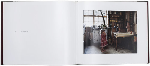
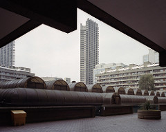
Really like this photographers work, he is using film, after constantly trying to make digital files look like film. Something I do quite a lot!
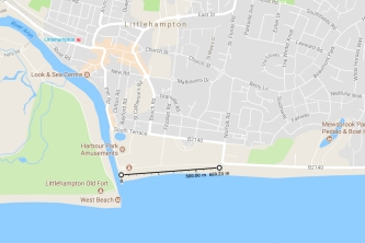
This particular photo called untitled, City of London, 2017 caught my eye for it’s composition and framing. However, whilst they are great shots, I’m not sure they show connection between the him and the environment.

This type of photography is called “New Topgraphics”,

New topographics was a term coined by William Jenkins in 1975 to describe a group of American photographers (such as Robert Adams and Lewis Baltz) whose pictures had a similar banal aesthetic, in that they were formal, mostly black and white prints of the urban landscape. Bernd Becher and Hilla Becher. Pitheads 1974.

www.tate.org.uk/art/art-terms/n/new-topographics
Tom’s photos are in colour, but most are very muted
don’t think this is useful for this brief, as I don’t want to create banal photos, I want to show connection and maybe the impact the environment has on an individuals identity.
. . . . .
searched for : want to find more about photography which links people with their surroundings
this made me chuckle:
https://www.boredpanda.com/people-look-like-surroundings-camouflage-clothing/
. . . . . .

I also wanted to research more about National Geographic.  Having watched a few on-line lectures from National Geographic photographers, I remember that many of them talk about the first photo in a series, being the ‘sense of place’ photo.  I wanted to see if this concept would be something that I should incorporate into this set of photos

NG even have a competition about ‘sense of place’ – Recognizing excellence in enhancing sense of place and authenticity, including support for the protection of historical monuments, archaeological sites, cultural events, indigenous heritage and artistic traditions.
http://www.nationalgeographic.com/worldlegacyawards/winners.html#senseOfPlaceWinners
https://www.pinterest.co.uk/natgeotravel/sense-of-place/?autologin=true

Square Mile – Littlehampton Seafront

Having thought about which ‘square mile‘ I would like to use, my first attempt at answering this is based on Littlehampton promenade.  I don’t have any connection with my own childhood, but it does with my children, step children and grandchildren and so I thought that maybe this is somewhere that we would all have memories of.

Littlehampton Seafront

This particular stretch of promenade has changed enormously over the years and especially in the past 5 years, when the whole river side defences have been rebuilt.  I am interested in how people use the space, i.e. for a Sunday stroll, walk the dog, a playground and as this assignment is about childhood interaction with surroundings, I thought I might focus particularly how children use this space.

This set of photos were taken on a surprisingly warm and bright October Sunday afternoon.  With me were three of step children ranging in age from 16 – 14 and my sister and her two year old.  So this gave me an opportunity to watch how the different ages interacted with different spaces and objects.  Arun District council have spent quite a lot of money over the last few years installing art objects and community spaces therefore this small stretch of prom has a lot of things packed into it tcontact sheeto do.

There is allegedly ‘the worlds longest bench’, an outdoor stage, a play park, and coffee shop designed by an award winning designer (affectionately known locally as ‘the rusty turd’!)

Having watched quite a few talks by National Geographic photographers, they always talk about the first shot being a ‘sense of place’ so I tried to take shots that might do that alongside the shots of the children interacting with objects they encountered.

I decided to use f/8 for all of the shots, as I felt I needed to keep both the foreground and background in focus because this is essentially about location and a connection with it. I kept the ISO at 200 as it was a fairly bright day but changed the focal length between 24 – 70 depending on the shot.

If I use these for the assignment, I think I will need to find a balance between showing ‘the place’ and how people interact with it.  I’m not sure if I should go back at different times of day or in different weather to show the changing nature of the area or if that’s too much bearing in mind I have to choose only 6 – 12 photos?

. . . . . . . . .

further reflection, I am pleased that these photos could convey connection with the environment, but not that they have an impact on a person’s identity

Square Mile: Research

Brief

In our earliest years we know a patch of ground in a detail we will
never know anywhere again – site of discovery and putting names to
things – people and places – working with difference and similitude
– favourite places, places to avoid – neighbours and their habits,
gestures and stories – textures, smells – also of play, imagination,
experiment – finding the best location for doing things – creating
worlds under our own control, fantasy landscapes.
(Professor Mike Pearson)

The brief  is about Y Filltir Sgwar (The Square Mile) and the concept that people form an intimate connection between their childhood ‘home’ surroundings which is stronger than any other they’ll ever have.  I think the author is saying that these bonds can take on fantasy proportions.

I need to make a series of 6 – 12 photographs that examine my surroundings in a new and experimental way.  Y Filltir Sgwar is the starting point, but it asks you to consider where this concept might take you and there is no direction in terms of content.  Architecture, landscape or people could be the focus.  It should also try to communicate something about me, my interests and motivations, a kind on introduction.

initial thoughts:

  • I don’t live anywhere near where I was brought up, so can’t revisit places I knew as a kid.
  • I live in a pretty normal suburban housing estate, which I don’t have a great connection to.  I mostly drive in and out of the estate, I don’t really know it that well and am not really inspired to get to know it.
  • There are other local places I am more connected to, should I focus on one of those


research

In starting to consider this concept I have looked at the photographers suggested by the course book: I have annotated my thoughts under each one:

  • Keith Arnatt: http://www.tate.org.uk/art/artists/keith-arnatt-666
    • Self Burial:Arnatt was fascinated with works of art that are created in the natural landscape but leave no trace of their presence behind. ‘The continual reference to the disappearance of the art object suggested to me the eventual disappearance of the artist himself’, he wrote. This sequence of photographs was broadcast on German television in October 1969. One photo was shown each day, for about two seconds, sometimes interrupting whatever programme was being shown at peak viewing time. They were neither announced nor explained – viewers had to make what sense of them they could.                                 Gallery label, April 2009

      Self-Burial (Television Interference Project) 1969 by Keith Arnatt 1930-2008

      Self  Burial: Keith Arnatt

    • like a when you throw a stone into the water, there’s a ripple and then it’s gone leaving no trace, perhaphs? does art change the world can we really leave a legacy?
  • Gawain Barnard: http://gawainbarnard.com/
    • In boredom to burn, the authors photos, seem to be reminiscing about his desire to burn things as a child.  These seem very dark and ominous and which may be a reflection on his thoughts about his home town. Not really a style I’d like to emulate.
  • Tina Barney: www.artic.edu/aic/exhibitions/story/barney.html
    • These photos seem to more about social comment than a sense of place, they also seem to highlight relationships
  • Venetia Dearden: www.venetiadearden.com/en/somerset_stories_fivepenny_dreams.
    html

    • Really like the artistry of this photographer, she uses great light, quite a lot of back lit photos and lots of black and white.  Photos have a filmic quality.  Feel warm and nostalgic, focuses on good things happening in these places.  I like this kind of photography alot.
      Somerset Stories Fivepenny Dreams
      ‘My passion and curiosity for Somerset has been fuelled by my long-term connection with this area where I spent my childhood. I am compelled to return again and again to explore my relationship with the landscape and the people living here. It is reassuring to witness the pioneering spirit of those living on and within the resources of their surroundings, and I wanted simply to capture intimate moments in families striving to create a way of life they believe in. My journey takes me through seasons, rituals, gatherings and day-to-day life. I witness a sense of belonging and identity within these rich bonds of family and community.’ Somerset Stories, Fivepenny Dreams reflects on the sense of belonging and identity connected to Venetia’s childhood home. Exploring the haunts of her youth and the lives of the current inhabitants, the series intimately documents her surroundings and families who live there.This five year project was published in 2008 and was recently shown at the


      015.jpg
      014.jpg

      photos by Venetia Dearden

  • JH Engström: www.jhengstrom.com/fbh1.html
  • Roni Horn: www.tate.org.uk/whats-on/tate-modern/exhibition/roni-horn-aka-roni-
    horn/roni-horn-aka-roni-horn-explore-exhibitio-10

    • This is a photographer who has developed a connection to a place other than the one she was born and has been returning again and again to document it change, she sees the landscape as growing
  • Tom Hunter: www.purdyhicks.com/display.php?aID=10
  • Karen Knorr: http://karenknorr.com/photography/belgravia/
    • I didn’t really like these photos, the photographer wasn’t trying to present lovely portraits but social comment on the places these people inhabited both phyisically and mentally.  There was real sense of dis-ease, and a cold detachment within them, which I think is what she was trying to convey.  Perhaps it’s my lack of connection to that kind of life that sits uneasy with me?
  • Peter Mansell: www.weareoca.com/photography/peter-mansell/
  • Marc Rees: www.r-i-p-e.co.uk/
  • Jodi Taylor: www.weareoca.com/photography/photography-and-nostalgia/
    • Really liked this photographer’s work, it seemed to make sense. I understood how she might have got from this kind of brief to what she had produced.  In the video of her level 3 work, it showed how she had considered how to present the work to enhance the feeling of nostalgia that she felt from revisiting her childhood places.


my thoughts for reviewing these photographers’ work:

I really liked Venetia Dearden’s style and connection with the people in her photographs, as I prefer people, perhaps I should focus on the people in the place that I choose?

In my opinion many of the photographers were also portraying the sense of identity that they or the people in the photographs are getting from their connection to that place.  Do I need a personal connection with the place to do this subject justice?

Could I use places that my grandchildren go now? It would be interesting to consider that they are currently living their ‘Square Mile’ and would focusing on them bring memories for them later in life? could I create a legacy for them?

My mind is whirring right now, need sleep

Getting Started

Starting to take a look through the material and get a feel for what’s going to be required of me.  I’m both excited and daunted at the same time!!
An extract from my course book, which I think would be great to keep for later use.
Course aims and outcomes 
Please take a moment to read through the aims and outcomes for this course. The aims and outcomes are mapped to the assessment criteria and we’ll be reflecting back on them at the beginning of Part Five.
The course aims to:
  • enable you to begin using technical and visual skills appropriately
  • enable you to produce practical work which uses the above understanding and  demonstrates skills of personal engagement, enquiry, imagination and experimentation
  • develop your understanding of contemporary and historical approaches he  photography
  • introduce critical analysis and self-appraisal of ideas, processes and outcomes.
On successful completion of the course you’ll be able to:
  • create images that demonstrate a practical and conceptual understanding of how to  apply techniques and visual skills
  • show initial ability in translating ideas into personal imagery • conduct a procedure of research, development and production in relation to the course themes
  • begin to reflect on the various levels of meaning in your own and others’ photography.
Even if you don’t intend to submit your work for formal assessment, it’s useful to take on board these outcomes to support your learning and use as a means of self-assessment. You can check your progress against the learning outcomes in your learning log when you review your progress against each assignment
References:
(this is my attempt at trying to write a reference correctly, not sure if it’s right yet)
Bloomfield et al (2017), Photography 1, Expressing you vision, OCA