2.4 – The distorting lens

Exercise 2.4
Find a location with good light for a portrait shot. Place your subject some distance in front of a simple background and select a wide aperture together with a moderately long focal length such as 100mm on a 35mm full-frame camera (about 65mm on a cropped-frame camera). Take a viewpoint about one and a half metres from your subject, allowing you to compose a headshot comfortably within the frame. Focus on the eyes and take the shot.

Longer focal lengths appear to compress space, giving a shallower depth of acceptable sharpness, which is known as depth of field. This makes a short or medium telephoto lens perfect for portraiture: the slight compression of the features appears attractive while the shallow depth of field adds intensity to the eyes and ‘lifts’ the subject from the background.

_DJF2662-Edit

Stanley, December 2017

_DJF2671-Edit

Riley, December 2017

This gorgeous pair both wanted to pose for this exercise, so obviously I had to photograph them both.

Aperture Priority: f/2.8, 70 mm, 1/250 sec, ISO1000

Particularly in the image of Riley, you can see the very shallow plane where sharpness is in the three fence strips level with him. The wall in the distance is just a colour and shape. In both images, the subjects standout from the background.

I absolutely love the image of Riley when edited in black and white. I also added a colour look up filmstock layer to give it timeless film quality.   There seems to be a real connection with him, which I think is more pronounced in the black and white version and I like the fact he’s not smiling.

_DJF2671-Edit_1.jpg

Riley

2.3 – The distorting lens

Exercise 2.3:

Choose a subject in front of a background with depth.  Select your shortest focal length and take a close low viewpoint, below your subject.  Find a natural point of focus and take the shot.

I chose to display this image in black and white, because it emphasises the distortion.

The model is only 9″ tall, but looks much bigger in relation to its surrounds because of the low viewpoint.  The background also appears to be falling backwards, even though it’s perfectly vertical wall.

Finally the bottom of the model (closest part to the viewpoint) looks out of proportion with the rest of the model.

This answers my question of Exercise 2.2, in relation to my height.  I will need to be aware of that when taking photos, especially portraits as using this angle might distort someones features.

Traditionally, this focal point might be used for a man, in order to make him look taller and more powerful in the frame!

2.2 – The distorting lens

For this exercise, I have taken a photo where the subject is in front of a background with depth.

The first shot was taken at a focal length of 70 mm and the second shot at 24 mm.  In order to keep the subject at a similar size in the frame, I had to move forward to take the second shot.

_DJF2654_RalphX2.jpg

When putting the images side by side it is really easy to see how the combination of focal length and viewpoint is affected by ‘perspective distortion’.

Perspective distortion is a normal effect of viewing an object.  It is thought that the human eye is similar to a 50 mm (full frame) lens, which is about half way between this two images.  Therefore, if you wanted to take an image that best represented how it is seen then use a 50 mm lens.  Our eyes would however, see a much wider field as our field of vision is probably closer to the 24 mm lens, as shown in excercise 2.1 

Other things I have noted in these two images, are that although both were taken at an aperture of f/4,  the 2nd (24mm) photo, has much more of the foreground is in focus and secondly, the background is much further away and sharper.

For a portrait like this, I think I would prefer the 70 mm version, as the subject stands out more in the image, and I also prefer the angle. (notwithstanding the fact that he doesn’t have a street light coming out of his head!!). There seems to be more definition between him and the background.  However, the 24 mm focal length would be better for Landscapes where keeping things in focus throughout the image is more desirable.

I wonder if the fact that I am only 5 ft 2″ has an impact on this, as in having to get closer to keep the subject in the centre of the image, I ended up looking up a bit? If had been taller would this be an issue?


2.1 – The distorting lens

Exercise 2.1

Find a scene that has depth. From a fixed position, take a sequence of five or six shots at different focal lengths without changing your viewpoint. (You might like to use the specific focal lengths indicated on the lens barrel.)

Technical Information:

exercise 2.1 metadata

screenshot of metadata shown in Adobe Lightroom

It was only after completing this exercise, that I realised that I had set the camera manually rather than using aperture priority. So I have now changed the priority mode and will use if for the subsequent exercises in this Part.

Nikon D810 Camera (fx sensor)

The focal lengths used were:

  • 24 mm
  • 38 mm
  • 46 mm
  • 58 mm
  • 70 mm

using a Tamron SP 24-70mm F2.8 Di VC USD A007N Lens

f/5.6
1/40 sec
ISO 400

Photos were taken in RAW, imported into Adobe Lightroom for minimal editing and saved as 1500 px Jpgs.  None of the images have been cropped or straightened.

This slideshow requires JavaScript.

The lens I was using has a zoom range from fairly wide at 24 mm up to a mid range zoom of 70 mm.  This is the lens I tend to use as my ‘go to’ everyday lens.

The first and widest photo, gives an overall view and helps place the climbing frame in its place. As the images scroll through, you do get a sense of moving towards the subject and the subject becomes more dominant to eye, so you look less at the surrounding elements in the image.

focal length exercise 2.1.jpg

In this experiment, I have blown up a section of each of the photographs so that they are almost the same size. Obviously, the 24 mm needed to be blown up much more than the 70 mm photograph, but interestingly quality in the detail at this magnification, doesn’t seem to be that different.

focal length comparison

but when magnified even more, you can start to see the difference in the amount of detail that has been recorded between the 24 mm shot on the left and the 70 mm shot on the right:

_DJF2593_more zoom

Had my objective been to focus in on the boy, then getting closer and zooming would have been a better option to get a sharper image.  However, in the context of him being a part of the wider photo, the quality is ok

Allesandra Sanguinetti

Aside

Allesandra_Sanguinetti_rsz_h403_8_221

Vida mia, 2002, Allesandra Sanguinetti

I came across this photograph whilst flicking through the pages of a new book:

‘The Photograph as contemporary Art’ by Charlotte Cotton.

It was one of those that immediately caught my attention and I wanted to know more about it.

The photographer Allesandra Sanguinetti, had made a 4 year study of two cousins starting when they were aged 9 and 10.

Exploring how they represented themselves to others.  but what really comes across for me in the set is their interaction with each other and in this photograph, is such raw emotion. I love the whole ambiance of the image as well as the story telling.  It feels like your feeling the emotion with her and is very intimate.  There may be also a small element of relating to this girl!

http://alessandrasanguinetti.com/index.php/adventures/info/

I believe there is a second book coming, I would be interested to see how these girls have grown into women.

Exercise 1.4 – Frame

Brief:

Using the viewfinder grid display in your camera, take a number of shots, composing each shot within a single section of the grid.  Ignore the rest of the frame:

With working full time at this time of year, I have struggled to get out to take photographs during daylight hours, so I decided to take a series of photos for this exercise using the cushions in my lounge.

Exercise 1.4 - Framing.jpg

Framing using small sections of the Viewfinder Grid

This slideshow requires JavaScript.

view full size images here

In these images, I have used the center of the yellow flower as the focal point for most of the photographs.  I have placed them in this grid collage roughly in the area of the viewfinder in which I composed each of the images.

None of the images have been cropped and have had minimal editing.

Technical Information:

Because of low light, I used a camera mounted on a tripod so that I could use a slower shutter speed  in order to maintain sharpness and reduce noise. The majority of shots were taken at f/8, except for number 7 (see below), which was taken at f/2.8.  Shutter speed was around 1/4 sec or 1/5 sec, ISO 400 and metering set to matrix.

D810_viewfiender

My camera’s viewfinder grid, looks like this

I used the viewfinder and the focus select button to make sure I was focusing in the area of the grid I wanted to compose.

In framing each image I found I was doing more than just moving the ‘point’ around the frame, but was really trying to make a composition within a small part of the screen.  I tried to disregard the rest of the frame as directed, which is quite difficult to do, but still produced some surprises when reviewing the images. So I obviously managed to do it.

Image Evaluation:

Exercise 1.4 - Framing_reviewed.jpg

evaluation of how my eyes travelled around the image

Observations:

  • There are both ‘points’ and ‘lines’ in each image.
  • The eye isn’t always drawn to the focal point of the image, i.e. No 3
  • For images 10, 14 and 16; having only concentrated on the composition in part of the image, areas of distraction have been missed which take the viewers eyes away from the focal point.  However, for image 16 this has added a dimension to the story of the picture that none of the others do.
  • No 2 has strong lines which take your eyes into and around the image.  When I took this I was only looking at the sofa at the top of the image, so was pleasantly surprised by this image.

Reflection:

Trying different areas of the frame to compose the photograph, almost forces you to look at things from different angles and give very different images of the same subject, which makes for more interesting results.

I have used settings that mean that pretty much everything in the frame is in focus.  I would like to try this again, using a shallower depth of field to see how this effects the results.

Project 3 – Surface and Depth

Research Blog

JPEGs by Thomas Ruff

2006-RUFTH0605

JPEGs by Thomas Ruff

All images that appear on the internet and/or printed in books and magazines today are digitised.  Nearly all images are digital even if they originated in non-digital or pre-digital forms. Given this fact it is surprising how few of them ever wish to address the fact that they exist as masses of electronic information that take visual form as pixels. Ruff has done a great deal to introduce into photographic art what we might call an ‘art of the pixel’, allowing us to contemplate at an aesthetic and philosophical level the basic condition of the electronic image. Of course he does this not by showing us the images on screens but by making large scale photographic prints, blowing them up far beyond their photorealist resolution. This might be the  first time some of these images have ever taken a material form.

extract from David Campany's blog/essay

http://davidcampany.com/thomas-ruff-the

http://jmcolberg.com/weblog/2009/04/review_jpegs_by_thomas_ruff/

The tremendous beauty of some of the images notwithstanding, the concept itself seems to rely a bit too much on the technique itself. What else is there? Make no mistake, there is nothing wrong with producing beautiful images or images that are “just” beautiful. And everything would be fine if there hadn’t been so many attempts to convince me that in reality “jpegs” is more.

extract from Joerg Colberg's review

These two articles are reviewing Thomas Ruff’s book; JPEGs.  In this book he has collected photos from different archives to create his own archive of iconic photos.  He has taken the concept that even though many of the images were created on film, they are all now stored in digital format which he found on the ‘web’.

In Joerg’s article he says that the photographer is stating that the idea behind the photos is that even when stored in poor resolution they still have an aesthetical quality.  the Question is: is this photography or art?  He also makes the point that an individual image can be part of many different archives, each with a different focus. I would relate this _DJF1817to ‘collections’ in Adobe Lightroom, where a single photograph could be in a number of different collections based on the focus of that particular collection.

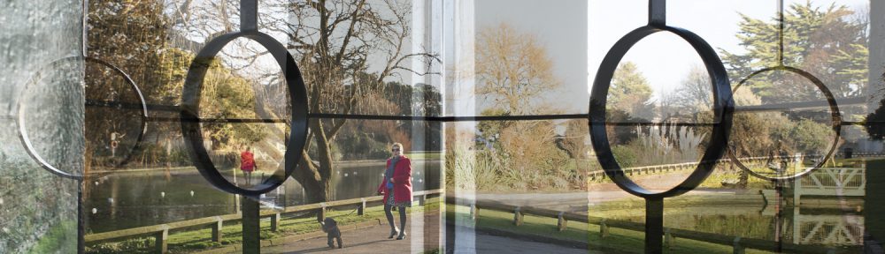
eg: my beach huts image could be a member of various collections, such as, Beaches, Golden Hour, or Structures.

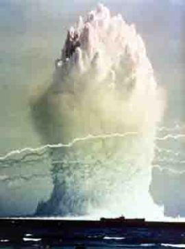
The 9/11 images were iconic, but of terribly low resolution. With the […] jpeg structure and the results from work with image structures I managed to modify the terribly poorly resolved but still visually aesthetical images my way. ‘Terribly beautiful’ images they were.” In a nutshell, this is the idea behind jpegs.

I find it interesting that he has taken a very modern phenomenon of  pixelated photos and printed them.  It’s a bit of a reversal of mediums.

This book was made in 2009, most mobile phones, ipads and computers these days have very high resolution screens, so we are used to seeing all of our media in a very photorealistic way, so it actually requires us to look closely at pixelated image to make sense of it. (Was that his point?).  I believe most people would continue searching for a better quality image rather than look at a low resolution, pixalated photo these days.

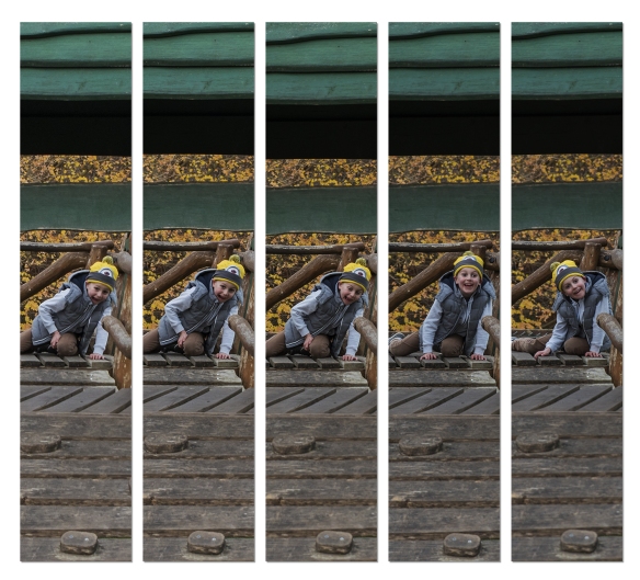
In order to relate this to my own work, I took two recently taken photographs and attempted to create the same effect by re-sizing the photographs to 180 x 270 pixels, and saving at ‘zero quality’ compression using Photoshop’s ‘save for web’.

As David Campney noted that the photos are best appreciated in printed form, I also printed them out, to see how they looked.

jpegs_Lachlan

jpgs_beachhuts

Conclusion:

I initially struggled a bit with the concept, and didn’t get why anyone would want to lower the resolution of an image, but then most photographers edit and amend their images to present them in a format they choose.  Therefore, I think there is an argument that photography is just about shape and form, and that humans can understand meaning in images even if they are not realistic.

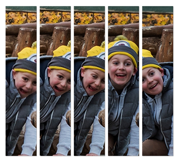
I wonder, however, how far you can degrade an image before it is no longer recognisable or meaningful? I took the same two images and used the dry brush filter in photoshop to deconstruct the photos even further.

Aesthetically interesting but no longer recognisable?  As with Thomas Ruff’s, JPEGs, if you hadn’t already seen the realistic version, would they still have meaning? This is something that might be interesting to explore further.


Thomas Kellner

Aside

I came across this photographer whilst reading another learning blog by Derek Youd. I thought it was really interesting and did some further research as I felt it carried on the theme of deconstructing image to create something different.

Whereas Thomas Ruff has taken existing images and reduced them to pixels, Thomas Kellner has interestingly taken images of one subject in order to create something new, but which seems to also encompass the original.


http://lenscratch.com/2017/03/thomas-kellner/

German photo artist Thomas Kellner has spent much of his photo career deconstructing architecture.  He calls his methodology  “visual analytical synthesis” where he thoughtfully plans a series of photographs in order to create a picture out of contact sheets. “His work is often referred to Cubism considering that his creative process includes a construction but the results resemble a deconstruction.”

I particularly liked this image of Big Ben:

Kellner_14_01