Maja Daniels – Participant Observation

This is a review of Maja Daniels’ talk about her work at Brighton and Hove Camera Club, on 9th January 2018

Maja Daniels is a Swedish photographer who was talking about her projects and showing the resulting images.

Maja described herself as a Psychologist whose photography is usually the result of a very long process. She left home in Sweden at 18 to move to France and has studied Photography, psychology, journalism and speaks a number of different languages.  

Maja sees her projects as of a way of communicating stories of the society in which she is living, and which gives her the opportunity to “talk about the world, to the world“.

Maja Daniels – INTERVIEW in The NEW YORK TIMES

‘Into Oblivion’  was the result of a three year project which came out of a call out by the director or a geriatric unit in France, near to where Maja was studying.  She started the project alongside 4 other students but quickly ended up being the only person still doing it.  She says that she spent a year visiting the hospital, working the with patients and getting to know their families before she even picked up a camera.  She then spent a further 2 years developing the work to a point where she thought it was finished. The initial concept of the door came during her initial visit when she saw patients peering out of the window from the other side. 

Photographing the patients looking out of the window is a message for those making medical policies.”can you see the reality of the policies you make”. She says that Alzheimer sufferers often walk and move around and their attention becomes focused on the door, because they ‘stuck’ by not being able to get through.

Maja like the idea that the viewer of the image always brings half the story. so doesn’t like her projects to direct the viewers thoughts too much.

Maja likes to work in different mediums depending on the impact she want’s to achieve. We saw a video of her images which were dubbed with the sounds recorded on the ward.  Although the images themselves are ‘quiet’ and subtle the video felt much more impactful and really gave a sense of the realty of living in this place.

In the break, I was able to speak with Maja and asked how she decided what images to use in her set and how many images to include the project.  This is something that I thought might help with the assignments for EYV.  She said that she always goes back to a subject on numerous occasions and challenges herself to try different angles and new views.  She always tries to come away with something new.  She also tries to get a range such as wide angle placement shots as well as details and each image should add something new to the work.  When asked how do you know when it’s finished, she replied that when she keeps coming back with the same images and can’t add anything new she will realise that it’s finished.  She doesn’t have any timescales and tries to be organic and open to the work expanding. 

She also said she very good at cutting images out.

Twins

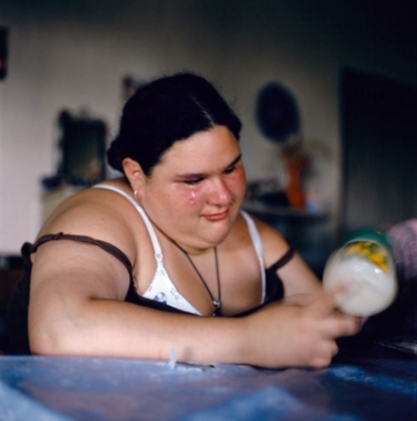
MADY AND MONETTE IN NEW YORK MAGAZINE

The second project that Maja showed us, was a project that chronicles the lives of identical twlns Mady and Monette who live in Paris.  The work is a juxtaposition to the oblivion project in that it celebrates the positive side of ageing.  She has never sought to ‘expose’ the twins, but to help illustrate how they see themselves and how they enjoy their ‘twindom’ and document the way it shapes their lives. I particularly like the image above in terms of the composition, colours and light.

Maja goes back regularly to visit them and has built up a great relationship with the twins, I think she see this more as a collaboration with the twins as they retain much of artistic control over the images she takes and also where she publishes them..

Sweden

Finally Maja shared some of the images she is currently working on, back in her home country of Sweden.  She has moved into a log cabin in the hometown of her grandparents, where they speak the oldest form of Norse still spoken.  She was fascinated by how the language has survived and how it is now declining as the younger generations are no longer learning and speaking it.

This is a very different piece of work from the other two projects and when finished, i think, it will be very interesting.

Maja says that her work is personal and subjective and shouldn’t be taken as an objective documentation of people or a situation.  She aims to make knowledge, through participative observation. 

It seems that for all of her projects, she has spent a lot of time and invested emotionally in the subjects she is photographing.  I think this is evident in the resulting images, they are intimate and real.

All in all, I like her approach and was very touched by the subject matter.  I think hearing her speak about them also gave a real connection with the people and places portrayed

Debra Flynn 10.01.2018 

majadaniels.com

addendum- 07/08/2018

In conversation: Maja Daniels

Sharon Boothroyd talks to photographer Maja Daniels about her work.

https://www.oca-student.com/resource-type/conversation-maja-daniels

Part 3 – Project 2 – A durational space

Long Exposures:

Photographer Michael Wesely has taken some really long  exposure images, 

See: http://itchyi.squarespace.com/thelatest/2010/7/20/the-longest-photographic-
exposures-in-history.html [accessed 25/09/14])
www.wesely.org

The Museum of Modern Art, New York, 2001–2004. Michael Wesely

The Museum of Modern Art, New York, 2001–2004. Michael Wesely

I really enjoy these images and they obviously take a lot of patience. There is a ghostly quality to them, which gives a glimpse of how the space has changed over time, really like this.

Hiroshi Sugimoto

watched video about this artist: but to be honest was left a little underwhelmed by his results, I don’t really get why you’d want to take an image of a white screen and with the lack of motion in the rest of image, it could just have been a photo taken of a white screen in an empty theater.

Alisdair Gill


http://alasdairgill.blogspot.co.uk/

Part 3 – Traces of Time – Coursework

Shutter Speed

‘Freezing Time’

I was surprised to discover that today’s fast shutter speeds were developed so recently, and that the first photographs took hours to develop.  I started my photographic journey with film, many years ago, but even then, it seemed quick to take a photo.

Names to remember in shutter speed development:

In being able to stop motion, in the fraction of a second it takes to push the shutter button, we are able to see things that our eyes couldn’t actually see. Szarkowski, 2007, p.5 argues that we can derive much pleasure in the fragmenting of time because of the aesthetic quality of shapes we can capture

Bullet Through Flame (Schlieren Method) © Kim Vandiver and Harold Edgerton, 1973

This image by Harold Edgerton is an example of how there can be beauty in capturing something we wouldn’t normally be able to see.

I believe that images like this, capture both a fragment of time, but also movement, because as humans we do have the ability to discern movement, even if we can’t actually see it happening.

I like the idea of being able to capture both.


http://alasdairgill.blogspot.co.uk/


Project 2 – Lens Work

Research – Photographers and Artists

Ansel Adams (1901-1984):

Famous for black and white wilderness photos, and membership of club f64, the name of the group is taken from the smallest setting of a large-format camera diaphragm aperture that gives particularly good resolution and depth of field.

The group believed in the “innate honesty” of the camera, which, as Weston described, “should be used for a recording of life, for rendering the very substance and quintessence of the thing itself, whether it be polished steel or palpitating flesh.” The f/64 photographers were concerned with natural subjects—Weston’s evocative close-ups of fruits and vegetables, for example, or Adams’s sublime images of Yosemite National Park, nudes, and everyday objects. In their 1932 manifesto, Group f/64 described pure photography as “possessing no qualities of technique, composition, or idea derivative of any other art form,” a conviction very much in line with modernism’s celebration of the intrinsic qualities of each medium—paintings should be painterly, photographs should be photographic, and sculptures should be sculptural.

https://www.artsy.net/article/theartgenomeproject-how-ansel-adams-and-the-photography-group

and teaching the ‘zone system‘, which is a way of calculating perfect exposure no matter what the conditions.  It mostly related to film photography but could be used in digital photography.

07ALTMAN-blog427

Half Dome, Ansel Adams (1927)


Fay Godwin (1931-2005)

British photographer, used her images to campaign for conservation of the british countryside. Mostly used deep focus

Godwin’s exceptional body of work, her outspoken personality and her genuine concern for the environment made her a unique figure in British photography. Her unpretentious attitude to photography and her devotion to the landscape are captured in this quote from one of her final interviews, with journalist David Corfield in 2004:

‘I don’t get wrapped up in technique and the like,’ she said. ‘I have a simple rule and that is to spend as much time in the location as possible. You can’t expect to take a definitive image in half an hour. It takes days, often years. And in fact I don’t believe there is such a thing as a definitive picture of something. The land is a living, breathing thing and light changes its character every second of every day. That’s why I love it so much.’
Read more at http://www.amateurphotographer.co.uk/technique/fay-godwin-1931-2005-iconic-photographer-18907#R7eEhF4wpR6vAmlv.99

images by Fay Godwin – really like the atmosphere created and the depth created by having a focal point in the foreground which leads the eyes into the image.


Gianluca Cosci

Gianluca’s work seems a complete opposite from Ansel Adams and Fay Godwin’s.  He uses very shallow depths of field and shows us very limited views of his subjects.

Standardisation is a tool of control and constraint of people into reassuring and harmless psychological and architectural boxes in which any hint of improbable rebellion would be easily sedated.

My work tries to suggest these ideas showing sanitised office blocks, censored landscapes and lifeless environments. With my photographs I would like to insinuate a subtle sense of violence in our deeply hierarchical society. I am interested in the point of view of the loser, the marginalised.

Often we are forced to have only restricted views, uncomfortable to maintain. In spite of this, I believe that one can take advantage of this apparent fault and use it to observe and understand things in a different, unexpected way.

Gianluca Cosci, 2006

In his interview with Kevin Byrne in April 2016, Gianluca says “G.C.: I don’t really consider myself a “photographer” rather an artist without a defined, strict identity… “

He seems to have a real issue with capitalism and the immense wealth of a few.  I think by denying us the full view of their creations he is pouring doubt on their achievements and giving us a more abstract art where we can interpret it how we wish. This may stem from his roots in small town Bologna in Italy where wealth and power may be less obvious. Is this a visual interpretation of his own feelings of self worth or pushing the viewer to think freely?

These 3 photographers had different viewpoints

  • Ansel Adams – the pure wonder of nature
  • Fay Godwin – mans effect of the beauty of nature
  • Gianluca Cosci – Manmade creations and their link with power and suppression of free thinking


Mona Kuhn:

As soon as I saw Mona’s images, I absolutely connected with them, I love the imagery, and colouration.  The soft creams and browns coupled with the duel exposures of looking through the windows at her subjects. She has used a fairly shallow depth of field which gives a soft dreamy look.

This is something I’ve tried a lot in my own work, so definitely something I would like to emulate and take forward.

Kim Kirkpatrick:

just 5 photos!!! very shallow depth of field, in industrial landscapes not very inspiring to me.

Guy Bourdin (1928 – 1991)

Guy Bourdin, was a French artist and fashion photographer known for his provocative images. From 1955, Bourdin worked mostly with Vogue as well as other publications including Harper’s Bazaar.

All of Guy’s photos are sharp throughout and yet still have a very graphic and artistic quality.


web references:

Allesandra Sanguinetti

Aside

Allesandra_Sanguinetti_rsz_h403_8_221

Vida mia, 2002, Allesandra Sanguinetti

I came across this photograph whilst flicking through the pages of a new book:

‘The Photograph as contemporary Art’ by Charlotte Cotton.

It was one of those that immediately caught my attention and I wanted to know more about it.

The photographer Allesandra Sanguinetti, had made a 4 year study of two cousins starting when they were aged 9 and 10.

Exploring how they represented themselves to others.  but what really comes across for me in the set is their interaction with each other and in this photograph, is such raw emotion. I love the whole ambiance of the image as well as the story telling.  It feels like your feeling the emotion with her and is very intimate.  There may be also a small element of relating to this girl!

http://alessandrasanguinetti.com/index.php/adventures/info/

I believe there is a second book coming, I would be interested to see how these girls have grown into women.

Project 3 – Surface and Depth

Research Blog

JPEGs by Thomas Ruff

2006-RUFTH0605

JPEGs by Thomas Ruff

All images that appear on the internet and/or printed in books and magazines today are digitised.  Nearly all images are digital even if they originated in non-digital or pre-digital forms. Given this fact it is surprising how few of them ever wish to address the fact that they exist as masses of electronic information that take visual form as pixels. Ruff has done a great deal to introduce into photographic art what we might call an ‘art of the pixel’, allowing us to contemplate at an aesthetic and philosophical level the basic condition of the electronic image. Of course he does this not by showing us the images on screens but by making large scale photographic prints, blowing them up far beyond their photorealist resolution. This might be the  first time some of these images have ever taken a material form.

extract from David Campany's blog/essay

http://davidcampany.com/thomas-ruff-the

http://jmcolberg.com/weblog/2009/04/review_jpegs_by_thomas_ruff/

The tremendous beauty of some of the images notwithstanding, the concept itself seems to rely a bit too much on the technique itself. What else is there? Make no mistake, there is nothing wrong with producing beautiful images or images that are “just” beautiful. And everything would be fine if there hadn’t been so many attempts to convince me that in reality “jpegs” is more.

extract from Joerg Colberg's review

These two articles are reviewing Thomas Ruff’s book; JPEGs.  In this book he has collected photos from different archives to create his own archive of iconic photos.  He has taken the concept that even though many of the images were created on film, they are all now stored in digital format which he found on the ‘web’.

In Joerg’s article he says that the photographer is stating that the idea behind the photos is that even when stored in poor resolution they still have an aesthetical quality.  the Question is: is this photography or art?  He also makes the point that an individual image can be part of many different archives, each with a different focus. I would relate this _DJF1817to ‘collections’ in Adobe Lightroom, where a single photograph could be in a number of different collections based on the focus of that particular collection.

eg: my beach huts image could be a member of various collections, such as, Beaches, Golden Hour, or Structures.

The 9/11 images were iconic, but of terribly low resolution. With the […] jpeg structure and the results from work with image structures I managed to modify the terribly poorly resolved but still visually aesthetical images my way. ‘Terribly beautiful’ images they were.” In a nutshell, this is the idea behind jpegs.

I find it interesting that he has taken a very modern phenomenon of  pixelated photos and printed them.  It’s a bit of a reversal of mediums.

This book was made in 2009, most mobile phones, ipads and computers these days have very high resolution screens, so we are used to seeing all of our media in a very photorealistic way, so it actually requires us to look closely at pixelated image to make sense of it. (Was that his point?).  I believe most people would continue searching for a better quality image rather than look at a low resolution, pixalated photo these days.

In order to relate this to my own work, I took two recently taken photographs and attempted to create the same effect by re-sizing the photographs to 180 x 270 pixels, and saving at ‘zero quality’ compression using Photoshop’s ‘save for web’.

As David Campney noted that the photos are best appreciated in printed form, I also printed them out, to see how they looked.

jpegs_Lachlan

jpgs_beachhuts

Conclusion:

I initially struggled a bit with the concept, and didn’t get why anyone would want to lower the resolution of an image, but then most photographers edit and amend their images to present them in a format they choose.  Therefore, I think there is an argument that photography is just about shape and form, and that humans can understand meaning in images even if they are not realistic.

I wonder, however, how far you can degrade an image before it is no longer recognisable or meaningful? I took the same two images and used the dry brush filter in photoshop to deconstruct the photos even further.

Aesthetically interesting but no longer recognisable?  As with Thomas Ruff’s, JPEGs, if you hadn’t already seen the realistic version, would they still have meaning? This is something that might be interesting to explore further.


Thomas Kellner

Aside

I came across this photographer whilst reading another learning blog by Derek Youd. I thought it was really interesting and did some further research as I felt it carried on the theme of deconstructing image to create something different.

Whereas Thomas Ruff has taken existing images and reduced them to pixels, Thomas Kellner has interestingly taken images of one subject in order to create something new, but which seems to also encompass the original.


http://lenscratch.com/2017/03/thomas-kellner/

German photo artist Thomas Kellner has spent much of his photo career deconstructing architecture.  He calls his methodology  “visual analytical synthesis” where he thoughtfully plans a series of photographs in order to create a picture out of contact sheets. “His work is often referred to Cubism considering that his creative process includes a construction but the results resemble a deconstruction.”

I particularly liked this image of Big Ben:

Kellner_14_01

Square Mile – more research


more research:

When you look at the buildings and spaces that surround your neighborhood, do you ever feel compelled to photograph and immortalize the scene, or do you see just another mundane landscape? For British photographer Tom Westbury, anything and everything has the potential to become a valid, interesting photograph.

What Places Tell Us About People

33629176035_70d0f92489_m
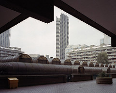
Really like this photographers work, he is using film, after constantly trying to make digital files look like film. Something I do quite a lot!

This particular photo called untitled, City of London, 2017 caught my eye for it’s composition and framing. However, whilst they are great shots, I’m not sure they show connection between the him and the environment.

This type of photography is called “New Topgraphics”,

New topographics was a term coined by William Jenkins in 1975 to describe a group of American photographers (such as Robert Adams and Lewis Baltz) whose pictures had a similar banal aesthetic, in that they were formal, mostly black and white prints of the urban landscape. Bernd Becher and Hilla Becher. Pitheads 1974.

www.tate.org.uk/art/art-terms/n/new-topographics
Tom’s photos are in colour, but most are very muted
don’t think this is useful for this brief, as I don’t want to create banal photos, I want to show connection and maybe the impact the environment has on an individuals identity.
. . . . .
searched for : want to find more about photography which links people with their surroundings
this made me chuckle:
https://www.boredpanda.com/people-look-like-surroundings-camouflage-clothing/
. . . . . .

I also wanted to research more about National Geographic.  Having watched a few on-line lectures from National Geographic photographers, I remember that many of them talk about the first photo in a series, being the ‘sense of place’ photo.  I wanted to see if this concept would be something that I should incorporate into this set of photos

NG even have a competition about ‘sense of place’ – Recognizing excellence in enhancing sense of place and authenticity, including support for the protection of historical monuments, archaeological sites, cultural events, indigenous heritage and artistic traditions.
http://www.nationalgeographic.com/worldlegacyawards/winners.html#senseOfPlaceWinners
https://www.pinterest.co.uk/natgeotravel/sense-of-place/?autologin=true